Review
Essay: Chicago: Center of
the Comics Universe
José Alaniz
Chicago:
Where Comics Came to Life. Chris Ware and
Tim Samuelson. Sidney Yates Gallery at the Chicago Cultural Center, June 19,
2021-January 9, 2022. <https://www.chicago.gov/city/en/depts/dca/supp_info/comics.html
>
Drawn to Combat:
Bill Mauldin and the Art of War. James Brundage. Pritzker Military Museum
& Library: opened May 14, 2021-April 2, 2022. <https://www.pritzkermilitary.org/billmauldinexhibit
>
Chicago Comics:
1960s to Now.
Dan Nadel. Griffin Galleries of the Chicago Museum of
Contemporary Art, June 19-October 3, 2021. <https://mcachicago.org/Exhibitions/2021/Chicago-Comics-1960s-To-Now
>
For a few months in 2021, Chicago became
the center of the US cartoon universe with no fewer than four major
comics-related shows going on simultaneously, the majority of them focused on the
Chicago scene and industry going back to its beginnings.
A visitor to the windy city, traversing
its streets with their magnificent architecture at every turn (a museum in
their own right), might well eschew the gargantuan Marvel: Universe of Superheroes
touring exhibition which was also in town (and reviewed elsewhere), and focus
instead on the richness that is Chicago comics. Said visitor might come in from
the metropolis’ autumn chill to the ornate halls of the Sidney Yates Gallery,
on the fourth floor of the Chicago Cultural Center, for Chicago: Where Comics Came to Life. Curated and designed by Chris
Ware, with the collaboration of Chicago cultural historian emeritus Tim
Samuelson, the show proved a revelation.
Figuratively and literally, the show had
Ware’s fingerprints all over it, its every square inch reflecting his wry
sensibility and meticulous attention to detail. The large space was divided
into walled-off sub-units to create an interlocking series of mini-exhibits
such that you might turn a corner and glimpse something from 50 years later or
earlier before resettling your attention on what’s in front of you.
“[C]omics are a rat maze,” Ware told an
interviewer. “Look here, don’t look here, go here, go there. So I designed this
show to act as a comic strip itself.”[1]
A rat maze designed by Chris Ware is bound
to be crammed with far more information at a glance than any human being could
take in, even over repeated viewings on multiple weekends — and that’s just
what you got. The walls turned boustrophedon-like, with every step thought out
as you penetrated into another sub-gallery. As noted, the twisty-turny architecture
encouraged your gaze to wander from the object before you to those on the other
side of the hall, all the way to the Chicago skyscrapers and Millennium Park outside
the large windows. It felt like negotiating a mammoth 3D crossword puzzle with multicolored
walls (82 of them!) spilling over with portraits, period pictures, art
implements, video clips, figurines, period advertisements, reproductions, original art, books,
memorabilia, ephemera of all kinds, comics, artists’ furniture and merchandise
— some of it hanging overhead.
Blurbs covering material from Rodolphe Töppfer
to the origins of the Chicago industry all the way to the 1960s were written by
Ware, Samuelson, Tim Jackson, Caitlin McGurk, Hillary Chute, Warren Bernard,
Trina Robbins and other scholars. The sheer amount of artists, editors,
publishers covered — and all the stuff — was staggering.
 Much emphasis was laid on the Chicago Tribune’s
Sunday comics page, which introduced the world to Frank King’s Gasoline
Alley (1918), Chester Gould’s Dick Tracy (1931) and Harold
Gray’s Little Orphan Annie (1924). You may have heard of them. But
what about Charles Lederer? John T. McCutcheon? William Schmedtgen? Bungleton
Green? “Where Comics Came To Life” brought those and countless other
turn-of-the-19th-century and later figures, most known mainly by
specialists, back from decades-long obscurity. Several were women and/or BIPOC.
Much emphasis was laid on the Chicago Tribune’s
Sunday comics page, which introduced the world to Frank King’s Gasoline
Alley (1918), Chester Gould’s Dick Tracy (1931) and Harold
Gray’s Little Orphan Annie (1924). You may have heard of them. But
what about Charles Lederer? John T. McCutcheon? William Schmedtgen? Bungleton
Green? “Where Comics Came To Life” brought those and countless other
turn-of-the-19th-century and later figures, most known mainly by
specialists, back from decades-long obscurity. Several were women and/or BIPOC.
Laid out before us was a vibrant history
of graphic narrative in Chicago, a history you literally walked through, with
astonishing discoveries at virtually every step. What follows is a shamefully
incomplete summation.
Chicago Art Institute alum Schmedtgen, while
a staffer at the Chicago Mail in 1882, developed an intaglio process to
expeditiously prepare and publish drawings – including in sequences of more
than one – in the daily newspaper. Over the course of his career (he would move
on to become art director at the Chicago Daily News), Schmedtgen
capitalized on further technological advances and oversaw illustrators like
McCutcheon and George Ade as they chronicled the life of the city in drawings.
In this era they helped create the modern comic strip. Their trajectories
complement — and in many cases precede — what was happening in the Big Apple at
such publications as Pulitzer’s New York World and Hearst’s New York Journal.
For example, The Chicago Inter-Ocean — not one of the New York
papers — was the first to publish a color illustrated supplement and
cartoons in 1892.
 Through the aforementioned myriad effects
as well as massive page reproductions taking up whole walls as background to
the displays, the exhibit presented dimly-remembered newspaper strip icons like
George W. Peck (1856-1916), the “father” of Chicago comics. His “Peck’s Bad
Boy” was a transmedial sensation that outlived him, even into the television
age. To take in strips like William Donahey’s The Teenie Weenies (1914),
Johnny Gruelle’s lush color artwork in his “Mr. Tweedle” Sunday feature (which
filled in the yawning gap left by Winsor McCay when he left the New York
Herald in 1911) and the early work of Clare A. Briggs, Sydnie Smith and E.C.
Segar is to catch glimpses of an era when cartoonists were highly-paid
celebrities and much sought-after circulation-boosting stars in their own
right. The Chicago Tribune could even make a claim for debuting the
first comic superhero, in the guise of Heinrich Detlev Körner’s “Hugo Hercules”
(1902).
Through the aforementioned myriad effects
as well as massive page reproductions taking up whole walls as background to
the displays, the exhibit presented dimly-remembered newspaper strip icons like
George W. Peck (1856-1916), the “father” of Chicago comics. His “Peck’s Bad
Boy” was a transmedial sensation that outlived him, even into the television
age. To take in strips like William Donahey’s The Teenie Weenies (1914),
Johnny Gruelle’s lush color artwork in his “Mr. Tweedle” Sunday feature (which
filled in the yawning gap left by Winsor McCay when he left the New York
Herald in 1911) and the early work of Clare A. Briggs, Sydnie Smith and E.C.
Segar is to catch glimpses of an era when cartoonists were highly-paid
celebrities and much sought-after circulation-boosting stars in their own
right. The Chicago Tribune could even make a claim for debuting the
first comic superhero, in the guise of Heinrich Detlev Körner’s “Hugo Hercules”
(1902).
The show devoted substantial attention to
the city’s Black publishers and cartoonists, like Robert Sengstacke Abbott, who
founded the seminal newspaper The Chicago Defender (1905). This
boasted the largest readership of any Black publication; many credited it as a major
factor in encouraging the African-American Great Migration from south to north.
For me the stand-outs in this section included Leslie Malcolm Rogers, a
graduate of the Chicago Art Institute who joined the Defender as its
second staff artist in 1919 and the next year launched “Bungleton Green,” the
longest-lasting African-American-centered strip produced by an African-American
(it lasted until the 1960s under various artists); Daniel Day, the “world’s
youngest cartoonist,” who worked at the paper from the age of 12, contributing
his strip of observational humor “Spotty” (1927) from the age of 14; and the
better-known Jackie Ormes, the first and most successful Black female comic
strip artist, who enjoyed a decades-long career and more than a million readers
in the Black press, with work often centered on fashion as well as social
commentary.
 The Frank King section, taking up several
walls on its own (about a third of the exhibit), provided an exhaustive,
practically year-by-year account of the “Gasoline Alley” (1919) cartoonist’s
life from childhood to his career at the Tribune to retirement in
Florida. The walls were plastered with larger-than-life- King Sunday comics
pages and strips, taking advantage of corners to highlight a color scheme or
other effect. These devices recalled Ware’s own constructs, like his Rusty
Brown lunch box, comics shop display stands and mobiles.
The Frank King section, taking up several
walls on its own (about a third of the exhibit), provided an exhaustive,
practically year-by-year account of the “Gasoline Alley” (1919) cartoonist’s
life from childhood to his career at the Tribune to retirement in
Florida. The walls were plastered with larger-than-life- King Sunday comics
pages and strips, taking advantage of corners to highlight a color scheme or
other effect. These devices recalled Ware’s own constructs, like his Rusty
Brown lunch box, comics shop display stands and mobiles.
A visitor here felt as if shrunk down to
ant size relative to the art. Looking up at them from close enough, the comics seemed
to dominate from horizon to horizon. Comics heaven! As Ware puts it in his
gloss, the design was inspired by Walt and Skeezix’s perennial nature walks
“through the reds, oranges, browns and yellows of a crisply-rendered midwestern
fall landscape.”
The King section also featured such
additional material as photographs, a detailed biography, a printing plate of a
Sunday strip from 1930, drawing implements, furniture, sketches, diaries,
letters, appointment books, merchandise — even a pubescent Skeezix hanging from
the ceiling. Some of these touches come off as a bit creepy in that Ware way.
Ware has long idolized King and sees him as one of his greatest influences;
that adoration was palpable in this show. Remarkably, some of the drawings in
King’s sketchbooks strongly reminded me of Ware’s drawings from his.
A show of Chicago: Where Comics Came to Life’s scope is bound to hold many
surprises and discoveries, as I’ve tried to convey. One particularly
captivating piece has stayed with me for how it made me rethink what I thought
I knew about the history of LGBTQ+ representation comics. The strip “Lucy and
Sophie Say Goodbye” (1905) by Anonymous, which ran in the Tribune for
less than a year, used a recurring gag formula not unlike Winsor McCay’s “Little
Sammie Sneeze.” Two women keep bidding each other farewell as one departs on a
journey. But their utter absorption in and physical affections toward each
other tantalizingly hint at something much deeper, even as chaos erupts. For these
heroines, arrayed in extravagant Edwardian dress, parting is such sweet sorrow,
and not even a tornado will tear them apart. This is comic “female hysteria”
veiling what seems a strong same-sex attraction.
According to McGurk’s gloss, some evidence
suggests that the artist may have been a man[2]
with some awareness of the homoerotic theme’s potential for controversy: “[T]he
artist may have concealed their identity to avoid complaint and controversy
over interpretation of Lucy and Sophie as romantic friends or lovers.” In theme
and execution, “Lucy and Sophie Say Goodbye” is a landmark work which the
exhibit made available to whole new audiences. And it was just one of this
event’s many-splendored treasures.
Not far from the Cultural Center one finds
the Pritzker Military Museum & Library, site of the second star in
Chicago’s celestial comics convergence of 2021-2022, Drawn
to Combat: Bill Mauldin and the Art of War. Where Ware and Samuelson’s
exhibit was an epic with what seemed a cast of thousands, this show was chamber
drama exceptionally focused on just one artist. But again, there were many
discoveries to be had.
Drawn to Combat’s curator, James
Brundage (a veteran of the Iraq war), brought together nearly
150 of the Pulitzer Prize-winning cartoonist’s original drawings and published
cartoons, along with personal material, documents, merchandise and books from
his long career. Before even entering the space of the gallery, you were
greeted by Mauldin characters painted on the walls of a long corridor leading
to the entrance (Chicago: Where Comics
Came to Life used a similar device).
Born in New Mexico in 1921, Mauldin
studied at the Chicago Academy of Fine Arts and tried his hand at modest gag
strips like Cactus Juice before WWII took him to the European theater.
Attached to the 45th Infantry Division, he saw the war firsthand,
and was even wounded in the shoulder. He drew cartoons for the army newspaper all
the way through the invasion of Sicily in 1943. His beloved “dogface” recruit
characters, Willie and Joe, delighted readers of Stars and Stripes,
while United Feature Syndicate distributed his work for a civilian audience.
After that, his immortality was assured. By the time the war ended in 1945, Mauldin
was widely syndicated, had published two booklets and won a Pulitzer Prize. Soon
there was even a Willie and Joe movie deal.
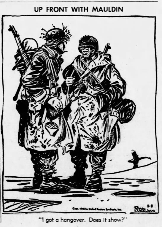
What was it about Mauldin’s war cartoons
that proved so compelling for some many people? In a word, candor.
Willie and Joe, ordinary grunts, looked
nothing like most civilians’ romanticized notions of corn-fed freedom-fighting
warriors. In “Yer Lucky. Yer Learnin’ A Trade” (1944), the brutish Willie, dangling
a cigarette from his fingers, matter-of-factly speaks those words to his
bare-chested companion, who’s building a road over mud. Bearded, disheveled,
loaded down with a rifle, grenades and knives, Willie looks like a walking
arsenal, a scruffy Christmas tree of war. The shirtless Joe, dog tags jangling
on his chest, looks up with slitted eyes, barely registering the sarcasm. Also
unshaven, he almost resembles a hirsute Hulk as drawn by Sal Buscema. The
bitter joke is that no skills learned on the front will really help soldiers
transition back to civilian life, which might as well be on another planet.

Form echoes content in these cartoons.
Mauldin’s confident thick lines and brushstrokes, both calculated and dashed
off, seem almost expressionist. A bundle or rolled-up sleeping bag at a
soldier’s hip is a mere swirl of thick lines with scratchy accents. Like the
grunts digging trenches and shooting Germans, Mauldin’s art may not always be “pretty,”
but it gets the job done.
In short, Willie and Joe make the “realistic”
infantrymen of Saving Private Ryan look like Jay Gatsby. They in fact
expose such hollow “patriotic” representations for the phony, glamorized
facades they are. Mauldin’s cartoons conveyed the fact that, even in a “just”
war, morale among the rank and file often sucked, for the simple reason that
they were abused, taken for granted, undersupplied, overworked and needlessly
exposed to danger. Like ordinary troops have been since time immemorial.
Little surprise, then, that the people who
created those conditions, the officer corps, tended to hate Mauldin’s work.
In Luxembourg, General George Patton
himself called Mauldin on the carpet over his “scruffy” troops. Patton wanted
to censor Mauldin’s cartoons in Stars and Stripes, due to their
“demoralizing” effect. (To no avail — Patton’s boss General Dwight Eisenhower
overruled him.) Mauldin commemorated the meeting with a drawing[3]
of Patton’s open door to his office in what looks like an ornate 18th-century
palace. The great man of history himself (along with his bull terrier) sits sullenly
inside.
Had Bill Mauldin died in 1945 or never
drawn again after that point, we would still remember him today as a fiercely
frank chronicler of war from a common man’s perspective. But in actuality
Mauldin would go on to produce his most piercing and substantial work over the
rest of the 20th century, his editorial cartoons attacking such
entrenched US evils as the mistreatment of veterans, racial prejudice,
inequality of all sorts, the Vietnam fiasco and the environmental crisis. He
won his second Pulitzer Prize in 1959, for a cartoon of the Soviet writer Boris
Pasternak as a prisoner.[4]
Few things seem to have angered Mauldin as
much as the particular brand of hypocrisy exhibited by white Americans who
proclaimed freedom at home but denied it those who were racially different from
them, regardless of service overseas. Many works just after the war detailed
the rampant discrimination against veterans of color who were often denied
benefits like the GI Bill’s provisions. A 1946 cartoon shows our heroes
returned from Europe, standing before a want ad which requires applicants to
“prove racial and religious background.” A clean-shaven Willie, still smoking,
still with a caustic expression, says, “I ain’t got a chance, Joe. I had too
many blood transfusions overseas.” A child stands next to them, looking at the
sign. Mauldin is asking what lessons the nation is teaching the young.
In many similar cartoons, Mauldin brought
attention to the racism against minority service members back from the war, who
were not allowed to re-enter the society they had fought for — not as full
citizens, anyway. (President Harry S. Truman did not outlaw segregation in the
military until 1948, though changes were not fully realized until six years
later.) Job discrimination was a major theme. In a 1947 work, a Black man
stares down a white officer barring his way into a recruiting station. The
officer has a black bird perched on each shoulder, one of them labeled “Jim
Crow.” “Them old eagles sure spoil that new uniform, colonel,” the Black man
says.
Another devastating piece from 1945 shows
two white men smilingly conversing at the counter of a fruit and vegetable
stand. A sign above them has the words Hitoshi Mitsuki (the former owner)
crossed out, with “under new management” beneath. “Naw, we don’t hafta worry
about th’ owner comin’ back,” says one man. “He wuz killed in Italy.” The
cartoon references the all-Japanese-American 442nd Infantry
Regiment, which fought in the European theater and whose troops faced much
discrimination following the war. Even more gallingly, the shop sports a sign
with the slogan “Let’s Keep America for Americans” and US flags. In still
another work on this theme from 1945, Mauldin draws a uniformed
Japanese-American veteran on crutches at a bar. A surly bartender points to a “No
J*ps Allowed,” sign and says, “Can’t ya read signs?” Yet another “America for
Americans” sign hangs on the counter, though it lies partly in shadow.
In the 1950s Mauldin took a hiatus from
cartooning to work on various ventures (including a film career) and to run for
congress as a Democrat (he lost). From 1958 to 1962, Mauldin worked exclusively
for the St. Louis Post-Dispatch. If anything, his critical pen
only grew sharper in these years and after, one of the most tumultuous eras of US
history. In fact, some newspapers dropped his cartoons due to his skewering of
racists.
As an editorial cartoonist for the Chicago
Sun-Times from 1962 to 1991, Mauldin’s role as chronicler took on a
national scope, attaining heretofore unseen heights of outrage, cutting satire
and biting denunciation as he commented on national tragedy and cupidity of all
sorts.
In this period Mauldin produced his most
famous work — one of the most famous editorial cartoons of all time — in
response to the November 22, 1963 assassination of President John F. Kennedy.
He showed Abraham Lincoln (the one at the Lincoln Memorial) with his hands up
to his face. The artist dashed off the drawing in less time than it takes most
people to have a social lunch.
In the 1960s and 1970s, Mauldin deployed
his acid wit against the KKK, red-baiting, homophobia, environmental
destruction, militarism, the Vietnam war, the My Lai massacre and — less
famously — gender/sexual identity discrimination.
For example, in “A Place For Everything
And Everything in Its Place” (1978), an aproned woman slaves away at mountains
of dishes, her foot shackled to the sink. (This part recalls “Down With Kitchen
Drudgery!”, a Soviet propaganda poster by Grigory Shegal from 1931). Another
room has the door closed, with a huge lock, which says, “Closets for Gays.”
This is what I appreciated most about Drawn to Combat: learning about the many
other causes which motivated Mauldin besides the war. His remained a crucial
and fearless voice on national affairs of all sorts right up until his
retirement: “You Ain’t Gaining Much Altitude Holding Me Down” (1962) depicts a
white bumpkin in wide-brimmed straw hat holding a shotgun, astride the
shoulders of a Black man, who himself stands chest-deep in water (delivering
the line, the latter looks the more dignified); “Bookmarks” (1968) portrays an
extraordinarily violent year (Martin Luther King and Robert Kennedy both gunned
down) through the visual metaphor of a thick book, its pages crammed with the
stocks of guns, hangman’s nooses, swords, knives, guns, with blood trailing
down from its pages and the title “The American Way: A Social and Political
History”; a 1981 cartoon of a man with a crutch before a personnel officer
sitting at a desk, who says, “If you want veteran’s privileges, you should
fight a popular war”; another from 1965 with a dead bird in a degraded
landscape, factories spewing pollution and a sick-looking fish popping its head
out of filthy water to say, “It’s getting so bad, even people are complaining.”
Mauldin died in 2003 and was buried in
Arlington National Cemetery with his extended band of brothers and sisters in
arms. Drawn to Combat proved a
fascinating portrait of a vital master of US comic art.

Through the mid-20th century,
the Chicago Tribune had the most widely-read national comics section in the country. Yet this is
only part of the story, since in the same period the Chicago Defender was
serving a Black readership which white-oriented papers like the Tribune
tended to forget. [6]
Chicago also became, in the 1960s and
1970s, a bastion of underground/alternative comics, and today boasts a thriving
scene. “Chicago Comics: 1960s to Now” told that story through clippings,
documents, comics, installations and tons of original art.
Among the most gripping were large splash
pages from “Home Folks” (1954) by Jay Jackson. Anticipating some of Will
Eisner’s work of the 1970s, these single-panel portraits of several different
conversations, featuring ten or more characters at a party or other such
gathering, invite the eye to “pan” over the space, thus forging a narrative.
It’s almost a comics version of a busy Breughel painting. Jackson’s “Speed
Jackson” (ca. 1933) and his revived version of “Bungleton Green” (1934), which
often ran side by side in the Defender, spared no punches in their
satirical attacks on US racism.
Originals by Jackie Ormes’ “Patty-Jo an’
Ginger” (1945) were a delight to lose oneself in, especially for those of us
who had only ever seen reproductions. I found remarkable Ormes’ subtle use of
dotted screen tones with highlights to achieve varied gradations of dark skin.
 Other Black artists prominently featured
in the show included National Book Award winner Charles Johnson, represented by
his Black Humor (1970) gag cartoons; Richard “Grass” Green, with Super Soul Comix #2 (1972); and Seitu
Hayden, whose Waliku (1973-1974), a Berke Breathed-like strip on the
everyday lives of black people, partly reflected the Black Nationalism of the
era. In a 1972 strip, one Black youngster says to another, “I might be a Black Muslim when I grow up
‘cause they help Black folks.” “Yeah, I might too,” says his friend, “if they start
wearen’ two tone jumpsuits insteada them ol ugly suits an bowties they got now.”
The latter fashionably sports a comb in his natural. (Sadly, today this work
exists only as newspaper clippings.)
Other Black artists prominently featured
in the show included National Book Award winner Charles Johnson, represented by
his Black Humor (1970) gag cartoons; Richard “Grass” Green, with Super Soul Comix #2 (1972); and Seitu
Hayden, whose Waliku (1973-1974), a Berke Breathed-like strip on the
everyday lives of black people, partly reflected the Black Nationalism of the
era. In a 1972 strip, one Black youngster says to another, “I might be a Black Muslim when I grow up
‘cause they help Black folks.” “Yeah, I might too,” says his friend, “if they start
wearen’ two tone jumpsuits insteada them ol ugly suits an bowties they got now.”
The latter fashionably sports a comb in his natural. (Sadly, today this work
exists only as newspaper clippings.)
Underground comix, published in such
venues as The Chicago Seed (1967), appeared in the guise of works by,
among others, Jay Lynch and Skip Williamson.
The 1980s and 1990s saw the start of the
alternative comics revolution in Chicago, centered around Quimby’s Bookstore in
Wicker Park. Major figures of this period included Ware, John Porcellino, Lynda
Barry, Nicole Hollander and other legendary names. Daniel Raeburn’s highly-regarded
comics criticism zine The Imp (1997) covered the scene.
For those of us of a certain generation
whose later formative years coincided with this era and these artists, seeing
their works displayed proved both nostalgic and demystifying. Especially to
those mere mortals toiling in the comic arts who will never rise to the
empyrean heights of, say, a Dan Clowes, Chicago
Comics: 1960s to Now was a weirdly encouraging experience. What I mean is that,
no matter how insanely perfect and polished an artist’s work appears in print,
the originals will always show flaws, cover-ups, material traces of
rethinkings, hesitations, a tiny misapplied brushstroke and errant ink splatter.
They’re human! At a certain proximity, even Clowes and Ware look rough,
raw, crude. “Shit, I could draw that,” one thinks of a stray minimalist palm
tree in the distant background of a Ghost World panel.
Leave it to Clowes himself, that arch
meta-commentator, to opine on this very facet of comic art display in 90s Eightball:
“To look at pages at their original size is to occupy the space of the
cartoonist at their creation, a vastly different space than that of the printed
object, much more intimate and physical.”
Also, who knew Lynda Barry draws so huge?
Her mixed-media comics collages come to life even more in person; the gold
glitter and plastic eyeballs on that Aswang demon (2000-2002) really stand out off
the page.

Speaking of off the page, Molly Colleen
O’Connell’s 2020-2021installation Extra, Extra, Extra reimagined a
mid-century Chicago newsstand as a colorful surreal smorgasbord of made-up
publications, stacks of fake newspapers, figurines, consumer products and a
purple alligator vendor with eyes for nipples: print culture as fever dream.
Other highlights for me were the section
on Archer Prewitt’s disturbing Sof’ Boy (1990), a Casper-like character
and faux icon with accompanying merchandise (plush toys, plate, pins,
figurines, t-shirt) skewering the sort of commercialism of comics characters
seen in the Where Comics Came to Life
show, like Skeezix figurines and bubble gum. (There was plenty of
exhibit-related merch on sale in the Contemporary Art Museum gift shop, too, by
the way.)
 Some of the most celebrated figures — Ivan
Brunetti, Ware, Emil Ferris — got their own dedicated rooms (these only seemed
to reinforce canonical hierarchies worth critiquing, but oh, well). Ware’s room
had all the cold, disturbing and virtuosic qualities one would expect, with
sections for Rusty Brown and other works, all arranged around a creepy
mechanical doll/sculpture thing sporting a domino mask, titled God (unfinished,
2012).
Some of the most celebrated figures — Ivan
Brunetti, Ware, Emil Ferris — got their own dedicated rooms (these only seemed
to reinforce canonical hierarchies worth critiquing, but oh, well). Ware’s room
had all the cold, disturbing and virtuosic qualities one would expect, with
sections for Rusty Brown and other works, all arranged around a creepy
mechanical doll/sculpture thing sporting a domino mask, titled God (unfinished,
2012).
Those were great, but they exposed me to
very little I didn’t already know. The value of any decades-spanning museum
survey like this — especially one devoted to an art form with as many neglected
figures as comics — should ultimately be measured according to how many artists
it brings back into the public spotlight for new generations to discover. And
in this respect, Chicago Comics: 1960s to
Now did not disappoint.
 Besides cartoonists like Ormes, Jackson
and Johnson — who deserve their own shows — the exhibit highlighted several
more recent Black artists, such as Yaoundé Olu, whose untitled 1977 photomechanical print reveals Afrofuturist
inclinations that have come to proliferate throughout the mediascape in recent
years. We could say the same about NOG, Protector of the Pyramids
(1980), an extraordinary series of superhero Afrofuturism by Turtel Onli. It
ran in the Defender for a few months in 1979, and Onli self-published a
collection of the material in 1981. Looking though Olu and Onlil’s oeuvre
reminded me of listening to Sun Ra’s concerts or watching a Janelle Monáe video.
I was seeing the Afrofuturist roots of present-day Black artists working in the
mainstream, like Ta-Nehisi Coates/Brian Stelfreeze with their Black Panther arc
“A Nation Under Our Feet” (2016) and Nnedi Okorafor/Leonardo Romero with Shuri
(2019).
Besides cartoonists like Ormes, Jackson
and Johnson — who deserve their own shows — the exhibit highlighted several
more recent Black artists, such as Yaoundé Olu, whose untitled 1977 photomechanical print reveals Afrofuturist
inclinations that have come to proliferate throughout the mediascape in recent
years. We could say the same about NOG, Protector of the Pyramids
(1980), an extraordinary series of superhero Afrofuturism by Turtel Onli. It
ran in the Defender for a few months in 1979, and Onli self-published a
collection of the material in 1981. Looking though Olu and Onlil’s oeuvre
reminded me of listening to Sun Ra’s concerts or watching a Janelle Monáe video.
I was seeing the Afrofuturist roots of present-day Black artists working in the
mainstream, like Ta-Nehisi Coates/Brian Stelfreeze with their Black Panther arc
“A Nation Under Our Feet” (2016) and Nnedi Okorafor/Leonardo Romero with Shuri
(2019).
Kerry James Marshall, who has been
laboring on his graphic novel Rhythm Mastr for over 20 years, was
another enthralling discovery for me. This is a work best appreciated at full
size, in large inkjet prints on plexiglass displayed in sequence across three
walls. Some of the storyline takes place in a jazz club, where across several
panels we see a drummer go to town on a solo, all ablur. Marshall’s process is
extraordinary: he bases the comics characters on dolls, for which he creates
and sews costumes and constructs whole miniature environments (a parking lot, a
jazz club with tiny circular tables, prints on the walls). In addition, he
works in such a way that reverses standard comics production. As Nadel
explains, “Instead of adding color during the printing process [as Jackie Ormes
or Jay Jackson would do], his rendering of Black characters is integral to the
drawings: black, not the white of the paper, is the baseline color of his
cast.”
 To repeat, works like those of Olu, Onli
and Marshall demonstrate in startling fashion the value of shows like Chicago
Comics: 1960s to Now: to shed a national light on creators too-little regarded
and in many cases too long ignored, but whose art is nothing short of radical, challenging
the underpinnings of US comics history itself.
To repeat, works like those of Olu, Onli
and Marshall demonstrate in startling fashion the value of shows like Chicago
Comics: 1960s to Now: to shed a national light on creators too-little regarded
and in many cases too long ignored, but whose art is nothing short of radical, challenging
the underpinnings of US comics history itself.
The show concluded with a sprinkling of younger
artists like Lilli Carré, Anya Davidson, Gina Wynbrandt, Margot Ferrick, Eric
J. Garcia and Nick Drnaso. Bianca Xunise was represented by a giant blow-up of
a detail from her cartoon Mask (2020), which shows a Black woman wearing
a mask and an “I Can’t Breathe” T-shirt. A bare-faced white woman with a
petulant expression tells her: “If you can’t breathe, then take that silly mask
off!” Perhaps the most 2020 image of all time.
In sum, the windy city made it worth the
trip. As Nadel put it in his introduction to Chicago Comics: 1960s to Now: “Chicago has been a center for comics
for decades — a haven not only for making and publishing cartoons, but also for
innovating on the medium.”
I’d put it this way: for those of us in
love with this art form, these incredible shows demonstrated that for comics, it
really was sweet home, Chicago.
[1] Borrelli, Christopher. “Free Show:
‘Chicago Where Comics Came to Life’ at the Cultural Center is 82 Jam-Packed
Walls by Chris Ware and Pal.” Chicago Tribune (July 1, 2021).
[3] Mauldin recounted the story, with
drawing, in his 1971 memoir The Brass Ring.
[4] Pasternak won the Nobel Prize for
Literature that year, chiefly for his “anti-Soviet” novel Dr. Zhivago,
though he feared leaving the USSR to claim his award out of fear of Soviet
reprisals against him and his family.
[5] Despite the show’s title, many
works dated back as far as the 1930s.
[6] Nadel also produced a remarkable
companion book to the show, It’s Life As I See It: Black Cartoonists In
Chicago, 1940–1980, which takes its title from a 1970 Charles
Johnson strip of a black artist describing his painting, a black square.


 Éric Dubois is a design professor in Paris and has
been participating with comic strip exhibitions since François Schuiten and
Benoit Peeters set him on the path with their Drawing Machines in 2016
at the Musée des Arts et Métiers in Paris. After that, he worked with Blake
and Mortimer, for which he created several exhibitions with journalists and
comics experts Thierry Bellefroid and Daniel Couvreur: Scientifiction
(2018), The Secret of the Swordfish (2021), MachinaXion (2022). Dubois
is the sole curator of ODYSSEY exhibition on the origins of Blake and
Mortimer. This is an exhibition dedicated to The “U” Ray, the first comic
book by Edgar P. Jacobs.
Éric Dubois is a design professor in Paris and has
been participating with comic strip exhibitions since François Schuiten and
Benoit Peeters set him on the path with their Drawing Machines in 2016
at the Musée des Arts et Métiers in Paris. After that, he worked with Blake
and Mortimer, for which he created several exhibitions with journalists and
comics experts Thierry Bellefroid and Daniel Couvreur: Scientifiction
(2018), The Secret of the Swordfish (2021), MachinaXion (2022). Dubois
is the sole curator of ODYSSEY exhibition on the origins of Blake and
Mortimer. This is an exhibition dedicated to The “U” Ray, the first comic
book by Edgar P. Jacobs.