News about the premier academic journal devoted to all aspects of cartooning and comics -- the International Journal of Comic Art (ISSN 1531-6793) published and edited by John Lent.

Tuesday, July 12, 2022

Exhibit Review Essay: European comics festivals return to Angouleme and Haarlem

By Barbara Postema

Angoulême: 49e Édition Festival Internationale de la Bande Dessinée, France, March 17-20, 2022. https://www.bdangouleme.com/

Stripdagen Haarlem, Netherlands, June 3-12, 2022. https://www.stripdagenhaarlem.nl/

        After several years of cancellations due to the COVID-19 pandemic, this year comics festivals are willing to give it a go again, and exhibitors and attendees are eager to participate. Both of the  festivals under discussion here were held in a beautiful historic city at venues spread across the town center, showcasing the city as a whole as well as the comics, and giving attendees room to wander if they needed to escape the crowds.

The Angoulême festival, postponed from its usual dates, was held in March for this once, where the spring-like weather made for a nice change from the usual dreary weather conditions in January. It was the 49th edition, already raising some anticipation for its 50th edition next year, for example with the selection of Julie Doucet for the Grand Prix. Her selection ensures that the anniversary next year will be historic in a number of ways—with only the third female Grand Prix winner presiding, and with Doucet being the first Canadian to take the highest honor.

As usual the festival started with a preview day for the press (March 16th), where exhibitions could be visited before they were open to the general public, often with the creators and curators present to provide commentary on the themes of the exhibits. Press day was much appreciated this year in order to see exhibitions with fewer crowds around. Programming for the press and comics professionals continued during the other days of the festival, including the International Rights Market for negotiating translations as well as adaptations to film.

However, the bulk of the events are open to everyone (at the price of a day ticket), and this includes numerous exhibitions, entry to the tents where publishers and creators are selling their comics, kids events, and signings. I spent quite some time (and money) in the tents Le Nouveau Monde and Espace BD Alternative, where small-press and alternative publishers and cartoonists hocked their wares. These two tents showed evidence of a few empty tables, signals perhaps that the move to March meant that some publishers could not attend this year due to schedule clashes, or perhaps that there were fewer international publishers and guests due to continuing COVID-19 travel restrictions. This latter possibility was also supported by the reported lack of Japanese guests and creators present at the festival, a change from previous years. Other tents throughout the city included Le Monde des Bulles, for the mainstream French comics publishers, and Manga City, where manga-related publications could be found. There was also a tent for the collectors, specializing in original art, special editions and ephemera.

Chris Ware Exhibit

But perhaps the most important aspect of the festival is the exhibitions. Every year there is a big exhibit dedicated to the previous festival’s Grand Prix winner, who gets to showcase their work. Chris Ware was elected for the Grand Prix in 2021 and at this year’s festival he presented a retrospective of his work in the fairly intimate space of the basement of Espace Franquin. The exhibition included many original pages, some of which were astounding in their size, while also bearing witness to the cartoonist’s careful and precise creative process. The show also included various objects Ware had made, including wooden models made for various family members to commemorate birthdays and anniversaries, as well as some fully constructed versions of the paper models he included in the ACME Novelty Library books, though those may have been assembled by someone else. The exhibit gave a nice sense of the great care and attention Ware dedicates to his pages, though his creative process as a whole remained mostly invisible.

Loo Hui Phang exhibition in Espace Franquin

The festival included two exhibitions devoted to the writers of comics. One was in the same building as the Ware exhibition: “Loo Hui Phang, Écrire est un Métier” shed a light on Phang’s own writing process, but also that of many other people who write for comics. Her exhibition also created awareness of the working conditions for writers for comics, who often lack labor protections and are also shut out from certain other avenues for making money in the comics world, such as selling original art, even as they contributed to the characters or the story represented in that art. She drew much needed attention to the precarious nature of work in comics.

René Goscinny exhibition in Musée d’Angoulême
The other exhibition focused on writing for comics put the spotlight on a writing superstar, René Goscinny, who wrote scenarios for numerous series, of which Asterix and Lucky Luke are probably the best known in the English-speaking world. This exhibition, mounted in the Musée d’Angoulême, provided an overview of Goscinny’s life and career while also showing his creative process, which included research, coming up with the names of characters (on of the key elements of the humor in the Asterix series), creating narrative sequences and writing a synopsis. Eventually a full script including dialogue would go to the artist (Albert Uderzo in the case of Asterix, or Morris for Lucky Luke), and the exhibition included many examples where the script pages were displayed together with the finished art for the corresponding page of comics, shedding light on a fascinating aspect of comics creation. Since comics writers tend not to produce products that work well on museum walls, their contribution to comics is sometimes easy to lose track of (as Phang’s exhibit also demonstrated), but the Goscinny exhibition managed to make the highlight on writing both illuminating and visually interesting.

Shigeru Mizuki exhibition in Musée d’Angoulême

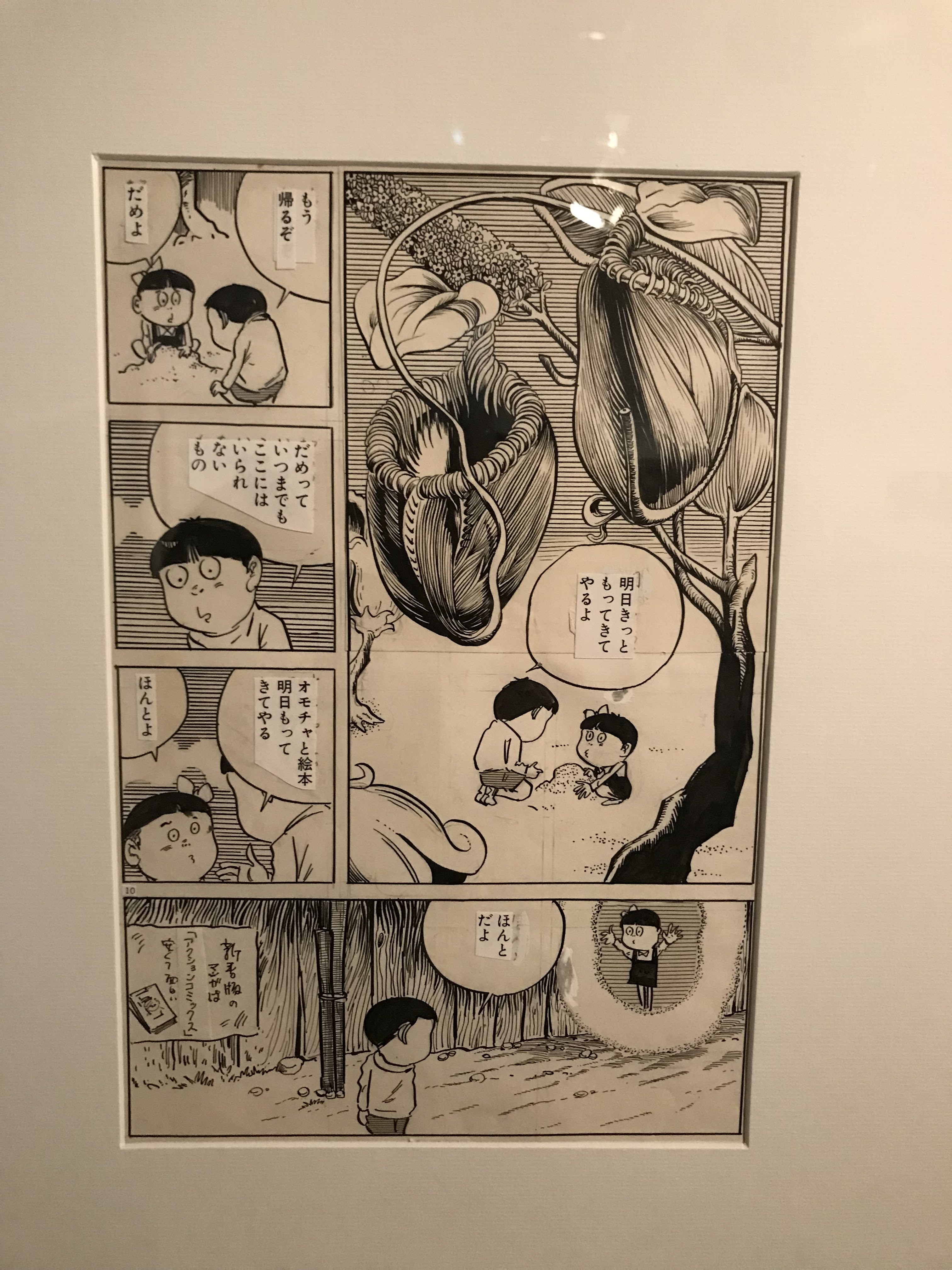
The Musée d’Angoulême also hosted an exhibition of the work of mangaka Shigeru Mizuki, on the occasion of his hundredth birthday. The retrospective included original art from his illustrations, his war comics and his horror comics, most notably the Kitaro series. The framed original art was hung in a somewhat maze-like set-up, sometimes making for uncomfortably close quarters with other viewers, but the large original drawings of Japanese landscapes and creatures from folklore were stunning and fascinating nonetheless. The festival included two further exhibits that focused on manga, which I did not manage to view. I also skipped two exhibitions on comics for children, since I was not familiar with the works and there was so much to see.

Christophe Blain exhibition in Vaisseau Moebius
Some of this year’s FIBD highlights for me were two exhibitions held in the Vaisseau Moebius, “Christophe Blain, Dessiner le Temps” and “Sous la Plume d’Aude Picault.” Blain is particularly well known for period comics about pirates and cowboys, the series Isaac le Pirate  and Gus. Many original pages from these works were included in the exhibit, as well as cover paintings, sketches, and originals from Blain’s many other comics and from his sketchbooks. His inspiration from and homage to other media, especially classic cinema, were a particular focus of the exhibition. Aude Picault’s work was a revelation to me, as I was previously unfamiliar with her work. She has made humorous slice of life comics about a nurse, as well as travel diaries, memoir work, and several erotic comics. The exhibition of inked pages, often from the stage before speech balloons and text were added, showed off her light and elegant linework, well suited to her breezy narratives that yet include touches of social commentary.
Aude Picault exhibition in Vaisseau Moebius

The Cité BD, across the river from the Vaisseau Moebius, is a set of converted 19th-century industrial buildings which now house the BD museum and archives, as well as a large comics store. It was buzzing with festival activities and crowded with school children on the Thursday when I visited. I visited three exhibitions there that were not specific to the Festival and were scheduled to run past the dates of the festival, namely, “De Popeye à Persepolis: Bande dessinée et cinéma d’animation”, “Baudoin: Dessiner la vie” and “La page manquante: Carte blanche à Wajdi Mouad.” The Popeye to

Wajdi Mouawad exhibition in Cité BD
Persepolis exhibition was a large-scale survey showing the cross-pollination between comics and animation over the course of more than a century, including some attention to technical features of animation as well as original pages and sketches by the creators involved. The exhibition on Baudoin showed a retrospective of his entire oeuvre, featuring hundreds of original pages that showcased the brushwork of his black and white art beautifully. The exhibition created by Wajdi Mouad was the smallest of the exhibitions in the Cité BD, taking up a single room only, but it was conceptually the most immersive, since it was set up as an installation which was meant to convey some sense of Mouad’s experience reading Tintin album L’Ile Noire in Lebanon, as well as his experience with war and displacement to France, changing his perceptions of the album over time. This small room provided a novel approach to comics-related exhibitions, presenting a reader’s very personal experience with a book.

         Like the Angoulême festival, the Stripdagen Haarlem was made up of exhibitions and events spread across the heart of the city. The bi-annual festival had intended to celebrate their 15th anniversary in 2020, but had to postpone and was finally able to observe the festivities two years later,
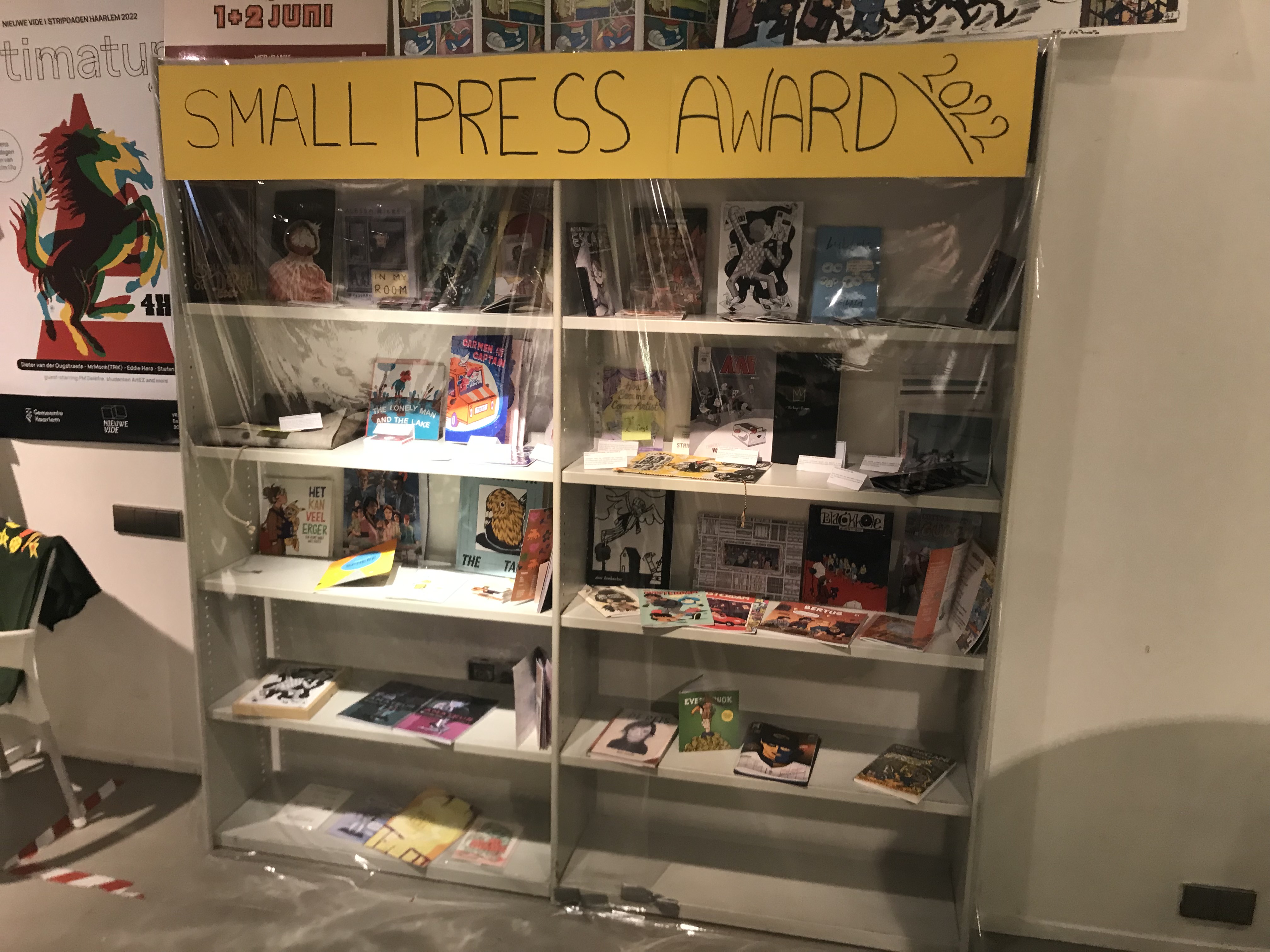
Small Press Award nominees in the Pop-Up Store
still using the same theme, world-building, and poster art by Dieter van de Ougstraete. Haarlem lacks the year-round comics presence that Angoulême is able to sustain, thanks to institutions like the Cité BD, so the festivities and exhibitions in Haarlem were hosted by a range of more traditional museums and galleries. The headquarters for the 10 days of the festival was a pop-up store which featured festival merchandise, books by artists involved in the festival, and, an important new addition to the festival, all the submission to the Small Press Award, which made its debut at this year’s festival. The works were displayed behind plastic in a large bookcase, but could be perused with the assistance of the pop-up store’s staff.

Rijkswachters X Stripmakers at Kunst Centrum Haarlem

While the Stripdagen lasted 10 days, the main events took place during the two weekends bookending the festival. Both weekends included lectures and workshops, while the opening long weekend also featured markets where publishers, creators and antiquarians could be found selling their wares. Unable to be there during the weekend, I attended the festival on a weekday and took in six of the 20 or so exhibitions. The decorated shop windows in the Kleine Houtstraat, around the epicenter of the festival at the pop-up store, were a nice touch, and the other exhibits I visited were all in close vicinity to the store. The venerable Teylers Museum, the oldest museum in the Netherlands, hosted the Joost Swarte exhibition “Ode aan het boek,” with all the included illustrations, sketches and pages related to books in some way. There was a lot to see, but the close proximity of the pages in a single room did not give the work much room to breathe. More of Swarte’s work was on display in Galerie Kruis-Weg68, but unfortunately the gallery had limited days.

Joost Swarte exhibition in Teylers Museum

Marcel Ruijters exhibition at Museum Haarlem

Some exhibitions nearby included “Gevangen in Dromen: Wonen, Bouwen, en Beleven bij Marc-Antoine Mathieu,” “Marcel Ruijters: Terug naar 1913”, “Rijkswachters x Stripmakers” and “Het Kleinste Museum van Haarlem.” Marc-Antoine Mathieu’s oeuvre is impressive, and the title, “Imprisoned in dreams” was evocative, but I found the exhibit a little underwhelming, since while it captured the promised themes, the included images and pages were photocopies pinned to walls and did not produce much new insight into the artist’s thought or creative process. However, Mathieu’s work has previously not been particularly well-known in the Netherlands, so perhaps the exhibition will bring some deserved broader attention to the French cartoonist’s work. The exhibition next door, devoted to Marcel Ruijters’ alternate world of 1913 proved more interesting, including original drawings as well as sketchbook pages. The exhibition paid a lot of attention to the world-building Ruijters put into his alternate history, so, like the Mathieu exhibit, the show fit in well

Haarlem’s smallest museum: SFF pocket covers

with the theme of the Stripdagen. These exhibits were to be found in the Museum Haarlem and ABC Architectuurcentrum respectively. Close by, in Kunst Centrum Haarlem, was an exhibition that was also a fundraiser. Just over 20 Dutch cartoonists had been invited to decorate a small wooden figurine, made from packing crates used in the Rijksmuseum, to capture the visual detail, style, or even the atmosphere of their work of choice from the Rijksmuseum collection. The resulting figurines were on sale. The most whimsical of the exhibitions I saw was to be found at the same address as the Rijkswachters. This “smallest museum in Haarlem” took the shape of a single shop window dressed with science fiction and fantasy pockets from the 1950s and 1960s, all chosen for their colorful and imaginative covers that evoked the contents of the novels in the most vivid and lurid ways possible, providing the first hints at the world-building inside the covers. The books were all taken from the collection of festival director Tonio van Vugt.

Cor Blok exhibition in Noord-Hollands Archief

The final exhibition I went to see, and which I perhaps enjoyed most of the ones I visited at the stripdagen, was also related to book covers. This exhibition, “De Wereld van Cor Blok,” was set up in the building of the Noord-Hollands Archief, and showcased the work of a Dutch artist and art historian who is best remembered for the covers he drew for the Dutch editions of The Lord of the Rings. The exhibition included some of his illustrations for Tolkien’s work, as well as maps and drawings of his own fantasy world Barbarusië, collaged and painted works that had never been exhibited before, and selections from his one and only comics work, The Iron Parachute, which Blok completed when he was 82 years old. This retrospective had been intended to honor the artist in 2020, but the festival and the exhibition were postponed due to the pandemic, and sadly Cor Blok died in 2021 before the exhibition came about. The exhibition was fascinating to see because it showed work in a great range of styles while also tied together by a consistent character. In addition, Blok’s work also simultaneously had an old fashioned quality harking back to the late 50s/early 60s when his Tolkien illustrations first appeared while also feeling fresh and timeless.

   The exhibitions of the Stripdagen were open for the 10 days of the festival (or longer in some cases, like Swarte’s Ode to the Book). However, the opening times were a little confusing, since especially the galleries kept their own hours,  mostly being open during the weekends of the festival, but with more hit and miss times on weekdays. As a result I found myself in front of a locked door when I tried to visit “Schaduw over Holland,” a joint exhibit by Guido van Driel and Milan Hulsing, drawing on their most recent graphic novels. Other exhibitions I had to miss due to time constraints included “Storm in de Geest,” which featured the world-building of the Pandarve, a fantasy world created by Don Lawrence and Martin Lodewijk which can be enjoyed in the series Storm, and also “De  Klaagzang van de Verloren Gewesten,” an epic fantasy series set in a medieval Celtic kingdom, written by Jean Dufaux and originally drawn by Grzegorz Rosinski. By all accounts, these exhibitions capture the theme of this year’s edition of the Stripdagen exceedingly well.

Both festivals offered a number of attractive publications related to the year’s festival and exhibitions: the FIBD has three published catalogs, for Goscinny, Mizuki, and Blain, as well as poster sets. Stripdagen Haarlem offered a catalog for the Joost Swarte exhibition “Ode to the Book”, a tie-in magazine called Wereldbouwers (world builders), which put a spotlight on the theme of the festival and the various featured artists, as well as posters and prints (some of them signed). These were available at the relevant exhibition venues as well as at the pop-up store.


Barbara Postema is Lecturer in English for Academic Purposes at Groningen University, a member of the History in Comics research project, and an honorary research fellow at Massey University New Zealand. Her book Narrative Structure in Comics was published in translation in Brazil in 2018. She has contributed work on narrative theory, wordless comics, and abstract comics to Image and Narrative, the Journal of Graphic Novels and Comics, and the International Journal of Comic Art, as well as collections such as The Routledge Companion to Comics and Graphic Novels, The Cambridge History of the Graphic Novel, and Abstraction and Comics. Dr. Postema is a former president of the Canadian Society for the Study of Comics (CSSC/SCEBD), and a current Member at Large of the Comics Studies Society (CSS). She is co-editor of Crossing Lines: Transcultural/Transnational Comics Studies, a book series from Wilfrid Laurier University Press.

 A version of this essay will appear in print in IJOCA.

Monday, July 11, 2022

Curator’s Notes on Icons of American Animation, the exhibition

by Robert Lemieux

During the first quarter of 2022, I was fortunate to curate a popular animation exhibition, Icons of American Animation. The exhibit spoke to the rich history of one of America’s most popular and influential art forms. The artwork spanned the 20th century, with over 150 pieces from 30 production studios, and emphasized notable characters, films, and animators associated with both film and television. Included within the artwork were 15 Academy Award winners and 20 films listed in the Library of Congress’ National Film Registry. By all accounts, it was an astounding presentation of the animation art form.

I contend that animation consists of two distinct, yet very connected, art forms. The first art form is the film itself. This is what most viewers relate to, as virtually everyone has a favorite animated film. The film is a stand-alone piece of art that is accepted as art, complete with a broad cultural reach (e.g., film studies, film critics, film festivals, film history, commercial tie-ins).  

The second art form reflects the ‘art behind the art’ and is less obvious to most viewers. This encompasses the production art needed to make the film – storyboards, model sheets, backgrounds, cels, inspirational paintings, etc. On an intuitive level, we know it exists, but it tends to be overshadowed by the final product, the film. Over the past 35 years, production artwork has become more recognized for its artistic value and has become highly sought by collectors. Our exhibit focused on this production art, as it tells the process of creating an animated film during the hand-drawn era that dominated much of the 20th century.

As a follow-up to the exhibit, IJOCA invited me to submit an article and discuss key aspects. Much of what follows is a ‘show-and-tell’ of the production process with specific examples from the exhibit. 

Before I show-and-tell, I want to share a few logistical and planning points. To start with, consider the exhibit’s title. Titling can be a drawn-out and frustrating task, as we search for the ultimate representation. For this exhibit, there were two keywords in the title – Icons and American. Let us address the latter word first, as it is the easiest of the two to discuss.

The inclusion of the word American was both strategic and respectful. To simply call the exhibit Icons of Animation, which was our initial thought, would have negated the contributions of international animation. That may seem like a simple point, but it was important to us.

Using the word icons was considerably more challenging. As one colleague noted, “If you are bold enough to use the word icons, you are going to need some really good stuff.” Agreed. Thankfully, with a history that runs for more than 100 years, animation offers plenty of iconic contenders. That said, what does it mean to be iconic? More importantly, what 20th century American animation would you point to as being iconic?

For ease of argument and simplicity of example, let’s assume we all agree Snow White and the Seven Dwarfs is iconic. The film has a running time of 83 minutes. If the film adheres to the standard 24 frames per second, that’s more than 110,000 hand-drawn images to choose from! What single image or set of images best represents the icon that is Snow White and the Seven Dwarfs? Is it the witch with the apple? Surely the dwarfs must be in there and, of course, Snow White. The prince? There are so many iconic elements to that film that it becomes a challenge. Keep in mind that the images we select help shape the exhibit’s narrative. So, in a sense, we determine that which is iconic.

Let us look at another example, Lady and the Tramp. Is it an iconic film? That is perhaps more debatable than Snow White. However, what is less debatable is the spaghetti scene, where Lady and Tramp share a plate of spaghetti. There is not a better image to represent the film and, yes, it is iconic. Even if I see the image outside of its context, I know exactly what it pertains to and where it comes from.

One of the biggest challenges we faced was finding animation art, iconic or otherwise. Aside from The Walt Disney Family Museum, which houses primarily Disney art, where do you find anything associated with the likes of UPA, Hanna-Barbera, Jay Ward, Fleischer, MGM, or many of the other studios from the 20th century? After considerable research, a fellow curator recommended Mr. Mike Glad, a private collector who has what many consider to be the most comprehensive animation collection. Part of Mr. Glad’s collection has been featured in various museum exhibits, both domestic and international. To be frank, the breadth and depth of his collection is astounding, and it was clear he could satisfy our icon theme.

Equally important was that Mr. Glad’s collection could tell the story of the hand-drawn era. The collection consists of an array of production art that represents the various stages of the animation process. The rest of this article presents aspects of that process via selected pieces.

Storyboard

Generally, the production process starts with storyboarding. Presented below is an example from Pinocchio (1940, Walt Disney Studios) that uses colored pencil on paper, and features scene and camera designations. Even with something as simple as a storyboard, we see the quality and detail of the artistic process. (Fig. 1)


Animation Drawing

This example is from Flowers and Trees (1932, Walt Disney Studios), which is the first Academy Award winning animated short. If you are familiar with the film, you know it is a love story, where the hero tree battles a villain tree for the love of the female tree. This piece represents part of the final scene. After vanquishing the villain, the hero proposes with a caterpillar ring. If you look closely, you can see they have lightly sketched how the caterpillar will roll into position. Also present is a small audience of flower characters in the background. As an animation drawing, it features the characters. You will notice there are no background details. When the characters are transferred to the acetate cel, this is how they will look. (Fig. 2)


Background

              Presented below are two examples that illustrate the beauty of background images. The first is from Donald’s Ostrich (1937, Walt Disney Studios), which is watercolor on paperboard. This is the opening image of the film, and it is on screen for a mere six seconds, as the camera zooms in to the station platform. You will notice that there are no characters. Placed over the background would have been acetate cels that show the motion of the characters, in this case a cow, a pig, and flying birds, which are also part of the opening shot. As the camera settles on the station platform, the story unfolds, and all the remaining action takes place either on the platform or the station’s interior. Those scenes would involve different backgrounds that reflect close-up and mid-shot camera angles. The point is that this single image, with its beautiful artistic detail, establishes the sense of place. It also speaks to the ‘art behind the art.’ As an aside, it was one of my favorite pieces in the exhibit. (Fig. 3)


The second background image is watercolor on paperboard from Pigs is Pigs (1954, Walt Disney Studios), and it also features a train station. However, this image reflects the impact of modern art on animation, post-World War II. During the exhibit, we placed the two train station images side-by-side to show the changing styles. This image appears at the end of the film and, like the image from Donald’s Ostrich, it is on screen for a mere six seconds. (Fig. 4)


Layout Drawing

              This piece from Snow White and the Seven Dwarfs (1936, Walt Disney Studios) is an example of a layout drawing, as it combines the features of an animation drawing and the background. The characters and the background are represented. The dwarfs, as well as the squirrel and rabbit, are moving characters that would be on acetate cels. Everything else would be part of the watercolor background. An incredible amount of artistry for a ‘simple’ layout drawing. (Fig. 5)


Inspirational Painting

              How is the mood of a scene established? Many artists create mood boards during the early part of the creative process. Similar to brainstorming, mood boards consist of images that an artist collects, and they help direct the artist in his/her creative process. Inspirational paintings are akin to mood boards and, as the name suggests, they are paintings that help set the look and mood of a scene. This example is from Cinderella (1950, Walt Disney Studios) and is watercolor and gauche on paperboard. Although the final scene may not look exactly like this, the image serves as the model. You get a sense of the mood via the colors, perspective, and shapes. This piece was created by Mary Blair, one of the few notable female animators. (Fig. 6)


Model Sheet

              Depicted here is a Lois Lane model sheet from Fleischer Studio’s Superman series in the 1940s. A model sheet provides detailed information about a character. In this example, we see anatomy, proportions, motion, angles, attire, and, in the lower right corner, detailed information about her eyes and mouth. A model sheet helps maintain the character’s consistency, especially if there are multiple artists drawing the same character. Virtually every primary character in an animated film would have an accompanying model sheet. (Fig. 7)


Color Model

              A color model is, essentially, an animation drawing with color notations. This image is from Porky’s Duck Hunt (1937, Warner Brothers Studios) and reflects how color is attributed. All the notations indicate the colors to be used, whether for clothing, props, or aspects of the character. In this example, we see BR (brown) for Porky’s jacket, blue-grey for the gun barrel, yellow for Daffy’s feet and bill, and two types of red for Porky’s hat. Like a model sheet, the color model helps maintain the color consistency. (Fig. 8)


Cel Setup

              This image is from The Band Concert (1935, Walt Disney Studios), and it represents the totality of the process, with everything in place. All the, somewhat muted, colors are associated with the watercolor background, and all the vibrantly colored characters are on acetate cels. This is the opening scene of the film, and the camera slowly zooms in toward the stage over the course of ten seconds. The impressive part is that all the audience members are in motion, as they cheer and clap. Considering the number of characters in the audience, that’s an extraordinary amount of motion that must be drawn, frame by frame. In short, this is a complex image. Thus, the more complex your design, the more complex it becomes to create the image and motion. (Fig. 9)


Music

              The roll of music is pivotal in film, particularly within animation. During the 1930s, many animated shorts consisted solely of music, with no dialogue. Disney’s Silly Symphony series, which numbered 75 short films, relied heavily on the musical score to promote the action. Some of the most notable films in animation history come from that series (e.g., Flowers & Trees (1932), The Skeleton Dance (1929), The Old Mill (1937)). Warner Brothers was also active in creating musical shorts, as they attempted to take advantage of their extensive music library. Many of today’s modern feature-length films have produced notable soundtracks (e.g., The Lion King). In short, music is a key component in the production process.

              The example presented below is a music sheet from Fantasia (1940, Walt Disney Studios), and it speaks to the intricacies of coordinating music to image. You will notice how the French horn and the bugle are emphasized in the musical notation and, most interestingly, how it applies to the scene. Below the musical notation is a watercolor thumbnail image of the scene accompanied by the camera shot notations. In this case, it is an exterior long shot of the castle, with a description of the sorcerer’s action. Most impressive is the thumbnail image, which speaks to the quality of the detail and craftsmanship. There were four Fantasia music sheets in the exhibit. (Fig. 10)


As popular as the art form has become, in the early 20th century animation was often viewed as an experimental novelty. The labor-intensive process of creating multiple drawings per second of film time was considered inefficient and costly by film studios. Despite these perceptions, it wasn’t long before like-minded animators joined forces, and the early strands of animation’s DNA began to coalesce into Fleischer Studios, Walt Disney Studios, Warner Brothers, Terrytoons, and Walter Lantz Productions. This hand-drawn energy would usher in animation’s Golden Era, which would extend for 40 years into the 1960s.

Throughout the Golden Era, most animated films were released as shorts, with running times of approximately seven minutes. The shorts were shown prior to a live-action feature film and, on occasion, proved more popular than the feature. In 1937, with the release of Snow White, the animated feature was born, adding to the art form’s popularity. After World War II, new studios began to emerge, such as Hanna-Barbera, Jay Ward, and UPA. In addition to the new material, many older shorts found a second life via a new venue – television. The segue to television in the 1960s also brought about a shift, as the number of features declined and, with the emergence of Saturday morning cartoons, animation became tailored toward children. In the last two decades of the 20th century, the industry rekindled itself with a resurgence of features from Walt Disney, as well as new studios, such as Don Bluth, Pixar, and Dreamworks. Additionally, there was an influx of prime-time animated television shows.

Over the course of the past century, one thing has become clear: The “experimental novelty” has transformed itself into a legitimate art form that continues to animate the imagination.

A version of this essay will appear in print in IJOCA in the fall.