News about the premier academic journal devoted to all aspects of cartooning and comics -- the International Journal of Comic Art (ISSN 1531-6793) published and edited by John Lent.

Showing posts with label exhibit review. Show all posts

Monday, March 21, 2022

Exhibitions of the 49th Angoulême International Comics Festival: Introduction

After a cancellation in 2021 and a postponement from its traditional time slot during the third week of January at the start of 2022, the Angoulême International Comics Festival returned in full swing for its 49th iteration on March 17-20. It felt particularly nice to be back especially since for many festival-goers, the last glimpse of this special town during Covid restrictions was on movie screens thanks to Wes Anderson’s loving treatment in THE FRENCH DISPATCH (2021). I happened to be staying at a house that was right in front of one of the film’s recognizable locations.


Notable additions to the town’s visual landscape included two new tributes to Albert Uderzo:

A) a huge 200 square meter mural conceived by François Boucq, located at 10 boulevard Louis Pasteur.


B) a sculpture of a menhir (6.5 meters high weighing 22.5 tons) placed just outside the train station appropriately next to the obelisk dedicated to René Goscinny.


Also outside of the train station were image installations set up by the festival that displayed political contributions by Lewis Trondheim, Riad Sattouf, Milo Manara, Victor Hussenot, Benjamin Chaud, Luiza Kwiatkowska and Natali Noszczyn that served as expressions of solidarity for the situation raging in Ukraine. 

The Ukrainian colors even lit up the facade and clock tower of City Hall, which serves as the Festival Headquarters for press and professional accreditation. 


The entrance to City Hall was also adorned with the Ukrainian flag, flanked by the flags of France and the European Union.


The situation in Ukraine also inspired a last minute addition to the official opening of the Festival that took place on the evening of Wednesday March 16: a live drawing concert featuring invited artists with the final piece auctioned for charities to support refugee relief. This concert followed the announcement of the winner of the Festival's Grand Prix award, which was bestowed upon French-Canadian artist Julie Doucet. The timing of this honor couldn't have been more appropriate, foreshadowed by the recent publication MAXIPLOTTE, a collection of her work (translated into French) edited by Jean-Christophe Menu for l'Association. I'm greatly looking forward to see what Menu and the Festival will put together for her Grand Prix exhibition to highlight the 50th edition of the Festival next year.     


Over the two and half days that I was in Angoulême, I was able to catch nine of the festival’s exhibitions. I’ll be presenting these nine exhibitions as a series of ‘exhibition in photos’ over nine individual blog entries with limited commentary. I hope the photos will offer a decent visual idea of the installation and presentation of each exhibition. My ultimate goal is to have these photos serve as the gateway to more lengthy exhibition reviews destined for the print edition of IJOCA. 

-Nick Nguyen

All photos taken by Nick Nguyen


Press badge (left) and the invitation to the Festival's opening ceremony drawn by Chris Ware


Tuesday, January 25, 2022

Good Humor, Bitter Irony: Reviewing “Miné Okubo’s Masterpiece” exhibit at JANM

Miné Okubo’s Masterpiece: The Art of Citizen 13660. Los Angeles: Japanese American National Museum, August 28, 2021 - February 20, 2022. <https://www.janm.org/exhibits/mine-okubo-masterpiece/> 

reviewed by Tony Wei Ling

The museum’s path is a loop, and so a visit to JANM’s Citizen 13660 exhibit either begins or ends with a view into the same shambly wooden structure: an original barracks removed and rebuilt from the Heart Mountain concentration camp. Part of JANM’s ongoing exhibit on Japanese American history, Common Ground, this building-inside-a-building bookends the celebration of “Miné Okubo’s Masterpiece.” Visitors first travel through Common Ground’s rooms, which span the earliest waves of immigration through to WWII incarceration and its aftermaths; the final room, situated just before the entrance to the Okubo exhibit, covers the 1970s/80s political struggle for redress that followed internment. Along with the architectural bookend of the barracks, this history of the Redress Movement physically frames the museum’s 75th anniversary exhibit of Citizen 13660.

    The JANM exhibit is structured into a narrative of the book’s production, displaying the variety of materials (varied camp sketches, original Citizen 13660 drawings, and page mockups combining drawing, typed caption, and marginal edits) in a compositional/editorial process of negotiated meaning. Miné Okubo’s iconic 1946 book pairs observational cartoons with terse first-person captions and follows Okubo through multiple relocations and incarcerations between 1939 and 1944: Berne to Berkeley, Tanforan to Topaz. By laying out the Citizen 13660 exhibit, room by room, into stages of drafting, design, and correction, the exhibit opens up for interrogation the multiple actors and influences that brought it into publication.              

Mine sleeping on a cot in her barrack
 

            Such an interrogation is important because Citizen 13660’s rendering of camp life’s “humor and pathos” has often been preemptively read as a political act in itself, one that critiques the events it charts and anticipates the organized call for reparations. No doubt much of this reputation comes from the book’s use as testimony in the 1980s, during which Okubo submitted her book to the Congressional Commission on Wartime Relocation and Internment of Civilians as evidence of government wrongdoing. However, scholars like Christine Hong warn against subsuming the book within this “retroactive interpretive lens,” since doing so “arguably obscures more than it illuminates Okubo’s legacy as a wartime artist.” Indeed, as Hong reminds us, Citizen 13660 could only have been published immediately following the war (and during the cross-country dispersal of former incarcerees) with the support of the WRA officials who ran the camps, some of whom endorsed the book. The book became, perversely, “an affirmation of the democratic potential of the American concentration camp,” Hong writes. This affirmation required fitting Okubo into the exemplar of an “entirely American” Nisei character (to quote Pearl Buck), such that reviews of her book sounded almost identical to the artist’s truly wild character references, such as the one from her teacher Glenn Wessels describing her as “un-Japanese in sympathies and in manner of thought.”

            Citizen 13660’s legacy has continued to work through this exemplar form, making Okubo into an ethnic representative whose witnessing and recording of the camps always already testifies to one political end or another: either a distinctly American story that mines the everyday adjustments and discomforts of camp life for common ground with white readers, or a sharply critical, irony-laden statement of racial protest. Debates about how best to interpret “Miné Okubo’s Masterpiece” as a politically potent (though not obvious) artistic work are not about pinning down the precise political character of a single cultural figure: they are about dislodging both the book and the artist from the position of exemplar. Hong’s caution not to read Citizen 13660 through a single lens clarifies the pressures of exemplarity as a representational mode, which can attempt to redeem ambiguous or close-mouthed texts by forcing them to speak.

            Although the museum’s physical layout leads the visitor straight from redress to Okubo, JANM seems to follow Hong’s caution not to enclose the artist within the political lens of redress. The curatorial writings about the exhibit are relatively circumspect on Okubo’s politics; they describe the book as “groundbreaking” for being “the first book-length account on America’s concentration camp from the perspective of a former incarceree” and “an early example of a graphic memoir,” not for being a self-evident critique of the state.

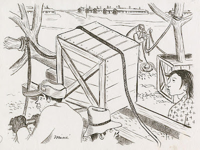
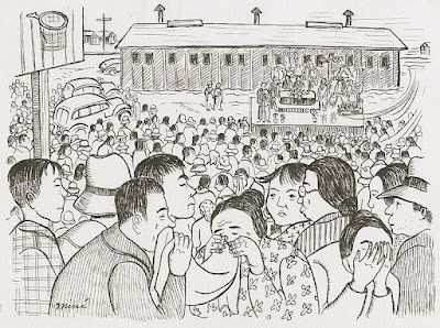
Memorial service for James Wakasa
            Perhaps more importantly, the exhibit’s design draws the visitor’s attention to edits made to both Okubo’s text and drawings, asking the visitor to compare versions of the same page. One key moment in the exhibit places a page from the final book next to its draft page mockup: it’s the page in which Okubo addresses a guard’s fatal shooting of an “elderly resident.” The final version’s caption consists of a single paragraph, from which much of the draft page’s typewritten details have been cut. Ironically, one of the remaining lines in the published version reads: “Particulars and facts of the matter were never satisfactorily disclosed to the residents.”  

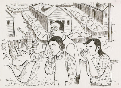
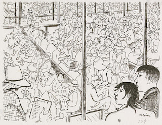
Detention room filled with departing residents

           What did it mean to excise those slight elaborations on “the Wakasa case” from the final publication? And what can readers today make of such an elision, in this already famously elliptical work? Against the backdrop of its various political mobilizations (re-domesticating alienized incarcerees, testifying towards redress), Citizen 13660 might be best characterized by its oscillations and reticence––qualities that JANM’s exhibit faithfully reflects and interrogates through its attention to revision and editorial process. JANM’s Education Unit has designed a wonderful activity guide that asks visitors to participate in slow examination of Okubo’s drawings through activities in “close looking,” comparison between early sketches and final versions, and even invitations to draw one’s own illustrations from Okubo’s captions.

            Over the decades, Citizen 13660 has been made a representative of multiple political/racial narratives––narratives not obviously cosigned or directly produced by the work itself. These interpretive frames are partly external impositions on the book, but they are also generated in large part by the work’s odd combination of documentation and reticence. A strategy of “documentation through reticence,” in fact, might be fitting to stress the scientist’s objectivity in Okubo’s textual voice. Or maybe “reticence through documentation”: the book rattles off a steady rhythm of particulars to fill incarceration’s empty time. “You had to work hard to keep yourself going, and to keep from thinking,” Okubo said in a post-publication interview. And as Greg Robinson observes, “Okubo may not have been referring simply to her camp experience,” but to the stifling representational burden of Americanizing/humanizing incarcerees.

Landscaping with trees

            Another way of looking at Okubo's reticence is as a strategy of abstraction––as a stylistic register that responds to the pressures of racial exemplarity. Talking about Citizen 13660 in terms of abstraction may seem odd, given the work’s obvious claims to figurative representation (as documentary) and its obsessive interest in particulars: barrack and room numbers, curfew times, toilet arrangements, wages. Its text and image move at different paces, though, and rather than elaborating or contextualizing the moments depicted in each drawing, Okubo’s captions often direct the reader and characters onward, onward, onward, at a brusque pace something like a punchline.

“Everyone was building furniture and fixing up barracks and stalls. Many of the discomforts of the camp were forgotten in this activity.”

“Letters from my European friends told me how lucky I was to be free and safe at home.”

“The incomplete partitions in the stalls and the barracks made a single symphony of yours and your neighbors’ loves, hates, and joys. One had to get used to snores, baby-crying, family troubles, and even to the jitterbugs.”

Her drawings, by contrast, loop the eye into compositions that Hong describes as “[w]himsically Matryoshka-like in visual architecture,” with figures whose gaze and movement rarely advance in a single direction––and which almost never resolve into any legible kind of effect. Okubo threads her readers between progressive and melancholic time: we neither move briskly into the future (as the book’s final caption seems to promise), nor do we stay endlessly in some fractured, traumatic moment.

            In his essay on abstract comics, Jan Baetens introduces the idea of abstraction at the level of sequence rather than just the individual image. Abstraction as a sequential strategy can serve narrative ends by “foreground[ing] an enigma” and by withholding connections between image-moments, although in Baeten’s model, abstraction and narrative are always in “active conflict.” Abstraction in Okubo’s proto-”graphic memoir” doesn’t mean a total absence of either figuration or narrative; I mean something like a looseness between forms and what those forms legibly, identifiably signify. Not a lack (of particulars, of lines, of images), but a loose connection: resemblance under reconstruction; narrative in double vision.

Sewage system repairs

            At the level of image, Okubo works out a visual shorthand for Japanese faces that refuses the specificity of portraiture, favoring instead a semi-opaque, semi-abstracted cartoon style that consciously both resembles and revises the racial caricature Okubo saw in comics. At the level of narrative, Okubo’s temporal “mixed messages” loosen the hold of progressive time, which preferred to frame internment as a momentary lapse, and which hoped to smoothly re-domesticate its internal aliens through their post-camp dispersal. Her layered and contradictory sense of time rehearses internment’s own absurd and distorted relationship to linear temporality; the minor but multiple incongruities between captions and drawings eat away at the narrative sense a reader attempts to make out of panels, pages, incidents, particulars. For both the singular and sequential registers of representation, abstraction emerges as a way of managing expectations: meeting the narrative demands of reinstated citizenship and yet clearing room for alternate narrative connections.

            As some early book reviews, displayed in the exhibit’s final room, were keen to observe, Okubo skirts obvious caricature or anguish in favor of “tolerance and restraint.” Her few moments of straightforward outrage are all that keeps the book from being “inhumanly quiet,” one reader said. These reviews seem to sense irony where they expected feeling (ironized state critique would later become the conventional reading), but they largely emphasized––and admired––the book’s apparent lack of bitterness. Of the reviews on display at JANM, one even offers Citizen 13660’s “touches of humor” as proof that Okubo “rises above resentment and rancor.” The relief is palpable amid the slight confusion.
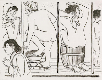
Bathing in tubs

            Not on display (but relevant here) is a 1947 review by Setsuko Matsunaga Nishi, a sociologist who was incarcerated at Santa Anita during the war. Nishi also notes the book’s “commendable objectivity,” but she complains that among these precisely observed discomforts of the camps, what “is not evident to most readers is the disillusioning torment that evacuation meant to them.” Nishi, of course, was right: Citizen 13660 refrains from foregrounding tragedy. And perhaps most readers were happy to read the book as a funny and humanizing, if oddly reserved, account of a nation’s embarrassing lapse. Citizen 13660 did on one hand facilitate the human empathy and “common ground” upon which a progressive American time could be plotted. Yet it also dealt closely and actively with the very logic of racial identification and exemplarity that has followed the book through its initial period of publication and its Redress-era resurgence. In its very title, Citizen 13660’s abstracted identification with/of Okubo brings some irony to the close association reviewers made between the artist and her representational strategies of restraint, humor, and (apparently) forgiveness. Citizenship, already an abstract form of legal personhood, becomes one half of an oxymoronic identification.

One of Nishi’s more disparaging remarks describes “the very facile nature of the book” as being in conflict with the “deep subjective meaning” of the art. “If the reader were to verbalize the significance of some of the illustrations,” she writes, “he might be surprised at the bitter irony.” What these drawings signify––what they are pictures of, exactly––is not immediately clear or stable. There’s no way to resolve its rhetorical shape into either a 1980s voice of oppositional critique or the 1940s one of redemptive propaganda. What looks from one angle like redacted/repressed tragedy looks from another like “good humor” (a particularly oblique and unfixed mode of historical relation) and from yet another like “bitter irony,” to use Nishi’s phrase. Okubo’s reworking of figuration and narrative sequence, which I’ve identified as a semi-abstracted style, disorient and disperse anything more than a bare sense of narrative facts and feeling. Katherine Stanutz describes this effect as an inscrutability open to future reinscription––“what is ungrievable in 1946 gradually becomes grievable in the 1970s and 1980s”––but to me, the lightness of Okubo’s text reads not as a deferral of grief, but as grief’s less hallowed (and less legible) form.

            Near the entrance to the exhibit, three expressive charcoal drawings from Okubo’s camp era-corpus hang on display––all of them done at a much higher and more recognizably “fine arts” register of abstraction. In one, a gaunt, childlike figure presses its face and hands against the picture plane; in another, an adult and a child peer crookedly out through barbed wire that divides the picture into multiple, pronged horizons. The crosses used to denote the barbs are integrated into the figures’ furrowed brows. These emotive drawings are especially instructive context for the cartoon style she chose for Citizen 13660, which is stiffer, cooler, and more line-driven in its mark-making. Like the charcoal drawings, Citizen 13660’s illustrations still flatten the depth of field, emphasizing the compressed dimensions of the page over that of three-dimensional space, but its characters rarely bear the same expressions of outright anguish, nor do they look directly out at the reader. Instead, the figures of Citizen 13660 are almost always engaged in a gesture of work, of adjustment. Even rest becomes just another task that passes time.

            You can’t, as of this writing, visit the Okubo exhibit in person––JANM is temporarily closed due to the rise in COVID-19 cases here in the US.* But JANM’s digital collections host a rich archive to explore, including Okubo’s drawings as well as many other collections, and the museum is hosting a series of online events/workshops related to the Citizen 13660 exhibit. I’m grateful to their work in putting together all of these routes into Miné Okubo’s work, which still has so much to teach us.

A version of this review will appear in the print edition of IJOCA. 

*The museum will reopen on February 1, according to a staff member.


Wednesday, December 1, 2021

Exhibit Review: Moomin Animations – Thrills and Cuddles

Moomin Animations – Thrills and Cuddles, Minna Honkasalo. Washington D.C.: National Children’s Museum on September 3, 2021-January 9, 2022. https://nationalchildrensmuseum.org/

 reviewed by Mike Rhode

In 1945, Finnish writer and illustrator Tove Jansson created her Mumintrolls for a children's book. The Moomins look like hippos crossed with the Pillsbury doughboy, but have proved popular enough to make her the Scandinavian equivalent of Walt Disney. She eventually wrote or drew 9 books about them. In 1947 she started a comic strip with the characters, which started appearing in English in 1954. Her brother Lars Jannson joined her on the strip from 1959-1961 and then he took the strip over until 1975 when it ended. Reprints have been published by Canada's Drawn & Quarterly. There have been multiple animated versions of her characters, and that is what this exhibit focused on.

The NCM has had some rough years, closing off and on while searching for new locations. In 2020, it finally wound up just off Pennsylvania Ave, NW in a plaza behind the Reagan building. They had to shut again almost immediately due to the COVID-19 pandemic, but reopened in September 2021 with the Moomin exhibit among others, and are aiming for an attendance of a half million people per year. Note that you have to visit with a child; unaccompanied visitors need to make an appointment, and throughout my tour of the exhibit, I was accompanied by a staff member. The museum is actually largely underground; one enters at ground level and then moves downward through an unfinished concrete warren. The guide is probably necessary for more than the main reason.

The Embassy of Finland has brought over a version of Honkasalo's original exhibit from the Moomin Museum that is completely composed of reproductions. It has several sections - a wall on Jansson's life, stills from various animations, 4 screens showing cartoons, and several activity areas for children. An average American viewer might have no knowledge about the Moomins, in spite of the fact that there have been so many adaptations. This exhibit focuses on animated versions and includes episodes from 1959 (West Germany), 1969 (Japan), 1977 (Poland), 1990 (Japan). Obviously, none of these would be particularly easy for an Anglophone to find, but the 1969 one in particular was surpressed by Jansson, as noted in the exhibit catalog - "She felt that Momin was too far removed from her stories' world and atmosphere. Elements foreign to Moominvalley had been inserted into the tales, including cars, money and weapons. For example, a few episodes show Snork driving around in a car, Moomintroll makes money by busking, and weapons feature in several episodes." "She did not want them to reach international distribution, so they have never been broadcast outside Japan. Today, they are hard to find even in Japan, on account of complicated copyright issues connected with the [1900s series]." The exhibit catalog is unfortunately not available, except for a few copies lying in the exhibit, but I recommend it highly if you can find it.

Jansson has been the focus of recent attention including a documentary, two biographies, and an edition of her letters. The wall on her life is written for children, but includes the basics necessary to have an idea about her as a person and as a creator. To the exhibit's credit, the segment on her life does not shy away from her love of another woman, even though it was socially unacceptable at the time. "A soul mate. Amid the hustle and buslte, Tove meets Tuulikki, the woman who will become her life partner for the rest of her life..." reads part of the panel.

The wall of stills would probably have been of more interest in the original exhibit, as it apparently included some actual artwork by her. Here, understandably, it's all reproductions and screen captures. A fan of the characters might be interested in seeing how they evolved in different animations. There are also some areas for children to draw, hang things on a tree, or take a picture with cardboard standups. There is also a small selection of gifts in the giftshop. Also of interest from a cartoon perspective are a STEAM-centric exhibits about creating animations featuring SpongeBob and his cast, and another on Paw Patrol.

All the images, except for "Exhibition space 4" and "Tove Jansson," are courtesy of the Embassy of Finland in Washington, D.C. The two are courtesy of the NCM. The exhibit catalog cover is taken from the copy the staff gave to me. A version of this review also appeared on the ComicsDC blog. My photographs can be seen here.


Monday, October 25, 2021

Exhibit Review: Beano: The Art Of Breaking The Rules

 Beano: The Art Of Breaking The Rules. Andy Holden. London: Somerset House, October 21, 2021-March 6, 2022. https://www.somersethouse.org.uk/whats-on/beano-art-of-breaking-the-rules

Reviewed by Mark Hibbett

There are two separate exhibitions happening at once in Somerset House's Beano: The Art Of Breaking The Rules, one of which is significantly more successful than the other.

The first is a fascinating retrospective of Beano strips going all the way back to the comic's beginnings in 1938, with original artwork sitting next to vintage comics. The curator, Andy Holden, has done a great job of bringing together rarely-seen originals that still fizz with life decades later. The work of established greats like Leo Baxendale and Dudley Watkins sing with excitement, and Jim Petrie's Minnie The Minx similarly bursts from the pages, even when those pages are browned with age. Seeing the work up close like this is a real thrill, especially when you notice margin notes such as the conversation between Leo Baxendale and his wife about the need to get the page inked and round to DC Thomson offices by the next day.

Throughout the show the original artwork is treated with respect, with artists properly credited and captions which tell the story of how The Beano became such an entrenched part of British life. The discussion on how a "slap-up feast" came to be such a constant of the comic during wartime was especially illuminating, and anyone who has ever been a child in the UK is bound to get a few rushes of nostalgic joy. For me it was seeing original cover art for Plug, a comic I've not thought about for at least 40 years, and the sight of those much-coveted Dennis and Gnasher fan club badges and "smart wallet."

It's also surprisingly funny. Like many, I gave up on The Beano as a surly twelve-year old ready for the more "grown-up" delights of Marvel and 2000 AD, and so was surprised by how many times I laughed out loud. There's a cheeky, mildly subversive sense of humour that is highlighted throughout, in the showcased strips as well as other parts of the exhibition. Favorites here were a handwritten letter to the editor from 1948 ("Will you please stop Lord Snooty") and the caption for a Banksy screen print which says "Banksy declined to be in the show but we ... included him anyway, because Dennis and his pals never accept an authoritative 'no’."

The second exhibition could have done with a lot more of this sort of attitude. As with the Good Grief Charlie Brown show in 2018, Somerset House does not seem to be confident enough to do an exhibition just about comics, and has to drag in some “Proper Art” as well. There are some commissioned works which in theory are responses to The Beano, but mostly it's pre-existing art that only has a very tenuous link with the main theme, and appears to be there as way to guide children away from comics and towards something more culturally acceptable.

Honourable exceptions to this include Horace Panter's answer to David Hockney's Splash and David Litchfield's Lowry-inspired Beanotown, but most of the rest of this part of the exhibit looks rather dull and pompous next to the exciting, dynamic and witty world of the Beano strips. A piece inspired by "The Numbskulls," for instance, looks like a dreary exercise in stating the obvious next to the wild invention of the actual comic, and seeing expensive, ponderous fine art  described as "playful" or "witty" just seems daft in a room full of cheap, accessible, and genuinely funny Beano strips down through the years.


Despite all that, this remains a beautifully put together exhibition showing off a wildly inventive part of British culture that does not get anything like enough attention. It's a shame that Teacher had to get involved so much, but in the end Dennis, Minnie and all the others are the real stars of the show.

Tuesday, August 11, 2020

Wisconsin Funnies Shows Comic’s Deep Roots in the American Midwest: A Review (updated)

by Chris Yogerst


Wisconsin Funnies: Fifty Years of Comics. James P. Danky, J. Tyler Friedman, and Denis Kitchen with contributions by Paul Buhle. West Bend, WI: Museum of Wisconsin Art and Milwaukee, WI: MOWA-DTN, August 8-November 22, 2020. $15 (MOWA) / Free (MOWA-DTN).   https://wisconsinart.org/exhibitions/wisconsin-funnies-fifty-years-of-comics.aspx

In 1973, Denis Kitchen purchased a farm in Princeton, Wisconsin, to house the headquarters of his growing publishing company Kitchen Sink Press. The eventual 2015 Eisner Award recipient would use this rural location to shepherd independent artists by providing a platform of free expression without the strings attached to a major publisher. The farm would be immortalized in a drawing by R. Crumb in 1985. A life-long defender of boundary-pushing comics, Kitchen helped found the Comic Book Legal Defense Fund in 1986 and took the debate to the national stage on Larry King Live in 1989.  


This staunch defender of the artform now has his collection of Wisconsin comics on display, along with work loaned from ten other artists, in Wisconsin Funnies: 50 Years of Comics which is split between the Museum of Wisconsin Art (MOWA) and Saint Kate – The Arts Hotel in Milwaukee. I was only able to visit MOWA for an exhibit preview of the half of the exhibit described on their website as “a comprehensive overview of comics in Wisconsin” (The other half is “comics with a political bent.”) The parent museum is gorgeously placed along the banks of the Milwaukee River. Masks were required and everyone remained respectfully socially-distant. The price of admission is $15, which will also get you access to the museum for an entire year.

Nearly 200 works by 31 artists are featured, all of which are included in a 250-page catalog with high resolution images of each piece in the exhibition ($45 + shipping, ISBN 978 -0-9994388-5-5). The exhibit opens with a mural on the second floor that was not yet completed when I was there. [Curator Tyler Friedman explains, "We commissioned three 30x30" panels for the exhibition lead-in wall to give the appearance of a giant comic strip. Peter Poplaski, Jeff Butler, and John Porcellino contributed a panel a piece."] Through the glass doors you will find expertly framed artifacts, a mixture of comic books and original art, complete with historical descriptors that add context to every piece. (I was told a couple cases of other ephemera will be going up but they were not installed when I was there.) One not need be an expert in independent comics to find value here. The exhibit offers a wonderful learning experience and each section provides a nicely bracketed story. Wisconsin Funnies was co-curated by Kitchen, director of the print culture center at UW-Madison James P. Danky, associate curator of contemporary art at MOWA Tyler Friedman, with contributions by historian Paul Buhle.


The exhibit is intended to mesh with the political passions accompanying the Democratic National Convention slotted to begin on August 17th in Milwaukee. With that sprit in mind, Wisconsin Funnies does not disappoint. Coming into the exhibit one can find a series of hand sketched originals as well as printed pages from comic books and strips. The exhibition offers an opportunity to learn about not only the history of Wisconsin comics, but also an opportunity to see the evolution of an art form. The artists featured in this collection serve as a primer for the political and social struggles of the postwar era through the Reagan years.

Kitchen Sink Press not only championed independent artists, but also collaborated with industry giants. Stan Lee and Marvel collaborated with Kitchen on Comix Books, which featured work by Trina Robbins and Art Spiegelman. Selections of original art from Robbins’ One Flower Child’s Search for Love is featured in Wisconsin Funnies and serves as an illuminating exploration of love and relationships during the 1970s, pushing back on preceding generations of conservative social strictures. Kitchen also published reprints of classics such as Harvey Kurtzman’s The Grasshopper and the Ant as well as Will Eisner’s The Spirit and A Contract with God. Selections of original art from these important works are included. 

 
One series of panels that particularly stood out to me are from Dan Burr’s Harvey and Eisner awards winner Kings in Disguise. The story is about a kid during the Great Depression searching for his father. The feelings of despair and longing jump off the panels. The imagery is stunning and reminiscent of the Hollywood films made in the early 1930s that were depicting the economic destruction as it was happening. One film in particularly that shares the aesthetic of Burr’s art is William Wellman’s Wild Boys of the Road (1933), which follows young teens who leave their burden-ridden families. Burr’s story, published in 1988, is just as moving as the images created and distributed during the Great Depression. Original pages by Burr from Kitchen’s underground newspaper Bugle (1975-1976) are on display as well.

 Peter Poplaski’s original cover art for Corporate Crime Comics #2 is of special interest for its nod to classic Dick Tracy comics. A quick glance will remind one of the “round up the usual suspects” line from Casablanca. What makes this cover special upon deeper reflection is how Poplaski depicted not standard supervillains or street thugs. Instead, the lineup is full of white-collar criminals guilty of tax evasion, pollution, and unsafe work environments. In 2014, Poplaski sketched Kitchen with Stan Lee as they appeared in 1974, which is also featured in Wisconsin Funnies.


Additional artists featured in Wisconsin Funnies are Al Capp, Ernie Bushmiller, Lynda Barry, Jim Mitchell, and many others. There is plenty to learn in this wonderful exhibit. I come to comics from the film studies world and could not pass up an opportunity to learn more about influential comic writers and artists who shook up the industry from right here in Wisconsin. Anyone in the Milwaukee area interested in the history of comics, politics, and popular culture should visit MOWA and absorb the power of this historic collection.

Educational activities included, or will include, the following:
Teen Masters: Become a Zinester | Tuesday, August 4.
Virtual Artist Lecture with Paul Buhle | Thursday, September 17 | More Info to Come.
Virtual Panel Discussion with The Nib | October 2020 | More Info to Come.

A version of this review will appear in print in IJOCA 22:2 (Fall/Winter 2020). Updated on August 18, 2020 with one sentence explaining the 'mural.'

Tuesday, March 17, 2020

Exhibitions of the 47th Angoulème International Comics Festival: Catherine Meurisse, chemin de traverse


Located along the Charente river between the Vaisseau Moëbius and the Musée de la bande dessinée, the Musée du Papier has previously hosted exhibitions that showcase the work of artists associated with the development programmes of the Angoulème International Comics Festival. These earlier exhibitions were typically staged in a single room reserved for temporary shows, offering enough space to cover the relatively smaller body of work accumulated bu young up-and-coming artists graduating from the Concours Jeunes Talent (Young Talents) like Pauline Aubry and Miroslav Sekulic-Struja.

For 2020, the festival organizers opted to scale up in size and scope with an exhibition consecrating Catherine Meurisse, an artist who participated in the festival's Concours de la bande dessinée scolaire (comics by/for schoolchildren) in 1993 - and ultimately winning in 1997 - and whose impressive career to-date hardly classifies her as an "up-and-coming" artist. This exhibition plays more like a coming-out celebration and its scheduling couldn't have been more timely for Meurisse: on 15 January 2020,  she was elected as the first comics auteure into France's prestigious Académie des beaux-arts; and heading into Angoulème itself, she was nominated as one of the three finalists for the festival's Grand Prix award. This comprehensive exhibition aimed to situate and elevate Meurisse's work to wider audiences by excavating her formative years while also illuminating the new horizons that she is preparing to explore.


The exit to the Catherine Meurisse exhibition at the Musée du papier. This stairwell served as the entrance to the previous festival exhibitions held at this location.

Aptly titled "Catherine Meurisse: Crossroads", the exhibition divides Meurisse's career-to-date across two separate but connected rooms, with a clear physical, discursive and emotional split to distinguish them as individuated but contiguous spaces.

The exhibition's splash panel. English translation: "Catherine Meurisse: Crossroads"

The first room covers Meurisse's earliest years right up to her ten-year stint at Charlie Hebdo, where she became the first female cartoonist to serve on the satirical journal's editorial board on a permanent basis. A tight labyrinthine route through five chronological, thematic and color-coded sections introduces visitors to Meurisse's first forays into the world of drawing, illustrations, comics and editorial cartooning, all filtered through the lens of her unique engagement with French art and literature.

"First steps" presents original drawings showing the development of Meurisse's visual style from childhood and adolescence drawings up to her first "mature" work published in 2005.
Catherine Meurisse's primary school notebook from 1985.
Le Corbeau et le renard, Meurisse's submission to the concours de la BD scolaire at the 1993 Angoulème International Comics Festival. The caption notes that the influence of Marcel Gotlib is already evident in her work.
These original pages by Quentin Blake (left) and Tomi Ungerer (right) helped situate Meurisse's aesthetic development against the backdrop of her inspirations. Pages by Sempé, Marcel Gotlib and Claire Brétecher were also displayed to help visitors connect with Meurisse's graphic references.
The second section"L'art maître du jeu" displayed a range of pages that built on Meurisse's graphic style to showcase her clever use and appropriation of 19th century French art and literature into her comics.

An aquarelle photocopy of a page from Moderne Olympia, where Meurisse uses the subject of Manet's famous painting as a character.

Two aquarelle photocopied pages from Le Pont des Arts, highlighting once again Meurisse's appropriation of literary references while also pointing out her comics acumen through speech balloon placement and page layout approach.
The third yellow-coded section, "Prolonging childhood", introduced Meurisse's illustrative talents in the service of words written by other authors for children's books and comics.
A 2002 sketchbook of Meurisse's "funny animal" character studies.
Meurisse channels Tomi Ungerer and Saul Steinberg in this illustration of "Open Door Enforcers" for Emmanuel Trédez' L'enforceur de portes ouvertes et cinquante autres métiers improbables.

Cover illustration drafts for Franky et Raoul, spécimens de la jungle!, Meurisse's only children's project to date in which she both wrote and drew the comics.
Les années Charlie section occupied the central position in the first exhibition room. Meurisse had her first strip published in the weekly Charlie Hebdo when she was 21. She later joined the editorial board four years later in 2005 for a stint that would last until 2015.


Meurisse was welcomed with open arms by the Charlie Hebdo crew, who encouraged her to explore her sense of humour and her curiosity with total freedom. She quickly established her own identity among the collective, and her cover illustrations were instantly recognizable.
During her stint at Charlie Hebdo, Meurisse's assimilated the styles of Claire Bretécher, Cabu, Reiser and Sempé (among others) to produce her own brand of political satire that affirmed her own personality with the liveliness and economy of her illustrations.
Meurisse also delved into comics journalism with reports about social and political issues, often featuring caricatures of French political figures that were not spared her biting ferocity and criticism.


Meurisse stayed true to her arts and literature heritage by taking over the culture page at Charlie Hebdo. This double-page spread recounted her 2013 meeting with Quentin Blake, the English artist whom she greatly admired.

The final section of the first room, Laughing at the established order, carried over the Charlie Hebdo spirit of social satire  by highlighting how Meurisse tackles patriarchal conformity with her usual caustic sense of humor.
A selection of pages showing the different ways that Meurisse uses her comics to thoughtfully and comically engage with female sexuality and the place and role of women in modern society.

These pages originally appeared in Charlie Hebdo, then were collected into the 2016 album Scenes de la vie hormonale.
The first exhibition room closes on the inevitable reference to the 7 January 2015 masssacre at the Charlie Hebdo offices that Catherine Meurisse narrowly avoided. This event and its aftermath marked a break in Meurisse's professional and personal life, leading her to quit the magazine following her contribution to issue 1178 (the "survivor's issue") to take a necessary pause to regroup. This break is scenographically referenced by the exhibition itself by the division into two rooms, marking a literal turning point or "crossroads" as implied by the title. If the first room covered her early years, then the second room would address her current situation and the new directions that it augers.

The passageway that connects the two rooms of the exhibition. The wall that the boy is leaning on is the back wall of the "Les années Charlie" segment.
The second exhibition room was much less cramped than the first room, offering visitors a more open space to experience Meurisse's artistic reinvention. The main section of this second room, titled "Talking with the world" and color-coded with a shade of forest green, focuses on Meurisse's re-engagement with herself, her art, and by extension, her world. This theme is foregrounded by the visual centerpiece of the second room, which is the first sight that greets visitors upon entering the second room from the passageway.

The large die-cut installation that was the visual centerpiece of the second exhibition, foregrounding Meurisse's re-engagement with the world and how she expresses this through her comics.
Meurisse's recent comics have taken on significantly increased layers of introspection, and her work shows traces of the emotional labour that was necessary to process the post-Charlie Hebdo experience. The exhibition presents original pages taken from La Légèreté (2016) and Les Grands espaces (2018) to spotlight the new ways that Meurisse visually sees the world, as well as how she sees herself in narrative relation to this world. Both of these books place Meurisse front and center as the main character who engages with her world and her memories with the same incisiveness as before but now with added layers of openness, curiosity and appreciation. Her self-representation in these books is drawn with a throwaway sketch quality, and is typically situated in a natural environment that is now rendered using different graphical techniques (such as pastel or graphite pencil).  

Studies in pastel that would lead Meurisse to the cover of La Légèreté (2016).
Original pages and details that suggest Meurisse's new visual style extends her previous approach with new graphic layers of environmental representation.
An original page from Les Grands espaces (2018) that juxtaposes the loose rendering of the characters against the hyper-realistic attention to the detail of the environment.
Close-up of an original page from Les Grands espaces (2018) drawn in graphite pencil.
The final section of the second exhibition room, and thus the final section of the exhibition itself,  presents visitors with a display of Meurisse's artistic process that not only highlights her technical labour but also their associated transformative aspects which helped her come to terms with the tragedies of the recent past. Showcasing a mixture of storyboards, sketches, video interviews and studies, this final section cumulatively uses this material to conclude that Meurisse herself embodies a crossroads, in terms of technique and approach: one between the sharp quick wit of editorial cartooning and the patient and laborious construction needed for comics.

The entrance to "The Drawing Factory", the final section of the exhibition.
The second half of "The Drawing Factory" section which closes with a video interview with Catherine Meurisse recorded on 15 November 2019
A page showing Meurisse's new explorations with watercolors in Delacroix (2019), her recent revisitation of her first mature work Causerie sur Delacroix (2005).
A storyboard from Moderne Olympia (2014) that demonstrates how Meurisse breaks down a page by first arranging the dialogue into individual panels, before adding the graphic elements. 
Catherine Meurisse, chemin de traverse launched at the Angoulème International Comics Festival on 30 January 2020, and continued to be on display at the Musée du papier until 1 March 2020. The quality of this exhibition is superb and Meurisse's profile is prominent enough that there can be hope that this show can travel elsewhere in the Francophone comics and arts worlds. An excellent introduction to the work of an artist who seems to be just getting started, this exhibition succeeded in providing an intelligent framework to persuade a neophyte reader like me to explore her work further.


-Nick Nguyen

All photos taken by Nick Nguyen