Articles from and news about the premier and longest-running academic journal devoted to all aspects of cartooning and comics -- the International Journal of Comic Art (ISSN 1531-6793) published and edited by John Lent.

Showing posts with label exhibition review. Show all posts

Saturday, September 20, 2025

The Ninth Art at the Centre Georges Pompidou: A Review of Comics 1964-2024


The Ninth Art at the Centre Georges Pompidou:

A Review of Comics 1964-2024

 Mark David Nevins


A comic book cover with a person in a helmet

AI-generated content may be incorrect.

Fig. 1


One could say that comics and art museums have had an uneasy relationship--but the reality is, they’ve mostly had no relationship at all.

One of the first large-scale attempts to bring comic art into museums in a serious way was MoMA’s 1990 show “High/Low:  Modern Art and Popular Culture.” This ballyhooed exhibition aimed to show how pop culture shapes “high” art, juxtaposing fine artists, such as Picasso, Warhol, and Lichtenstein, with comic strips and newspaper ads--some of which had served as sources or “swipes” for those artists’ work. From scholars to fans, reception was scathing. Roberta Smith famously sneered in The New York Times that it was “at best, the wrong exhibition in the wrong place at the wrong time.1

Me? I didn’t really care. I was 25, completely unconcerned about esoteric intellectual debates, and awestruck to be able to spend hours looking at “Krazy Katoriginal pages.

A less intellectually encumbered celebration of comic art came 15 years later with “Masters of American Comics,” which was shown across two venues in Los Angeles:  the Hammer Museum and MOCA. This 2005 show highlighted 15 comics “masters”--from Winsor McCay and George Herriman to Jack Kirby, Art Spiegelman, and Chris Ware--with each essentially given his own mini-retrospective. A sprawling “greatest hits” of American comic art, the show was praised for its attempt to legitimize comic art as museum-worthy while faulted for presenting a canon that was, without exception, white and male. (Even early in the 21st Century, Herriman was still “passing,” posthumously.)

Unlike “High/Low,” the “Masters” show presented some problems for me--40 years old and in possession of a Ph.D. in Literature--due to its lack of any curatorial framework or “idea” behind the exhibit:  no examination of commercial or cultural contexts; no argument for the development of an art form; no attention to the various marginalizations that had shaped the medium of comics. That said, I left my pretensions at the door to bask in the glow of hundreds of pages of original art--and left with some insights that still inform my passions and opinions to this day:  Frank King and Milton Caniff are absolute geniuses; Lyonel Feininger is criminally underrated, while Will Eisner is a bit overrated (sorry); and Winsor McCay’s work really must be seen in color to be fully appreciated--the black-and-white original art mostly sits on the wall and disappears.

This past year, nearly two decades later, France raised the stakes with a compendious and ambitious exhibition at the Centre Pompidou titled “Comics 1964-2024,” curated by Anne Lemonnier, Emmanuèle Payen, Thierry Groensteen, and Lucas Hureau.2 Billed as a celebration of 60 years of le neuvième art (“the ninth art,” a term adopted in the 1960s by Francophone critics seeking to legitimize comics), the show gathered hundreds of works from around the globe and across a remarkable range of styles, formats, and movements. This was not the Pompidou’s first foray into comics:  previous exhibitions included shows in the 1970s and 1980s on comics and everyday life and comics from the 1950s, as well as a blockbuster Hergé show in 2006. But “Comics 1964-2024” has been by far the most ambitious European effort to present comics holistically as a mature art form.

Thanks to some serendipitous business travel, I was lucky enough to have a free day in Paris on literally the last day of the Pompidou show, thus giving me a trifecta of the most important museum shows about comics in my lifetime … so far.3 I stayed inside the museum for the entirety of its opening hours on Sunday, Nov. 3, 2024, exhausting the friends who had joined me--and I could easily have spent three or four more days at the show without getting bored. Indeed, surrounded by more than 1,000 comic pages, covers, illustrations, sketchbooks, printed books, and other ephemera, I’d have happily been locked into the museum for a week!

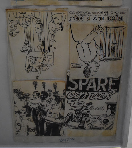
After passing through a “portal”--an homage to the 20th-Century master Jean-Claude Forest by beloved and prolific 21st-Century cartoonist Blutch--the visitor entered an initial room that presented a powerful argument:  the global upheavals of the 1960s--cultural, social, political, and artistic--had catalyzed a new kind of comic art.


A person sitting at a desk in front of a large orange sign

AI-generated content may be incorrect.

Fig. 2


Or, perhaps put more daringly:  catalyzed by those events, comics as a form had become something completely different from its historical roles as children’s entertainment or an occasional diversion for adults in daily newspapers.

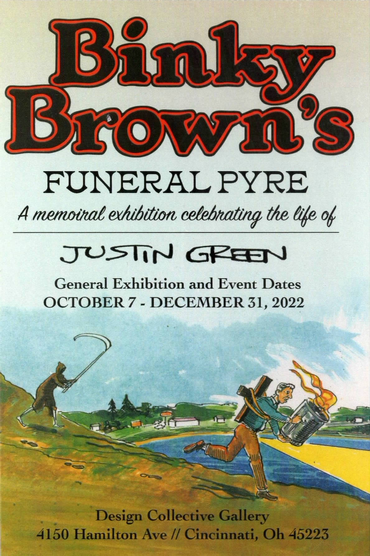
As linguists and anthropologists talk about polygenesis, there was something going on in the zeitgeist or collective unconscious during this decade that sprouted distinct but essentially related sequential narrative traditions. In France, a touchstone was the rise of Hara-Kiri, a self-proclaimed “stupid and nasty” magazine featuring bandes dessinées mocking bourgeois politics and aesthetics. In Japan, Garo magazine presented a showcase for introspective, radical manga for adult readers. And in the United States, the Underground Comix movement exploded with Robert Crumb, Justin Green, Trina Robbins, and other over-the-counter pioneers who irreverently satirized mainstream American culture and mores.

That opening salvo for “Comics 1964-2024” was strong:  the claim that these simultaneous cultural eruptions laid the foundation for what was to come in sequential art over the next half-century. Just a few decades later, the world would witness the almost unimaginable flowering and maturation of the graphic novel, the literary comic, and the hybrid artistic experiments that represent comics as a medium and an art form in the 21st Century. From origins at the margins of proper society--countercultural ’zines, head shops, underground presses--comics have evolved into a medium now worthy of being presented in one of the most admired museums in the world.

For better or worse, that opening argument dissipated as one got deeper into the show. As the exhibit unfolded, the programming shifted to a loosely structured sequence of theme-based rooms, seemingly committed to displaying a “greatest hits” of stunning comic art rather than exploring any cohesive story about the medium’s development. For visitors newer to comics, the sheer variety must have been thrilling--if perhaps overwhelming--but for those with more knowledge of comics’ history, its major works and key creators, the lack of historical or conceptual throughline was frustrating. Or that was certainly my own feeling, as well as the report I heard from more than a few knowledgeable friends lucky enough to see the show.

With “Contre-culture” (Counterculture) as the first room, the themes of the following rooms ranged from “Fiction du future” (Future Fiction or science fiction) and “Rêve” (Dreams) to “Villes” (Cities) and “Géométrie” (Geometry). This selection of themes felt arbitrary--if not uninteresting. While the whole exhibition gave the attentive viewer both visual delight and historical range, it came at the expense of clear intentionality and without much curatorial apparatus.

The early countercultural material was rich with context and layered juxtaposition. Seeing French underground comics alongside American and Japanese works from the same era revealed not just parallel energies but fundamentally different--and even orthogonal--artistic responses to the global cultural moment. Where American underground comix leaned into psychedelia, drugs, and sexual liberation, French artists channeled their energy into political dissent and aesthetic innovation, as in the case of Forest’s Barbarella or Peellaert’s Jodelle. Japan’s Garo offered yet another track:  class struggle, existential introspection, and artistic minimalism, perhaps taking cues from contemporary national writers and filmmakers, such as Kenzaburō Ōe and Nagisa Oshima. This juxtaposition was brilliantly instructive--as the wall text explained:


The 1960s saw the development of forms of free expression and protest all over the world, going against the values and hierarchies of establishment culture. This counterculture was the identity marker of a generation and especially permeated the field of comics, which until then were considered as being for children by their very nature.


A room with a wall with a sign and a poster

AI-generated content may be incorrect.

Fig. 3


In France, Japan, and then the United States, new forms of comics appeared on the fringes of mainstream production. They expanded comic readership and sowed the seeds for themes that would take on considerable significance around the turn of the century, defining the contours of modern comics:  graphic journalism, confessional style, addressing major societal issues, and mixing comics with other forms of art. The 1960s also marked the start of the process of cultural legitimisation that would lead to the recognition of “the ninth art.”


But, as the exhibition unfolded, its themes became more diffuse. “Rire,” the room dedicated to humor, gathered pages by Claire Bretécher, André Franquin, Bill Watterson, and Albert Uderzo, among others--but presented them with no logic or framing. Which caused the viewer (or me, at least) to start a little mental game:  “Which creators should or could have been included in this room, and why were they omitted?” As I proceeded through the rest of the exhibition, that game took up more and more of my mental attention. In the section on “black and white,” for example, to illustrate how comics intersect with film and roman noir, I’d have preferred less Frank Miller (who has always struck me as overly derivative of his forebears) and more Jose Muñoz (Fig. 4), Baru, Didier Comes, Alex Toth, or even Darwyn Cooke’s masterful interpretations of Richard Stark’s brilliant series of hardboiled novels about a thief named Parker.


Fig. 4


To continue, while hopefully not complaining overmuch, the 1980s “realistic” branch of Franco-Belgian comics, not so fashionable these days, was completely overlooked (no Jean Giraud, no François Boucq, no Hermann), as was much of the kids’ section (no Peyo, no Quino). While that first room had implicitly set the show’s parameters as Western Europe, Japan, and North America, the utter omission of comics from Africa (with strong traditions in South Africa, West Africa, Nigeria, and Algeria); China, Korea, or the rest of Asia outside Japan; or South America (aside from the few creators published in Europe like Muñoz and Alberto Breccia) was puzzling. The United Kingdom also got short shrift. The omission of inarguable giants and massive influencers like Jaime and Beto Hernandez (USA), Max (Spain), Joost Swarte (Netherlands), and Dylan Horrocks (New Zealand) was mystifying. And there not even a glimpse of the Italian Milo Manara, one of the biggest names in latter-day European comics--though perhaps for an all-ages show a 13th room on Erotica was understandably vetoed.4

While the European curators made efforts to include plenty of North American cartoonists, their perception of 21st-Century work from the new world felt dated. Creators, such as Eleanor Davis, Sammy Harkham, Dash Shaw, or Jillian Tamaki, could have settled nicely into more than one of the thematic rooms and offered a more contemporary look at how comics creators across the Atlantic are engaging with the form. What’s been happening in English-language comics in the latest generation is as exciting as anything coming from the continent, but you wouldn’t know it from this show.

One side note on the exhibition’s physical space:  clearly the desire to show as much original comic art as possible was paramount. But each room--even the makeshift ones set off by curtains--felt cramped and claustrophobic, especially with the masses of enthusiastic crowds. Artwork was hung tightly arranged, with little breathing room for the material or the viewers. The original works were mostly presented simply--often without frames at all--but the density, along with the lack of commentary, again made it difficult to discern patterns or threads, never mind arguments. One could happily lose hours in any room, nose inches from stunning originals--seeing the actual ink on paper in the hand of the artist is transporting--but the exercise felt more like rummaging through some lucky collector’s trove than engaging in a museum show.

A section on horror or fear, “Effroi,” followed suit. With work from the EC Comics of the 1950s (which, it should be noted fall well outside of the show’s stated timeframe!), Japanese masters Junji Ito and Hideshi Hino (Fig. 5), and Charles Burns, it was packed with macabre brilliance but, again, no curatorial logic. Horror is not a monolithic genre--it spans the grotesque, the psychological, the physiological, the absurd, and more--and without guidance, the viewer was left to make sense of jumps from, say, Swamp Thing to Daniel Clowes without much sense of relation. That said, highlights abounded, including 110 pages from Hino’s Hell Baby, which held my attention for a good half hour. Oddly, the curators offered a full wall of the spellbinding work of the German master, Anke Feuchtenberger, in this section, where it felt out of place. Perhaps “Dreams” would have been more suitable.


A group of drawings on a wall

AI-generated content may be incorrect.

Fig. 5


To be fair, every section of the exhibit pleased, once the viewer gave up looking for a curatorial argument and simply enjoyed the work. “Rêve,” the room on dreams, included some of the most imaginative work on display--from Fred’s surreal Philémon strips to Julie Doucet’s dream diaries to David B.’s Les Incidents de la nuit (Nocturnal Conspiracies).

In this area, an oneiric anthology, comics’ unique power to blur inner and outer worlds was on full display. A towering installation, perhaps ten feet tall, of the first 32 pages of “Les Cauchemars de l’amateur” (Fig. 6), a never-published nightmare comics story by Killoffer, was one the highlights of this section, and indeed the entire show. (How is it possible that this work has never been collected into a book?!)


A black and white photo of a storyboard

AI-generated content may be incorrect.

Fig. 6

Another triumph was the room dedicated to “Couleur,” which traced how artists from Moebius to Brecht Evens use color not just decoratively but narratively and emotionally. Seeing original pages from the illustrator/cartoonist Lorenzo Mattotti (Fig. 7), Nicole Claveloux’s The Green Hand, and Moebius’s ground-breaking Arzach (Fig. 8) in their unmediated, physical form offered a rare treat: mechanical printing simply cannot capture the nuance of these richly painted colors.


 A collage of images of a person playing a guitar

AI-generated content may be incorrect.   A painting of a rock formation

AI-generated content may be incorrect.

     Fig. 7                                                             Fig. 8


Autobiography (Récits personnels) was a particularly strong section. Works by David B., Alison Bechdel, Fabrice Neaud, and Dominique Goblet, illustrated how comics can be a powerful medium for emotional intimacy, psychological inquiry, and self-reinvention. The juxtaposition of Bechdel’s Fun Home and Neaud’s diary comics underscored how different cultural contexts may shape confessional storytelling--even in what some viewers might (falsely) assume would be a leveling category such as queer comics. But again, the lack of a curatorial thesis led to puzzling omissions and lost teaching moments. It’s no surprise, of course, that this section was so strong, since autobiography has in many ways been the foundational mode for comics’ self-reinvention since the 1990s. As such, autobiography isn’t just a one category among others--it is, arguably, one of the central evolutions of comics in the last 30 years, and that argument could and should have been made.

The section, “Histoire et mémoire,powerfully elucidated comics’ relationship with history and memory. Pages from Art Spiegelman’s Maus, Keiji Nakazawa’s Barefoot Gen (Hadashi no Gen), Emmanuel Guibert’s La guerre d’Alain (Alan’s War, Fig. 9) and Jacques Tardi’s World War I narratives (Fig. 10) traced how cartoonists have tackled historical trauma with depth, immediacy, and moral urgency. These works stand not only as documentation, but as emotional interpretation--and they remind us how comics, through juxtaposition and layering, are uniquely suited to convey the fragmented nature of recollection. However, since war comics have been such a dominant genre over the last half-century, including in the mainstream, a savvy viewer was likely awkwardly reminded of how much was left out.


                                    Fig. 9                                                                Fig. 10


To my dismay as an English Ph.D., the “Littérature” room felt the least essential. It presented capable adaptations of works by Poe, de Maupassant, Flaubert, and Steinbeck--alongside satirical appropriations, such as Winshluss’s Pinocchio and Posy Simmonds’s Gemma Bovery--but didn’t offer much insight or commentary into anything novel such adaptations might produce. Hunt Emerson’s sly and sometimes scandalous retellings of classics, such as Lady Chatterley’s Lover and The Rime of the Ancient Mariner, would have been much more illuminating, not to mention David Hughes’s magnificent Othello. (Both artists are British.) While there’s nothing wrong with showing comics’ engagement with literature, the underlying message here seemed to be one of validation:  “Look, comics can do literature too!” Yet the deeper truth--that comics can do many things that traditional words-only prose cannot--was left unexplored. The section missed an opportunity to explain the medium’s distinctive capabilities:  its ability to collapse time, blend narration and image, and structure perception spatially as well as temporally.

By the final few rooms--which focused on geometry, cities, and formal experimentation--the show began to feel more like a sprawling cabinet of magnificent curiosities than a presentation of ideas organizing the displays. I suspect most viewers, whether comics experts or casual visitors, were running out of gas by this point--yet perhaps they might not have been, had there been a clearer explanatory thread or conceptual map running through the exhibit. Indeed, the back end of the show featured some of the most visually inventive objects on display--including pages by Chris Ware, Jochen Gerner, Yuichi Yokoyama, and Marc-Antoine Mathieu--which dazzle in their conceptual complexity. Seth’s surprisingly large and meticulous model of his imagined city of Dominion (Fig. 11) was stunning, but must have been lost on some visitors who had by now reached complete cognitive saturation.


Fig. 11

For all its bounteous riches, I admit that “Comics 1964-2024” nevertheless left me with the feeling of a missed opportunity. The show began with a sharp idea: that comics around the world had collectively responded in a unique and unexpected way to the shocks and possibilities of the 1960s and have since matured into a complex, global, and increasingly popular set of languages and media--no longer an overlooked little sibling to more serious modes of high art. That idea could have carried through the exhibition, but, instead, the show followed a more traditional retrospective model:  gather as much great work as possible and organize it loosely by theme. The result was often stunning--but rarely instructive.

However, being more generous, perhaps the exhibition’s biggest flaw--its lack of sustained argument--was also, for some viewers, its strength. Over glasses of wine after the show, one of my companions said to me, “I don’t know a lot about comics, but moving from room to room what was most amazing to me was how very different all of the work of the different creators is and what a vast universe of ideas and styles and subject comics can embrace.” No, the show did not lay out a coherent history or thesis, but it certainly conveyed comics’ astounding depth and breadth. And it did so with affection, admiration, and an earnest desire to elevate the medium.

So, a positive and optimistic conclusion. It was absolutely thrilling to see almost the entirety of a major art museum, like the Pompidou, turned over to comic art for the better part of a year, and “Comics 1964-2024” is truly unprecedented in its scope, depth, and sheer celebration. As comics continue to gain cultural legitimacy, we can hope that exhibitions like “Comics 1964-2024” may become more common. The Pompidou show may not have achieved the full integration of narrative and form, of ideas and images, that the best comics themselves offer--but it did bring graphic narrative into the halls of one of the world’s great museums, with no need of a Trojan Horse like “High/Low,” and put its diversity on display for a wide public. That alone is an achievement. The Ninth Art, like the curators who care for it, is still evolving. May the next major comics exhibition be even more beautiful--and a bit braver in its storytelling.


Endnotes


1 “High and Low Culture Meet on a One-Way Street.” The New York Times. Oct. 5, 1990.

2 It should be noted that “Comics 1964-2024” was just one part of a broader program at the Pompidou, “La BD à tous les étages” (Comics on Every Floor), which ran from May 29 to Nov. 4 of 2024. In addition to a series of lectures and performances, ancillary exhibitions included Corto Maltese:  Une vie romanesque, focused on Hugo Pratt’s iconic sailor; “Tenir tête,” an immersive installation for children designed by the remarkable Marion Fayolle; a showcase of the avant-garde comics from the magazine Lagon; and “La bande dessinée au Musée” or “Comics at the Museum.” I was able to spend some time at this last show as well, which paired contemporary comics artwork with masterpieces of modern art. While I liked the concept, the promised “dialogues” didn’t really impress.

3 For those less lucky, a sumptuous catalogue was produced for “Comics 1964-2024.” Like the catalogues for the two earlier American shows, it deserves to be in the library of any committed comics aficionado.

4 On the other hand, another great Italian comics artist known for his erotica, Guido Crepax, was included. And rightfully so:  once you get past the kink, Crepax is one of the most innovative and influential masters of page composition in all of comics history.

________________________

Mark David Nevins is a professor at Holy Cross College and heads a consulting group.

Thursday, October 17, 2024

Exhibition Review: Hell, Ink & Water: The Art of Mike Mignola

  reviewed by Carli Spina


Hell, Ink & Water: The Art of Mike Mignola. New York: Philippe Labaune Gallery. September 19 - October 26, 2024. https://philippelabaune.com/show/philippe-labaune-gallery-hell-ink-water-the-art-of-mike-mignola

As a gallery specifically devoted to “high-end narrative art and illustration,” the Philippe Labaune Gallery in New York City was a perfect setting for Mike Mignola’s first gallery exhibition. This exhibit featured a range of his work, while his iconic work on Hellboy was well-represented through an array of cover illustrations and watercolors of the characters. The exhibit also included many pieces from his other notable works, such as a collection of illustrations and a watercolor from Pinocchio: An Illuminated Edition. Seeing this curated collection of Mignola’s works together underscored recurring themes of his work, including death, the supernatural, playing cards, plants, and the macabre, to name just a few. It offered a clear understanding of the way that his personal style translates across media, from pencil sketch to watercolor. Given how many of the illustrations are in black, white, and, occasionally, shades of gray, the color work in the watercolors particularly stood out.

 For many Mignola scholars and fans, the Hellboy art was a major draw of this exhibit and there were several pieces of interest including his original artwork for many covers which demonstrate his skill at character expressions, dynamic motion, and composition. In addition to covers, his Hellboy characters are front and center in the original artwork he created for a poster for the Art Bubble Festival held in Copenhagen, Denmark in 2017. The gallery had arranged many of the Hellboy pieces near one another, which offered a nice way to compare them and see recurring elements and approaches. Beyond Hellboy, his work with other well-known comics characters also popped up here and there in the exhibit, including Batman, Robin, and the Rocketeer, which offered a chance to see how his art translates to characters that are not his original creations.

 The exhibition featured several pencil drawings of characters with plant elements in their anatomy. They were quite a bit different than the other works in the collection while, at the same time, very clearly in line with his style. These sketches exhibited Mignola’s skill in bringing a character to life through a single drawing and his deft depiction of apparent motion.

 Mignola’s watercolors were a true highlight of the exhibit. His use of color in these pieces skillfully drew the viewer’s eye to specific elements in some works and, in others, created lighting within the work that felt by turns natural and eerie. While these watercolors displayed the same recurring elements seen in his other works, their color and style made them stand out even among all the other impressive pieces in the exhibit.

 The gallery, in conjunction with IDW Publishing, created a catalog for the exhibition. It features images of art from the exhibition with the title and size of each piece presented alongside it. Signed copies of the catalog were available at the gallery and unsigned copies are available for sale elsewhere. It is a great option for Mignola fans who were not able to visit the exhibit in person, particularly those interested in seeing the watercolors from the exhibit. The gallery’s website also hosted high-quality images of the pieces in the exhibit that users can zoom in on, which is another helpful resource for those who want to examine the pieces. Fans of Mignola’s work will be impressed by the range of works included in this exhibit and those who were not able to visit the gallery should definitely check out the website or the print catalog.


Monday, December 12, 2022

Exhibition Review: Justin Green's Funeral Pyre

fig 1
fig 2
 Justin Green's Funeral Pyre: A memorial exhibition celebrating the life of Justin Green. Carol Tyler and Julia Green. Cincinnati, OH: Design Collective Gallery, 2022. https://www.facebook.com/dsgncllctv and https://www.dsgncllctv.com

 a review by Mark McKinney (Miami University, Oxford, Ohio)

            As the exhibition's title indicates, visiting Justin Green's Funeral Pyre allows visitors to celebrate and mourn Justin Green. [FIGS 1 + 2] The artist died in Cincinnati at age 76 of colon cancer on April 23, 2022, according to his obituaries in several prominent periodicals, including the Chicago Tribune, The Comics Journal and The New York Times. Justin Green is best known for his autobiographical work Binky Brown Meets the Holy Virgin Mary, first published by Last Gasp in 1972, and cited by Art Spiegelman as having inspired him to write Maus. The exhibition's organizers are Carol Tyler and Julia Green. Tyler, his wife, is an accomplished cartoonist specializing in biographical and autobiographical comics, and is therefore uniquely qualified to represent Justin Green's art and life. So is Julia Green, their daughter, who is both an artist and owner of the gallery hosting the exhibition. The exhibition allows the visitor to remember Justin Green in tangible ways, and to celebrate the art he has left behind, both through the content and structure of the exhibition, and the stories that Tyler and Julia Green tell about him and his art. Design Collective Gallery is located in Northside, a neighborhood northwest of downtown Cincinnati that is known for its openness to the arts and popular music. For example, just a few doors down from the gallery lies a local landmark store, Shake It Records, which has a large stock of vinyl disks, a comics section in the basement, signs painted by Justin Green, and original artwork by him on the walls, especially full-page comic-strip biographies he drew for Pulse! magazine, published by Tower Records. The Design Collective Gallery, with its painted graffiti mural on the outside of its north wall, and this exhibition, fit seamlessly into the neighborhood. The gallery's front glass windows are decorated with large black-and-white characters from comics by Justin Green. [FIG 3] The exhibition opened on October 7, 2022 and runs through December 31 of this year, in Design Collective Gallery (4150 Avenue, Cincinnati, Ohio). It is open from four o'clock in the afternoon to seven o'clock in the evening on Thursdays, Fridays and Saturdays, or by appointment). On entering the gallery, visitors are greeted by Tyler or Julia Green, who kindly give tours of the exhibition. I visited it on Thursday, December 8, 2022, and was given one.

    
fig 3   
fig 4
fig 5


  The exhibition is organized into approximately six sections, organically grouped by themes, but without a strict chronological progression or complete thematic separation between them. Two large rooms, each of which contains a section of the exhibition, are separated by a center wall running most of the building's length, with an open doorway midway that allows passage between the two. The long left or north room, the first space when one enters the gallery, is titled "The Underground," after Justin Green's underground comics. [FIG 4] Julia Green said that the room contained about one sixteenth, at most, of his underground comics originals, and that the family owns only three pieces of that work, because her father had sold, traded, or given away almost all of it. However, thanks to the generosity of current owners of the original art, several important pieces are part of the exhibition. Moving clockwise around the room, beginning at the northwest corner of the building, one first sees the photograph that helped inspire Green's comics collection Sacred and Profane [FIG 5] (it is also reproduced on the inside front cover of the book). Taken by Keith Green, the artist's brother (who died in 1995), it shows a sign in the form of a saw, advertising a store in San Francisco, seemingly laid across the lower part of a cross that advertises a different, religiously affiliated, building, as though the tool were sawing iconoclastically through the symbol of Christ's crucifixion. [FIG 6] The photograph inspired the artist's work on the comic book, Julia Green told me. Beginning just to the right of the photo, and stretching across most of the rest of the north wall, a large painting of a building borrowed from the front cover and page three of Sacred and Profane artfully frames reproductions of the pages from all five installments of "We fellow traveleers" [sic] anthologized in the Last Gasp book, after serialization in Comix Book, a series published by Marvel and Kitchen Sink Press. [FIG 7] Librarians at the Billy Ireland Cartoon Library and Museum, at the Ohio State University, generously scanned the original art, held in their collection, so that high-quality reproductions of the pages could be displayed here. At the end of the sequence, in the corner, is original art from the "Rowdy Noody" page on the back cover of Sacred and Profane, and related originals, including the front cover illustration of Comix Book no. 5 (cf. the last panel of "We fellow traveleers: conclusion," part 5).

fig 6
fig 7

fig 8
fig 9

           The right-hand side of the back wall features a large reproduction of the famous frontispiece drawing of the naked, chained and suspended narrator of Binky Brown Meets the Holy Virgin Mary. [FIG 8] Visitors are invited to write down a title from a bibliography that lists Justin Green's comics and post it in the remaining blank wall space, so that a wall full of Green's titles appears to emerge from the pen of his tortured self-portrait as Binky Brown. Against the back half of the room's south wall are a display case and a long, hung frame containing sketches, letters and notebooks that document Green's art and his relationship to it. [FIG 9] Among them is a letter in his beautiful calligraphy that he wrote in1975 to

fig 10

Albert L. Morse, the man who had purchased all the original art from Binky Brown Meets the Holy Virgin Mary (1972) for twelve dollars per page, amounting to just over five hundred dollars for the forty-two pages. [FIG 10] In his letter, Green bitterly expresses his belief that he had been exploited by Morse through the sale, and should receive further compensation from the buyer for his artwork.[1] The artist suggests that personal problems, including the state of his mental health, were factors leading to him accept such a small amount of money for his autobiography. Julia Green explained to me that her father had sold the art to Morse in order to be able to pay his rent. Together, these artifacts document Justin Green's artistic creativity, his struggle to bring his comics-related projects to fruition, and his conflicted relationship to the sign-painting that he began in San Francisco, before moving to Cincinnati in 1997 and continuing to work in that profession. The latter was both a source of autonomy, because it enabled him to pay his bills, and of frustration, insofar as it prevented him from working fulltime on other creative projects, such as his comics.[2]

fig 11
fig 12
fig 13

             On the front half of the same wall hang several pieces of original art by Green: a page from the "Projunior" series, a casket sculpture, "Zen time" (two single-page stories, including the one from the inside back cover of Sacred and Profane), "The graduate" (one page), two Philip Morris tobacco advertising parodies, and two versions of a Colonel Sanders parody page published on the inside back cover of Green's Show + Tell Comics. [FIG 11] Julia Green intentionally positioned the Colonel Sanders parody pages near the front of the gallery so that when one stands inside the building looking out through the front window, the Kentucky Fried Chicken restaurant and its Colonel Sanders sign located just across the street are visible simultaneously with Green's parodic drawings of the advertising icon. [FIG 12] Although the drawings, which show a blood-stained Colonel Sanders slaughtering chickens with an axe, might seem to suggest otherwise, Julia Green said that her father was not a vegetarian. She also said that he had smoked cigarettes even though his parodies refer to the deadly effects that smoking can have. The casket sculpture appears to symbolize part of Justin Green's

fig 14

attempt to exorcise the weight that his Binky Brown series ended up representing for him.[3] [FIG 13] Tyler and Julia Green opened the casket to show me what they had put inside. The material includes a photograph of the casket at their home in California, before he shipped it to Ron Turner at Last Gasp comics. At the inside top of the casket, they placed a pen-and-ink drawing by Green of a naked woman crouched atop two bound books, reaching out to touch a human skull. [FIG 14] Tyler told me that the woman could represent her or Julia Green reaching out to touch the dead artist, and kneeling on top of his art work. Below the drawing is a two-page letter by Tyler to her husband, dated March 27, 2020, and asking him for some of the basic documentation helpful to loved ones after a person's death: preferences for distributing personal possessions, passwords for bank accounts, and so on. An uncompleted, official-looking form for writing down one's "Last Will and Testament" is attached just below. Right under that is perhaps the artist's last drawing, done in red pencil on a yellow legal pad: a smiling face – of a ghost? – and an arrow facing downward, as though the answer to Tyler's request for Green's last wishes might be found below. However, she told me that her husband left no will or final directives. Instead of a last will and testament, he left a final joke.

fig 15

            Justin Green's contribution to the early history of minicomics is featured through original art in the display case standing in the center of the room. [FIG 15] In his homage to the late artist, comics historian Patrick Rosenkranz states that "Justin Green's Spare Comic… initiated the mini-comic genre, along with 'Jud' Green's Underground Cartooning Course."[4] Artwork for both of those minicomics is included here. [FIG 16] Julia Green explained to me that her father would take his minicomics art to a Kinko's store to reproduce it on photocopy machines. Another minicomic in the exhibition recounts the birth of Julia Green through the narrative of a stork character flying to various addresses where her parents had lived, before finally finding them in the San Francisco General Hospital and passing out on the floor, after having delivered the baby to her happy parents, shown together with her in a photo. 


fig 16

fig 17
   The other large exhibition space is titled "Binky." [FIG 17] A copy of the first edition of Binky Brown Meets the Holy Virgin Mary hangs on the left wall, followed by a double row of reproductions of its forty-two pages, lined up in sequence, and of its back cover. [FIG 18] Two installations and a display stand in the room feature a variety of objects recalling Green's life and art. They include calligraphic ink pens, a can of used house paint, a statuette of the Virgin Mary, a Catholic prayer card, and badminton birdies. At the center of one installation a cloth sew-on patch with the word "Noyatin," Binky Brown's incantatory word for diminishing the anguish of his obsessive compulsions, sits atop a large book of Catholic catechism, as though the patch were there to ward off the Catholic taboos and rituals that haunted Binky Brown, and his creator. [FIG 19] The back halves of both left and right walls feature mounted pages with quotations from letters to Justin Green and from statements about him and his work, made by famous people ranging from Kim Deitch, Matt Groening, Aline Kominsky-Crumb and Art Spiegelman, to Federico Fellini, Tom Wolfe and Kurt Vonnegut. Several are excerpted from the Justin Green memorial organized by John Kelly on the blog of The Comics Journal.[5] Tyler and Julia Green also included excerpts from their own published statements about the artist. This room too contains original art, including "Binky Brown in Toronto," and, notably, "The 1949 Slinky Slur," featuring Binky Brown as a boy. The latter story, drawn in 1988, evokes boyhood rituals of obsessive-compulsive disorder, and critiques bullying and racist cruelty. The episode might have been taken from the artist's own life, Julia Green said.

fig 18
fig 19

fig 20

            Just behind the long room with "The Underground" section are several small exhibition spaces. They are set up in a way that recalls living history museums, often associated with urban or rural working classes, or else living spaces of the rich that are preserved in fine art museums. These are, in fact, shrines, carefully and lovingly reconstructed by Tyler and Julia Green, just as is, of course, the entire exhibition. One of them, titled "Inner Sanctum," reconstitutes the artist's living space in his final months, but also evokes his entire life. [FIG 20] It includes Green's plaid shirts arranged on a wall, around one of several mandelas that he painted close to the end of his life to try to cope with his illness and his mortality. [FIG 21] On the floor lie his paint-stained clogs. His guitar is propped up against an armchair. [FIG 22] Tyler told me that she had placed the urn with Green's ashes on the chair for a memorial ceremony. During the event, family members brought and laid on it, next to the urn, personal objects with special meaning for the artist and his life, such as a drawing he made as boy that symbolized his lifelong desire to follow his own path, which was opposite from that of others. A printed page with the ceremony's order of events rests on a filing cabinet. Above the armchair hangs a self-portrait that Green painted while in high school. His books and personal photos sit on a bookcase and shelves. On a wooden stand lies a hot plate on which he heated up substances contained in labeled bottles and cans, concoctions with which he tried to cure himself of the cancer that finally killed him, as Tyler explained to me.[6] [FIG 23]

fig 21
fig 22

fig 23
fig 24

     Outside the "Inner Sanctum," in a hallway leading toward the gallery's back room, is a display case with samples of Green's calligraphic work, made for a friend. In other display cases and attached to the wall are dozens of pieces of original artwork by Green, for a myriad of projects, ranging from Binky Brown stories to his Pulse! magazine work, and projects for cartoons and comics. [FIGS 24, 25] One, a cover illustration for a projected but never published collection of drawings, is titled "Notes before closing time, Justin Green, Cincinnati, 2009." On it, the grim reaper's reflection appears in a mirror, startling the artist, who is sitting at the counter of a bar or a diner. [FIG 26] Tyler told me that he was always thinking about death. Green's sign-painting work is also featured prominently in this area. Artifacts include a sign he made to advertise his sign-painting business, and sketches for signs he made for others. The last sign he painted, for the bathroom in Julia Green's gallery, is at the end of the hall, around the corner. 


fig 25
fig 26


fig 27

At the very back of the gallery, in a large workshop or storage area, lies another installation. [FIGS 27, 28] It reconstructs a scene that Justin Green painted: a pastiche of The Art of Painting (or The Allegory of Painting; circa 1866–8). The latter is a self-reflexive representation of the art of painting – a self-portrait of the artist in the process of painting a woman's portrait – by Johannes Vermeer van Delft.[7] Green made his version, depicting "a small sign shop somewhere between the Vietnam Era… and 1986," to illustrate the front cover of the October 2001 issue of Signs of the Times, a national sign-painter's monthly magazine based in Cincinnati, to which he contributed a comic strip for years. [FIG 29] Through his own self-reflexive image, Green asserts that sign painting and cartooning are both arts, just as was the work of the Dutch old master. Tyler and Julia Green both described Justin Green's masterful sign painting skills for me. His former partner from his sign painting business in California helped create the installation for the gallery, including by printing the large backdrop behind it. A poster version of Green's page is available for sale from the gallery. Tyler told me that her husband had asked her to have copies printed as presents for the caregivers at the hospice where he spent his final days. A copy of the poster is attached to an easel set in front of the built installation, so that one may view together, in a meta-representational mise-en-abîme, both the poster and the (rest of the) installation, which reproduces the scene that Green depicted in his illustration.

fig 28
fig 29

fig 30

fig 31

         The remaining installation is titled "The Studio." Situated across the hallway from "Inner Sanctum," it is itself another self-reflexive artistic work, and also again contains one. The installation recreates Justin Green's cartooning workspace, which Tyler and Julia Green took from home and reassembled in the gallery. [FIG 30] It is a three-dimensional mise-en-abîme that incorporates a two-dimensional one: original art drawn by Justin Green and referring, like "Notes before closing time," to his impending death. On his own wooden easel, below his desk magnifying glass, its light still on, sits a half-finished illustration, as though he had just stepped away from his work. [FIG 31] As Julia Green pointed out to me, the image is exceptional in terms of her father's usual creative process, because instead of being wholly at one stage – say, the pencil rough, or the page then being inked, or colored – it combines various stages. The illustration's title and image suggest that this was entirely intentional, and that the artist meant it to be his final artistic statement. The title is "The last will and testament of Binky Brown, by Justin Green." Just as does the installation in which it is set, the image represents Green's drawing studio, with his easel and chair, pens and inks, paintbrushes and paints. The lower part of the image, still in the pencil rough stage, depicts the artist seated at his desk, with a mostly empty thought balloon above his head. He is turning around, because he is being called away right in the middle of his work. "Let's go, pops!" says a thin, skeletal figure with a scarf around its neck, standing behind the artist. This is clearly death summoning Justin Green before he has completed his final project, perhaps an anthology of his comics, something he had imagined doing but was never able to complete. We might also view the illustration as a reflection of the artist's relation to the entire exhibition itself, which – Tyler and Julia Green have said – he had hoped to see through to completion before his death.

fig 32

            According to Julia Green, it was her father who titled the exhibition "Binky Brown's Funeral Pyre."[8] This meta-artistic statement must be yet another self-aware irony of Justin Green, to which those he left behind have given form. If a funeral pyre involves heaping personal effects in a pile and lighting them to feed a fire that cremates the deceased, here, instead of being piled up and burned, those effects are exhumed and laid out carefully in sequences. They are relics of the dead artist, carefully and lovingly arranged so that the living may both mourn and celebrate him. In fact, Tyler told me that she is currently making a book about mourning. While I visited the exhibition, listening first to Julia Green and then to Tyler tell me about the artist's life and work, family friends came in, viewed the exhibition, and chatted with them. Recordings of Justin Green playing the blues on his guitar provided background music in one of the rooms. To visit the exhibition, and to listen to his wife and daughter speak about him, is be able to participate, empathetically, in a kind of ritual, both sacred and secular, in something like a wake for the dead artist, someone who made tremendous artistic accomplishments, despite suffering enormous pain throughout his life, because of his anxiety and obsessive-compulsive disorder. The exhibition teaches us much about Justin Green's life and art, but we will soon be able to learn even more. Carol Tyler and Julia Green are planning publications of Justin Green's Binky Brown series and other comics, sketches and notes, correspondence, and no doubt much more. [FIG 32] A book biography of the artist by John Kelly is in the works, as is Married to Comics, a documentary film by John Kinhart about Carol Tyler and Justin Green, with a release planned in the near future.

             The author took all the photographs that illustrate this review. The art and installations in the illustrations are all © the Estate of Justin Green. Any republication of the photographs requires prior authorization from the author and from the executors of the Estate of Justin Green.

References

Green, Justin. 1976. Sacred and Profane. Berkeley: Last Gasp.

Green, Justin. 2009 [first edition 1972]. Binky Brown Meets the Holy Virgin Mary. San Francisco: McSweeney's Books.


[1] In his acknowledgments at the end of the McSweeney's edition of his book, Justin Green wrote: "In addition to those lauded in the afterword, the late Albert Morse should be thanked for squirreling away in his garage the original Binky art, which he bought for a song back in '73. That disavowal ironically preserved the art intact. His surviving mate and caregiver Christine Valenza kindly authorized the use of the original work for this publication, without asking for a lousy dime."

[2] See also the conclusion of "Sweet void of youth with Binky Brown," in Sacred and Profane.

[3] An online tribute to Justin Green explains the coffin's history and meaning: "In 2005, Green sent this small, handmade coffin to Last Gasp’s Ron Turner. To Turner, it indicated that Green had some future literary plans to kill off—bury and finally shed off—his most famous creation, much in the same way Robert Crumb killed off Fritz the Cat with an ice pick," in John Kelly, "Remembering Justin Green," The Comics Journal, 8 June 2022, https://www.tcj.com/remembering-justin-green/; accessed 10 December 2022.

[4] Patrick Rosenkranz, "Justin Green, 1945–2022," The Comics Journal, 30 April 2022, https://www.tcj.com/justin-green-1945-2022/; accessed 10 December 2022.

[5] Kelly, "Remembering Justin Green." The Comics Journal, 8 June 2022, https://www.tcj.com/remembering-justin-green/

[6] See also Tyler's statements quoted in the following articles: Rosenkranz, "Justin Green, 1945–2022"; and Christopher Borrelli, "Justin Green, a pioneer whose Highland Park childhood led to a new confessional kind of comic, dies at 76," Chicago Tribune, 29 April 2022, https://www.chicagotribune.com/entertainment/ct-ent-justin-green-comics-obituary-20220429-fq2nxm67r5ewtdnu7nvt7ceyui-story.html; accessed 10 December 2022.

[7] In the collection of the Kunsthistorisches Museum in Vienna; https://www.khm.at/en/objectdb/detail/2574/; accessed 10 December 2022.

[8] In Kelly, "Remembering Justin Green."