Articles from and news about the premier and longest-running academic journal devoted to all aspects of cartooning and comics -- the International Journal of Comic Art (ISSN 1531-6793) published and edited by John Lent.

Showing posts with label Galerie Martel. Show all posts

Tuesday, October 21, 2025

Exhibition review: Stefano Ricci's "Je les ai vus" at Martel BXL

by Nick Nguyen

Je les ai vus. Stefano Ricci. Martel BXL, Brussels, Belgium. October 4 - November 22, 2025. 


Photos taken by Nick Nguyen except for the exhibition poster (below) from the Martel BXL website. 


used as the exhibition poster and invitation insert

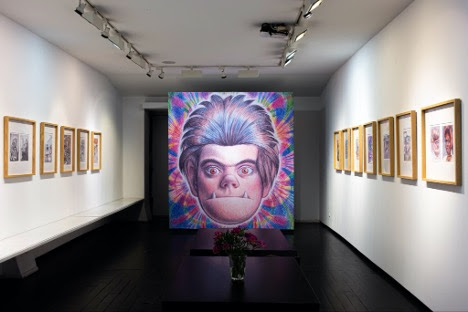
The 2025 Fall programming at Martel BXL opened with a monograph exhibition devoted to the recent projects of Stefano Ricci, the Italian visual artist whose distinct sensual graphic style resonates across his work in animation, illustration, painting and comics. This show marked the third time that Rina Zavagli's gallery shone its spotlight on Ricci, and Je les ai vus represented his first solo exhibition in Belgium. The English translation of this title is I Saw Them, an assertive nod to the act of seeing that offers several entry points for visitors to engage with the exhibition.

Firstly, it is a reference to the production context of the first grouping of fifteen original pieces displayed in the front section of the gallery. The 2023 reopening of the Cinema Modernissimo in Bologna, Italy after an overlong restoration project was cause for great celebration by cinephiles like Stefano Ricci, inspiring him to offer his artistic support to the Cineteca di Bologna for a poster project that would be known as Li Ho Visti (also translated as I Saw Them). For the complete inaugural season of programming at the Mondernissimo, Ricci proposed to create a personal poster for one of the four-to-seven films that screened everyday, from its start on 21 November 2023 to the end of the season on 7 June 2024. Within that time frame, Ricci met his commitment by watching a programmed film each morning and then creating its poster over the course of the day. This process led to Ricci eventually producing 189 posters of films from a wide spectrum of cinema that spanned national, cultural, generic and temporal categories. 

Front left wall display 

Front right wall display

The arrangement of these fifteen pieces, all of equal size, followed an attractive color rhythm that contributed to their immediately striking visual impact upon entering the gallery. The featured pieces were devoid of the layer of text and dates that accompanied their movie poster incarnation so visitors had the privilege of seeing the art as it was originally conceived on its velvet paper support. Wall labels featuring the associated movie title information accompanied each piece, offering the opportunity to situate the film and engage with Ricci's personal visual and material interpretation of it.

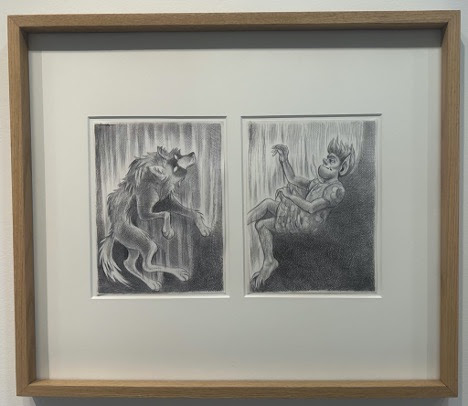
The title Je les ai vus also literally frames the second grouping of pieces that occupied the middle section of the gallery, which were modest in scale and color palette in relation to the movie posters. Arranged in a symmetrical alignment based on their size and format was a selection of twenty images from Ricci's recent Avvistamenti project, a collection of his drawings of everyday observations, of the people, places, animals and things that he sees. 

Fifteen pieces taken from AVVISTAMENTI arranged on the left wall of the central area of the gallery


Four pieces taken from AVVISTAMENTI arranged on the right wall of the central area of the gallery


Portrait of Italian intellectual Goffredo Fofi taken from AVVISTAMENTI, installed on the column in the central area of the gallery

While the title Je les ai vus frames the displayed images through the lens of Ricci's vision, it can also extend to include the spectator's experience of seeing them. "I Saw Them" also suggests an act of bearing witness, of taking the time to pause, reflect and connect with what one perceives. Seeing Ricci's original art offers a unique opportunity to contemplate his creative process, which is more akin to sculpting than drawing. The layers of ink, acrylic, chalk and pigments that he leaves on his canvasses provide an added textural dimension to his images that eludes accurate capture by print reproduction. His rich deployment of color as vibrant expressions of visual and physical affect are amplified by the lighting of a gallery context, whether it be direct or indirect, artificial or natural. The experience of seeing both of these material aspects of Ricci's artwork in a presential setting not only draws attention to the creative labor behind their realization, it also opens contemplative possibilities of personal and emotional connection with the art and the artist. 


The relationship between connection and creative labor was fully present at the vernissage of the exhibition, with Stefano Ricci availing himself for an afternoon signing session at the gallery. Seeing Ricci work at the drawing table is a performative spectacle in and of itself. His body tenses into a shamanic trance of focus and concentration while his hands are in perpetual motion as he scratches, wipes, smudges, brushes, spits and erases to create images that slowly take shape on the nothingness of a blank page. Ricci recounted that his image creation begins with a chaotic amount of ideas in his head that he feels he must visualize through his hands in a non-linear fashion. The amount of physical labour that he puts into each piece often stresses the fibres of his paper support due to the intensity of his tactile manipulation and the sometimes excessive amount of brute material he uses. This can sometimes lead to artwork that exhibit areas of strain, wear-and-tear, and liquid saturation, but Ricci incorporates these "imperfections" to be part of the image that he has created. Visitors who received the unexpected privilege to witness the creative process of such a unique graphic artist in front of their naked eyes all walked away knowing that they had seen something special.   

The central table showcasing the books that feature the exhibited works: 
Edition Sigaretten's "Avvistamenti-Apparitions" (top) and the Cineteca di Bologna's "Li Ho Visti"(right).

Je les ai vus also served as the occasion to debut the two Italian-produced books that featured the entire collections from which the exhibited works were drawn from. Li Ho Visti from Edizioni Cineteca di Bologna, which lists its publication date as October 3, 2025 (a mere day before the exhibition opening) is a beautiful oversize hardcover collection of full color reproductions of all 189 movie posters that Ricci created for the Cinema Modernissimo, accompanied by a handful of introductory texts, including one from Ricci himself.  Avvistamenti from Sigaretten in their Edizione Grafiche series is a smaller softcover collection of his everyday observations (or apparitions as its English title suggests). It is an equally beautifully produced book, with full color reproductions of all the pieces comprising that project, including fold-out pages to respect the "widescreen" ratio of some of the images. 

All told, Je les ai vus successfully mobilized all of these elements to serve as an enticing primer to the vision of Stefano Ricci for those uninitiated to his work. It was also a wonderful reminder for those familiar with his work that his creative efforts and energy remain undiminished over time, just as much as his curiosity continually leads him to explore and experiment with different forms of visual narrative. 

A fuller look at the pieces on display for this exhibition is available at this Flickr photo album


Monday, February 10, 2025

Emil Ferris: My Favorite Thing is Monsters, Book Two exhibition review

reviewed by Laurie Anne Agnese 

Emil Ferris: My Favorite Thing is Monsters, Book Two. Paris: Galerie Martel, November 7, 2024 - January 11, 2025. https://www.galeriemartel.com/emil-ferris-2024/

Like the werewolf stories that she treasures, Emil Ferris’s evolution as an artist started with a bite. “But it wasn’t the bite I thought it would be,” she explains in the Meet Emil Ferris documentary short that was playing at Galerie Martel’s show for My Favorite Thing is Monsters, Book Two. “But it did make me a monster and it made me understand being a monster.”

In 2002, Ferris was celebrating her fortieth birthday when she was bit by a mosquito and contracted West Nile Virus. Ferris woke up from a coma three weeks later to discover her transformation: she was paralyzed from the waist down and unable to use her drawing hand. It closed the chapter of her life as a single mom working to support her six-year-old daughter on various commercial art freelance jobs in Chicago.

“The bite saved my life,” Ferris says. “Because if you lose something that you take for granted, all of a sudden it becomes extremely valuable to you.” She fought back paralysis so she could raise her daughter. She committed to drawing again, this time for her own art and enrolled at the Art Institute of Chicago. To create the two books that comprise My Favorite Thing is Monsters, Ferris spent 14 years drawing at night, while working odd jobs and struggling with various health and financial issues.


Video credit: Meet Emil Ferris, 2019, director Mathieu Gervaise for Monsieur Toussaint Louverture (Ferris’ French publisher)

Ferris’ voice was heard throughout Galerie Martel whose curators placed this looped chapter of the documentary to preface their exhibit of original artworks from the second volume of My Favorite Thing is Monsters. At more than 800 pages, the two books represent a remarkable and wholly unique work that was praised by Art Speigelman for advancing the language of comics. But viewing the work through the additional lens of Ferris’ struggle also contextualizes the tremendous effort that informs the hard-earned message of the book: art has the power to heal.

My Favorite Thing is Monsters, Book 2, continues the story as told through the personal notebook of Karen Reyes, a ten-year-old living in Chicago during the tumultuous year of 1968. This gothic romantic tale of Karen’s coming of age is layered with her understanding of herself as an artist, as a “good monster,” as a trangendered person. These transformations are uncovered through a generic detective story that drives the narrative: Karen is also on a dangerous quest to solve the murder of her neighbor, Anka, a holocaust survivor, while also discovering that her life in her uptown Chicago neighborhood is built on lies and violence.

Photo credit: Vadim Rubenstein, courtesy of Galerie Martel

The arrangement of the artworks in the gallery was notably symmetric. To the left, drawings of equal height showed the variety of visual techniques and forms borrowed from comic books and artist sketchbooks.  The selection on the right side of the gallery were portraits of the gothic characters who inhabit Karen’s imaginary and actual world. The focal point of the arrangement was Book Two’s enlarged cover placed in the center of the gallery:  a self-portrait of Karen as she sees herself as a monster. 

Emil Ferris’s original drawings of covers from My Favorite Thing is Monsters, Book Two.

Being a monster in Ferris’s world is identified with physical differences, in particular the visually grotesque. In the book, Karen’s copies of covers of monster magazines are dark and ghastly, though she takes enormous pleasure in reading, collecting and sharing them.  The cover images hover between imaginary and real-life horror as they often foreshadow scenes in the story. The covers also provide the only structure to the books which otherwise contain no chapters or page numbers. They appear as monthly installments, so the passage of time is suggested through the device of the occasional cover issue date.

But being a monster is not always observable from the exterior, but rather through actions and motivations. The original pieces offer a closer appreciation of the variety of styles employed by Ferris, such as the fluid comic panels and word balloons that are reformatted to make a page spread, to drive the action of the story and demonstrate how the characters live. 


An original artwork (left) and the published version (right), from My Favorite Thing is Monsters, Book Two. The monster on display is a supposedly religious man preaching the bible, while also abusing his followers, and keeping his secrets in his own notated version of the bible, which Karen reads.


Original artwork which appears as a double page spread in the published book.

Karen’s copies of fine art that she finds in books or during her cherished visits to the Art Institute of Chicago with her brother recall a form borrowed from the artist sketchbook.  Karen’s interpretations of works of art are the book’s most exquisite and surprising, and they demonstrate Ferris’ demanding and labor-intensive style. Working with basic materials, ball point pens and cheap spiral bound notebooks, Ferris uses the materials that Karen could afford, building rich textures and shadows from the smallest of cross hatches.

Original artwork from My Favorite Thing is Monsters, Book Two featuring Karen’s rendering of Le Lit, 1892, by Henri de Toulouse-Lautrec

Ferris was so committed to the idea of creating Karen’s personal notebook that she originally worked on lined notebook paper but changed her process to working in layers to ease the labor of making corrections. The portraits featured in the exhibit demonstrate her use of layering, which add to the depth and complexity of each page, and by extension, the overall work.

Karen also copies many different artworks depicting the biblical story of Judith beheading Holofernes.  Judith is a daring and beautiful widow whose village has been invaded by the Holofernes army. She gains his trust through a sexual seduction, and then decapitates him to save her village.  Though Judith only appears in historical paintings, she’s featured on the character side of the gallery, because her story is so deeply pondered and brought to life by Karen’s imagination. In the published book, Karen reflects deeply the choice Judith made to use violence to save the people she loves and adds herself to the artwork as Judith’s loyal servant.


From left to right: Judith with the Head of Holofernes, 1665, Felice Ficherelli, Art Institute of Chicago; Emile Ferris’ original artwork; Published version in My Favorite Thing is Monsters, Book 2. 

In a later segment of the Meet Emil Ferris documentary, Ferris highlights the importance of collage and synthesis to her artistic process:

   “I wanted to give a lot. I wanted to give everything I could. I could only choose certain things, so there’s a collaging that happens where I put two things together because one image has one energy but when you put it aside another image and then there’s text, it creates another sort of energy.”

 These layering and collaging choices are observed in the drawings of Franklin/Francoise, a school friend of Karen’s who was severely beaten for cross dressing, and a character she reads about in her monster magazines that looks like a younger version of Sylvia Gronan, Karen’s neighbor and the wife of a local mobster. The collision of texts and other images adds context to the characters.

Original artwork from My Favorite Thing is Monsters, Book Two. Franklin/Francoise (left) and Sylvia Gronan (right). Their published versions are below


Original Portraits of Stan Silverberg (Anka’s widower), Diego (Karen’s brother) and Anka as a ghost.


The placement of the three portraits together allowed the exhibition the opportunity to show a compassionate side of Emil Ferris. Stan Silverberg is Anka’s widower rendered in blue, as is Anka’s ghost. Karen chose blue for Anka’s inner sadness that now her widower processes.  The center portrait shows Diego, who is committed to raising Karen as best as he can while also being involved with the local mob in order to avoid the draft for the Vietnam war. He’s one the books’ many flawed heroes.  In Karen’s portrait of Diego, she is responding to the advice of her friend who advises “when somebody is in a dark place the best thing you can do for them is to always try to remember their better, most beautiful selves.”

 My Favorite Thing is Monsters, Book 2 offers no easy answers to the many questions and ideas it weaves together, so fittingly neither does it offer much in the way of a clear or conclusive ending. But the narrative, and everything it took to make it, demonstrates what Karen realizes in Book 2 that “the greatest way to be a strong, evil defeating monster is to make art and tell stories.”

Unless stated otherwise, all photos taken by Laurie Anne Agnese

Sunday, December 1, 2024

Exhibition in Photos: The Inaugural Collective Exhibition of Martel BXL

Exposition Collective Inaugurale. Brussels, Belgium: Martel BXL. November 16 - December 7, 2024.

by Nick Nguyen


If Brussels considers itself as the capital of comics, then a new player has set up shop in town to provide an energizing boost to that claim. Martel BXL is the second comics art gallery founded and directed by Rina Zavagli, whose Galerie Martel in Paris has steadily and rightfully earned itself an influential reputation since opening in 2008. Zavagli's exhibition programming over the years has distinguished itself with an eclectic internationalism in scope and stylistic range that recalls the vision and spirit of RAW, the seminal comics anthology magazine edited by Francoise Mouly and Art Spiegelman. That and the combination of Zavagli's refined artistic eye, her formidable relationship-building skills, her deep respect for the labour of the artist, and a generous approach to hospitality have established Galerie Martel as a must-see stop for the comics cognoscenti on any trip or layover in Paris. In addition, the gallery's vernissages are intensely attended social events that jam pack its humble space to the point of spillover outside into the small street that bears its name.

Not content to simply rest on the lofty laurels that she has earned, Zavagli has extended her operations with this new Brussels location that aims to carve out its own identity while maintaining the brand consistency with the Paris gallery. This dual operation is a growth milestone that is subtly signaled with the understated adoption of a new name and logo to mark this shift. Jettisoning the word "Galerie" and de-emphasizing the emboldened "art" in "Martel" removes the tautological indices to its function and location so that the Martel name now confidently stands on its own.    

To inaugurate Martel BXL, Zavagli wisely chose to present a selling exhibition featuring the work of 40 different artists who have each collaborated with her at one time or another over the years at Galerie Martel. It is a fitting, intelligent and strategic approach to announce her arrival on the Brussels scene as the exhibition pays tribute to the past, present and future of Zavagli's gallery experience. The stable of artists affiliated with the Martel banner represent a mix of established comix veterans and maturing bande dessinée contemporaries who offer access to bodies of work that shape a certain idea of the international history of comics art championed by the gallery. This group exhibition also serves as an amuse bouche for a Brussels comics art community steeped in Franco-Belgian comics tradition to anticipate future collaborations to be presented in Martel BXL  

The lineup of artists for the inaugural exhibition as announced on the poster and invitation cards.

The announcement of an exhibition of such collective scope also includes the consideration that it takes an appropriate amount of space to display the work of all these artists. It is in this spatial respect that Martel BXL immediately distinguishes itself from its Paris predecessor as it offers over twice as much display real estate. Situated in the socially heterogeneous commune of Ixelles, the gallery occupies the main floor of a classic maison de maître (townhouse mansion) whose window facade faces out onto one of the busiest thoroughfares in its neighbourhood.    

 The street view of the gallery offers even the most casual of passersby the chance to clearly see the depth of the space from the entrance right through to the back garden. 

The sheer length of the gallery corridor provides the sufficient space to showcase 43 individual pieces with enough breathing room between them so they can stand alone on their own merits while still dialoguing with their neighbors. Each piece was framed to respect its individual style and physical attributes so that the only aspect that was uniform about them all was their eye-level placement along the walls. Each piece was also presented without any immediate metadata to indicate authorship, materiality, or date and context of creation, allowing visitors to engage with them on purely visual and aesthetic terms before being moved to interact with the very knowledgeable and amiable gallery manager Simone Mattotti to discover further information.   

Looking into the gallery from the street


Looking toward the street from inside the gallery at its midway point.


From the midpoint of the gallery looking toward the back of the gallery


Looking toward the street from the back of the gallery, where a staircase leads to the storage area.

At the midpoint of the gallery is a central space that widens the corridor to become a room with larger floor space to include a coffee table where BD albums, catalogues, portfolios and sketchbook collections by the exhibited artists are available for browsing. This room also offers an open passage to the working area of the gallery which is situated next to an enclosed open air garden patio, the first of two that were designed by Dutch graphic artist Rudy Vrooman (the second garden is at the back end of the gallery, near the hospitality area).     

Side garden patio to the left of the staircase


Garden patio at the back end of the gallery, behind the hospitality area.

The coffee table at the central room of the gallery.
 

There's no question that Martel BXL has come out of its starting gate with a bang while still being attentive to its integration into the Brussels arts scene.  The gallery's artistic identity is so clearly defined that its arrival contributes a unique major presence to the city's cultural landscape without treading on the toes of other established comics art galleries. In this spirit, Martel BXL's immediate plan to follow up on the inaugural group exhibition is to acknowledge and highlight their Belgian artistic collaborative partners. The final day of the group exhibition on 7 December will welcome Herr Seele of Cowboy Henk fame for a special dédicace/book signing session. A week later, the first monograph exhibition to be held at Martel BXL will showcase the work of Eric Lambé, whose newest book ANTIPODES in collaboration with author David B. has just been announced as part of the official selection for the 52nd edition of the Festival International de la Bande Dessinée at Angoulême.

Following this path, the future augers well for the fortunes of Zavagli and her Martel enterprise as Brussels, and by extension Belgium, offers whole new opportunities and markets for collaboration, partnerships and collecting. There is little doubt that Martel BXL, like Martel Paris, will soon feature as a new must-see stop for comics lovers on any trip or layover in the capital of Europe. 

-Nick Nguyen

All photos taken by Nick Nguyen. 

PS. Below are photos for the curious completist wishing to get an idea of the arrangement and presentation of the 43 pieces that made up the group exhibition.

The full list and description of the works is found here.

Front left wall: Chris Ware, Guido Crepax, Thomas Ott, Charles Burns


Front left wall continued: José Munoz, Nina Bunjevac, Anke Feuchtenberger, Pablo Auladell


Front left wall continued: Enzo Borgini, Dominique Goblet, Maneule Fior, Thierry van Hasselt


Front right wall: Fred, Art Spiegelman, Lorenzo Mattotti, Eric Lambé


Front right wall continued: Simon Hanselmann, Alex Barbier, Miroslav Sekulic-Strava


Front right wall continued: Gabriella Giandelli, Icinori, Brecht Evens 

Right wall column (front): Franco Matticchio


Right wall column (side): Joost Swarte


Front left column (side): Giacomo Nanni


Right wall of central room: Tomi Ungerer (left)


Central wall of central room: Javier Mariscal, Yann Kebbii, Richard McGuire


Open passage wall of central room: Emil Ferris, Florence Cestac


Left wall of central area: Gary Panter, Brecht Vandenbroucke, Zéphir, Miles Hyman


Left wall of central area continued: Herr Seele


Left wall above staircase: Ludovic Debeurme, Hugues Micol


 Back left wall in front of hospitality area: Stefano Ricci, Anna Sommer

Friday, April 8, 2022

Exhibition in photos: Chris Ware 2022 at Galerie Martel

 Chris Ware 2022. Galerie Martel. Paris. 16 March - 16 April 2022.


Opening just a day before Chris Ware's Grand Prix exhibition debuted at the 49th edition of the Angoulême International Comics Festival, Galerie Martel in Paris presented a parallel selling exhibition of his original art work to whet the appetites of collectors and aficionados. Twenty-four pieces dating from 1999 to 2020 were dutifully displayed in custom-made plastic frames whose simple aesthetic design was well suited for the task.  

This is the third time that Rina Zavagli has hosted Chris Ware at Galerie Martel (the first was in 2013, the second in 2018). Once again her humble gallery space played host for the vernissage on 15 March in the presence of Chris Ware, who made himself available for a rare one hour signing session that was fully booked in a blink of an eye.    

The poster for the Angoulême International Comics Festival serves as the central image of the exhibition, so it goes without saying that the gallery offers this image as a limited edition seriegraphe, signed and numbered by Ware himself.

Also available at Galerie Martel are several boutique items related to the exhibit: a Rusty Brown Fine Art Print Set and a 197 page picture book of images related to the Rusty Brown Theme Song animated film.

The Galerie Martel webiste provides thorough information about the exhibit, the boutique items and the individual pieces (including their dimensions, technique and cost). 

-Nick Nguyen

All photos taken by Nick Nguyen

Photos are organized in an attempt to present a visual chronology of the exhibition installation as experienced in a sequential walkthrough.