Articles from and news about the premier and longest-running academic journal devoted to all aspects of cartooning and comics -- the International Journal of Comic Art (ISSN 1531-6793) published and edited by John Lent.

Monday, February 10, 2025

Emil Ferris: My Favorite Thing is Monsters, Book Two exhibition review

reviewed by Laurie Anne Agnese 

Emil Ferris: My Favorite Thing is Monsters, Book Two. Paris: Galerie Martel, November 7, 2024 - January 11, 2025. https://www.galeriemartel.com/emil-ferris-2024/

Like the werewolf stories that she treasures, Emil Ferris’s evolution as an artist started with a bite. “But it wasn’t the bite I thought it would be,” she explains in the Meet Emil Ferris documentary short that was playing at Galerie Martel’s show for My Favorite Thing is Monsters, Book Two. “But it did make me a monster and it made me understand being a monster.”

In 2002, Ferris was celebrating her fortieth birthday when she was bit by a mosquito and contracted West Nile Virus. Ferris woke up from a coma three weeks later to discover her transformation: she was paralyzed from the waist down and unable to use her drawing hand. It closed the chapter of her life as a single mom working to support her six-year-old daughter on various commercial art freelance jobs in Chicago.

“The bite saved my life,” Ferris says. “Because if you lose something that you take for granted, all of a sudden it becomes extremely valuable to you.” She fought back paralysis so she could raise her daughter. She committed to drawing again, this time for her own art and enrolled at the Art Institute of Chicago. To create the two books that comprise My Favorite Thing is Monsters, Ferris spent 14 years drawing at night, while working odd jobs and struggling with various health and financial issues.


Video credit: Meet Emil Ferris, 2019, director Mathieu Gervaise for Monsieur Toussaint Louverture (Ferris’ French publisher)

Ferris’ voice was heard throughout Galerie Martel whose curators placed this looped chapter of the documentary to preface their exhibit of original artworks from the second volume of My Favorite Thing is Monsters. At more than 800 pages, the two books represent a remarkable and wholly unique work that was praised by Art Speigelman for advancing the language of comics. But viewing the work through the additional lens of Ferris’ struggle also contextualizes the tremendous effort that informs the hard-earned message of the book: art has the power to heal.

My Favorite Thing is Monsters, Book 2, continues the story as told through the personal notebook of Karen Reyes, a ten-year-old living in Chicago during the tumultuous year of 1968. This gothic romantic tale of Karen’s coming of age is layered with her understanding of herself as an artist, as a “good monster,” as a trangendered person. These transformations are uncovered through a generic detective story that drives the narrative: Karen is also on a dangerous quest to solve the murder of her neighbor, Anka, a holocaust survivor, while also discovering that her life in her uptown Chicago neighborhood is built on lies and violence.

Photo credit: Vadim Rubenstein, courtesy of Galerie Martel

The arrangement of the artworks in the gallery was notably symmetric. To the left, drawings of equal height showed the variety of visual techniques and forms borrowed from comic books and artist sketchbooks.  The selection on the right side of the gallery were portraits of the gothic characters who inhabit Karen’s imaginary and actual world. The focal point of the arrangement was Book Two’s enlarged cover placed in the center of the gallery:  a self-portrait of Karen as she sees herself as a monster. 

Emil Ferris’s original drawings of covers from My Favorite Thing is Monsters, Book Two.

Being a monster in Ferris’s world is identified with physical differences, in particular the visually grotesque. In the book, Karen’s copies of covers of monster magazines are dark and ghastly, though she takes enormous pleasure in reading, collecting and sharing them.  The cover images hover between imaginary and real-life horror as they often foreshadow scenes in the story. The covers also provide the only structure to the books which otherwise contain no chapters or page numbers. They appear as monthly installments, so the passage of time is suggested through the device of the occasional cover issue date.

But being a monster is not always observable from the exterior, but rather through actions and motivations. The original pieces offer a closer appreciation of the variety of styles employed by Ferris, such as the fluid comic panels and word balloons that are reformatted to make a page spread, to drive the action of the story and demonstrate how the characters live. 


An original artwork (left) and the published version (right), from My Favorite Thing is Monsters, Book Two. The monster on display is a supposedly religious man preaching the bible, while also abusing his followers, and keeping his secrets in his own notated version of the bible, which Karen reads.


Original artwork which appears as a double page spread in the published book.

Karen’s copies of fine art that she finds in books or during her cherished visits to the Art Institute of Chicago with her brother recall a form borrowed from the artist sketchbook.  Karen’s interpretations of works of art are the book’s most exquisite and surprising, and they demonstrate Ferris’ demanding and labor-intensive style. Working with basic materials, ball point pens and cheap spiral bound notebooks, Ferris uses the materials that Karen could afford, building rich textures and shadows from the smallest of cross hatches.

Original artwork from My Favorite Thing is Monsters, Book Two featuring Karen’s rendering of Le Lit, 1892, by Henri de Toulouse-Lautrec

Ferris was so committed to the idea of creating Karen’s personal notebook that she originally worked on lined notebook paper but changed her process to working in layers to ease the labor of making corrections. The portraits featured in the exhibit demonstrate her use of layering, which add to the depth and complexity of each page, and by extension, the overall work.

Karen also copies many different artworks depicting the biblical story of Judith beheading Holofernes.  Judith is a daring and beautiful widow whose village has been invaded by the Holofernes army. She gains his trust through a sexual seduction, and then decapitates him to save her village.  Though Judith only appears in historical paintings, she’s featured on the character side of the gallery, because her story is so deeply pondered and brought to life by Karen’s imagination. In the published book, Karen reflects deeply the choice Judith made to use violence to save the people she loves and adds herself to the artwork as Judith’s loyal servant.


From left to right: Judith with the Head of Holofernes, 1665, Felice Ficherelli, Art Institute of Chicago; Emile Ferris’ original artwork; Published version in My Favorite Thing is Monsters, Book 2. 

In a later segment of the Meet Emil Ferris documentary, Ferris highlights the importance of collage and synthesis to her artistic process:

   “I wanted to give a lot. I wanted to give everything I could. I could only choose certain things, so there’s a collaging that happens where I put two things together because one image has one energy but when you put it aside another image and then there’s text, it creates another sort of energy.”

 These layering and collaging choices are observed in the drawings of Franklin/Francoise, a school friend of Karen’s who was severely beaten for cross dressing, and a character she reads about in her monster magazines that looks like a younger version of Sylvia Gronan, Karen’s neighbor and the wife of a local mobster. The collision of texts and other images adds context to the characters.

Original artwork from My Favorite Thing is Monsters, Book Two. Franklin/Francoise (left) and Sylvia Gronan (right). Their published versions are below


Original Portraits of Stan Silverberg (Anka’s widower), Diego (Karen’s brother) and Anka as a ghost.


The placement of the three portraits together allowed the exhibition the opportunity to show a compassionate side of Emil Ferris. Stan Silverberg is Anka’s widower rendered in blue, as is Anka’s ghost. Karen chose blue for Anka’s inner sadness that now her widower processes.  The center portrait shows Diego, who is committed to raising Karen as best as he can while also being involved with the local mob in order to avoid the draft for the Vietnam war. He’s one the books’ many flawed heroes.  In Karen’s portrait of Diego, she is responding to the advice of her friend who advises “when somebody is in a dark place the best thing you can do for them is to always try to remember their better, most beautiful selves.”

 My Favorite Thing is Monsters, Book 2 offers no easy answers to the many questions and ideas it weaves together, so fittingly neither does it offer much in the way of a clear or conclusive ending. But the narrative, and everything it took to make it, demonstrates what Karen realizes in Book 2 that “the greatest way to be a strong, evil defeating monster is to make art and tell stories.”

Unless stated otherwise, all photos taken by Laurie Anne Agnese

Sunday, February 9, 2025

Lent Comic Art Classification 2017 Edition online as free ebook


I've been updating it and hopefully a 2nd edition will come out next year as this version is dated due to comic art evolving and changing. You can see newer additional headings in the 2023 Comics Research Bibliography at https://archive.org/details/crb-2023-ebook-edition-final-v.-1.0  2024 is in production.

Excerpts from the introduction by Dr. John A. Lent:

In 1986, in preparation for a conference presentation in India, I self-published a 156-page international bibliography on comic art, which I also sent to some libraries and researchers. That led to the compilation of ten volumes of comic art sources, broken down by regions, genres, functions, and other aspects, published by Greenwood Press between 1994 and 2006. As I assembled materials for these bibliographies, I developed categories into which to place sources. The classification system presented in this monograph is the result.

The classification system portrayed in these pages is meant to bring some order to filing, categorizing, and discussing comics and cartoons. Actually, the fullest section, on the United States, can be used with minor modifications to organize comic art studies about any country.

Thursday, February 6, 2025

Lucca Comics & Games 2024 Festival Review: "The Butterfly Effect"

 reviewed by Bart Beaty and Rebecca Sullivan, University of Calgary


Lucca Comics & Games 2024. Lucca, Italy. October 30 – November 3, 2024.

https://www.luccacomicsandgames.com/


The Butterfly Effect

Our biggest takeaway after visiting Lucca Comics & Games for the first time is that we failed as parents by not bringing our kid. This is a festival for today’s manga-anime-gaming obsessed generation. While it may not be comics enough for some, the total experience is breathtaking and well worth bracing the mind-boggling crowds. The 2024 edition of Lucca Comics & Games, the largest comic book festival in Europe and the second-largest (after Tokyo’s Comiket) in the world, took place from October 30 to November 3. The history of the Lucca Comics & Games is complex, tracing back to the Salone Internazionale del Comics in 1965, which was also held in Lucca. A new festival, Lucca Comics was created when the Salone moved to Rome in the mid-1990s, quickly growing larger and more prominent than the original event. In 2006 the two events reconciled, with the Salone returning to the walled city of Lucca. What began as a comics event is now more accurately described as a fan culture event with some comics elements tacked on. Indeed, the comics, despite their prominence in the name, can feel slightly residual.

The festival has grown exponentially since that the merger almost twenty years ago. Attracting about 50,000 attendees in the mid-2000s, it sold 275,182 tickets across its five days this year (down from the record high year in 2022). For a town of 89,000 people, this is quite the logistical challenge. School is cancelled during the week of the festival, with many locals abandoning the city and renting their homes to attendees, while thousands pour in every day on the train. If you go: Plan to take the train (book in advance) and pack light as taxis are barred from inside the walls and only local cars are allowed. Order your wristbands well in advance as well since they will sell out and staff scrupulously check outside every tent. This is not an event to be dropped in on at the spur of the moment.

The enormity of the crowds makes the festival a considerable challenge, with long queues for most of the popular tents. This year, we counted sixty-four distinct exhibition spaces across the entirety of the town. That does not include the expansive Japan Town outside the walls – although Japanese producers were strongly represented within the main site. The town was subsumed by tents, mostly controlled by single exhibitors: Lego, Nintendo, The Cartoon Network, Hasbro, Funko, Crunchyroll, and Samsung among many others. Some were targeted promotions – like Netflix dedicating a large tent just to promote the second season of Squid Game – and many offered festival exclusive merchandise. Lines stretched for hours (the J-Pop tent must have been at least a three hour wait) that could test the patience of even the most dedicated consumer. We queued for almost an hour to buy a limited-edition Dungeons and Dragons t-shirt as a gift for our son. Maybe we’re good parents after all.

The scope of the tents is encapsulated by the festival’s stated aims: “The community event is dedicated to comics, games, video games, fantasy books/fantasy novels, manga, anime, animated movies, tv series, and cosplay.” Cosplay is probably misplaced as last on that list given that a very significant percentage of the attendees were participating cosplayers representing a wild array of pop culture interests. Every afternoon in the square, in front of one of the many churches, a cosplay event unfolds celebrating a different fandom. We watched a parade of Harry Potter fans, ranging from very young children in store-bought wizard hats to adults with highly-detailed costumes evincing hundreds of hours of work. Everyone seems welcome.

While “comics” may lead the title of the event, it does not much feel that way on the ground, where video games and television seem to be the predominant interest. Several Italian publishers host their own booths at Lucca, including Panini, Bonelli, Tunué, and Star Comics. Of these, Panini and Bonelli had, by far, the largest and busiest booths. Panini is the Italian publisher of both Marvel and DC’s comics, offering much nicer editions of the works than either of those publishers sell in the United States. They also do a large business with Disney-related works for younger children and had long lines of autograph seekers stretching well outside the tent into the square.

Bonelli, the venerable Italian publisher of Dylan Dog, Tex Willer, Nathan Never and dozens of others, also offers a wide array of products, including deluxe editions of classic material. The Padiglione San Martino had a much larger tent housing more than two dozen smaller comic book publishers from across Italy, while the largest tent could be found at the Padiglione Napoleone, hosting about sixty exhibitors including Canicola, Coconino Press, Rizzoli Lizard, Humanoïdes Associés, and Fantagraphics. This was the primary centre of gravity for comic book sales across the festival and, since it is a tent erected in a town square, it revolves around a statue of Napoleon that overlooks the commercial chaos.

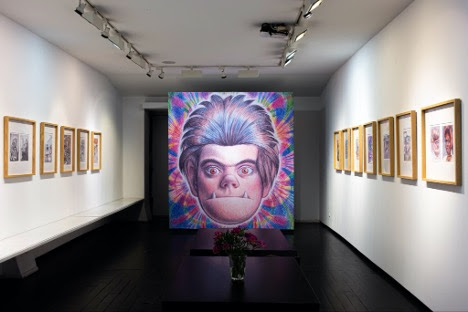
As with other European comics festivals, Lucca Comics & Games played host to a series of exhibitions. In general, these were much smaller than what can be found at Angoulême or Fumetto. Seven exhibitions took place in the Palazzo Ducale, each following essentially from one room to the next and hung in front of the permanent exhibitions of classical and renaissance Italian painting. The result was sometimes jarring but oftentimes provocative juxtapositions. While the Palazzo entrance was oddly difficult to find, especially as the street crowds grew larger and larger by the hour, the exhibitions were well worth it and generally did not have lines.

Press Animae to Play featured a small selection of work by Yoshitaka Amano as a tease for a much larger Milan exhibition opening about two weeks after the festival. About two dozen works, including early anime cels and more recent covers for Sandman: The Dream Hunters filled a single room.

Contrappunti showcased the work of Carmine di Giandomenico, who has made a name for himself in the American comic book market with work for Marvel (Battlin’ Jack Murdock; Magneto) and DC (Flash).

A small show celebrating five decades of Les Humanoïdes Associés followed, with a tight focus on Métal Hurlant and an emphasis on its Italian contributors (Tanino Liberatore, Magnus, Cecilia Capuana, Brandoli and Queirolo, and, of course, Hugo Pratt) with a few pieces by well-known French cartoonists like Frank Margérin and Möebius.

Two rooms showcased twenty years of winners of the Lucca Project Contest for young authors, celebrating the more than 3,600 aspirants who have entered over the years.

Kalimatuna highlighted the work of three female cartoonists from Morocco: Takoua Ben Mohamed, Zainab Fasiki, and Deena Mohamed. Unapologetically feminist, the works on display emphasized the impact of gender-based violence on Moroccan women.

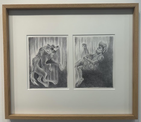
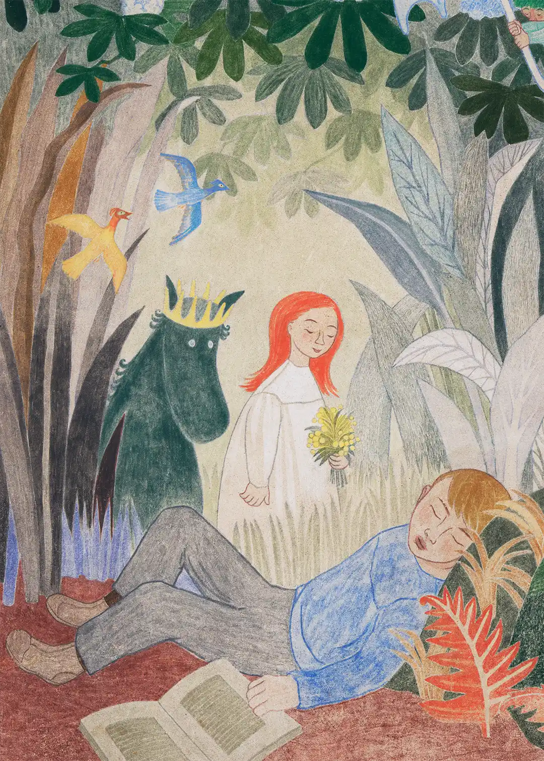
An exhibition of the work of Kazu Kibuishi followed, with most of its attention given appropriately to Amulet. Significantly here, Kibuishi’s framed pages (black line art on white pages) were displayed on backdrops of blown-up digital prints of the colour version of the final pages, drawing easy attention to the significant differences between the original page and the final project. We had never seen original comics art presented in this manner, and it was tremendously smart; particularly given that so much work in Amulet is accomplished by the colorists.

Amulet by Kazu Kibuishi (above and below)

Finally, the work of Francesca Ghermandi was found in Il Pianeta Intergalattico, including a range of her work across her lengthy career working for Frigidaire, Mondo Gomma, and Linus.

Across town, at the Chiesa dei Servi, the major exhibition of the show could be found: Gateway to Adventure: 50 Years of D&D Art. When we first learned that the major exhibition of the festival was related to games rather than comics we were, frankly, disappointed. That feeling disappeared immediately upon entering the space of the church.

The exhibition featured the first public unveiling of the collection of Matthew Koder, a Citibank executive who has extensively gathered D&D related artworks. It showcased more than one hundred works - mostly oil paintings - from the 1970s to today. The breadth of the collection is astonishing, including the oil paintings that were used for the original editions of the Dungeon Master’s Guide and Player’s Handbook, original art from the interiors of those and other early TSR publications, the covers of early issues of Dragon Magazine, various D&D modules and novels, and the Dungeonmaster game and television series. The show concluded with paintings for Magic: The Gathering cards in recognition of the ownership of the property by Wizards of the Coast. At the end of the church a small group wearing headsets broadcasting across the church played a campaign while attendees admired the work on the walls.

Broken into a series of eras, the Koder Collection represented the graphic style of every revision of the game and its rules. It was a truly magnificent exhibition, all the more remarkable that it is held in a single collection. With luck, this show will travel broadly as it would find an enthusiastic audience in many locations.

All of this, of course, is only to scratch the surface. Given the vast scope of the show there were entire sections that we never entered, from the LARPers gathered on the town’s walls practicing their swordplay to the children playing on the Cartoon Network’s elaborate adventure set (source of most of our parental guilt). Every conceivable geek fandom was represented, from the traditional collector’s tents selling vintage comic books and original art to the voluminous number of stalls peddling t-shirts and imported Japanese anime figurines.  


        We were warned beforehand that the weekend would be out of control, so we limited our visit from Wednesday to Friday evening, leaving early Saturday morning (wheeling suitcases through the crowds on the cobble-stone streets to the train station was quite the adventure). Even by Friday, we had to argue with pedestrian traffic controllers who implemented one-way thoroughfares, blocking the way to our apartment.  While we already felt overwhelmed by the experience, it is clear that even in the full five days a visitor could not take in everything that a show this size had to offer and still make time to enjoy an Aperol spritz every afternoon.

Exhibit review: Tove Jansson: Paradise

 reviewed by Bart Beaty and Rebecca Sullivan, University of Calgary

Tove Jansson: Paradise. Heli Harni, curator. HAM Helsinki Art Museum, October 25, 2024 – April 6, 2025. https://www.hamhelsinki.fi/en/exhibitions/tove-jansson-paradise/

Photos are by the reviewers except for Bird Blue (detail) which is from the Museum's website.


It is all but impossible for visitors to Helsinki to avoid the influence of Tove Jansson. A Moomin shop occupies a prominent location in the airport, while two competing Moomin shops can be found in close proximity to the central train station. Moomin figures can be found in bakeries and candy shops and bookstores. The Moomins can be found peddling chocolate-filled peppermint candies, organic oat snacks, coffee mugs, cutting boards, can openers, stuffed toys, t-shirts, and wool socks. They are everywhere and they are on everything. Unsurprisingly, therefore, they were also in HAM Helsinki Art Museum.

From October 25, 2024 to April 6, 2025, the top two floors of Helsinki’s primary art space were given over to Tove Jansson: Paradise. Billed as an in-depth look at Jansson’s public paintings, the show included a large number of Jansson’s pre-Moomin paintings from the 1930s and 1940s while focusing extensively on her career as a muralist.

Jansson’s first Moomin book, The Moomins and the Great Flood, was originally published in 1945 to no great success. Prior to that time, Jansson, the daughter of a sculptor father and an illustrator mother, spent most of the 1930s in a succession of art schools in Stockholm, Helsinki, and Paris. Following in the footsteps of her mother, she published illustrations in Garm, a Finnish-Swedish satirical magazine from 1929 to 1953 while, at the same time, exhibiting paintings in group shows. Jansson’s first solo painting exhibition took place in 1943, two years before the first Moomin book was published. Two years later, she painted her first mural at the Strömberg factory in Pitäjänmäki, Helsinki. Tove Jansson: Paradise is interested in combining all of these aspects of her career: the paintings from her student period through her early professionalization, her career as a muralist working in public spaces, and the early years and then rapid success of the Moomin books and comics.

Jansson’s first two solo shows were arranged by Leonard Bäcksbacka at his Konstalongen gallery 1943. The successful first show provided a boost for the young artist, but the second solo exhibition in 1946 was not well received by either critics or art patrons. The first several galleries of the exhibitions are given over to a selection of her paintings as well as the contemporaneous illustration work for Garm. Jansson’s paintings of this period are not immediately recognizable as the work of the Moomin author but demonstrate a strong influence of mid-century European modernism with their thick brushstrokes and moody palette, while the illustration work – often topical and political – shows stronger traces of the material that will develop in her children’s books.

Following the display of her early easel paintings, the final room on the first floor of the exhibition hosts two large frescoes as well as studies for the same. Commissioned in 1947 by the restaurant in the basement of the Helsinki City Hall, the two painting are titled Party in the Countryside and Party in the City. These works begin to synthesize Jansson’s modernist and folklorist aesthetics, providing a fascinating glimpse into the evolution of an artist determined to become a critical and commercial success.

Party in the Countryside depicts eight figures frolicking in lush vegetation. The images are cartoony in their representational simplicity and subtle pastel colour scheme - an abrupt departure from the tone and style of her paintings following the unsuccessful second show. The city scene is no less luxurious, depicting couples in gowns and evening wear dancing on a flower strewn balcony.

The two works, the artist’s first attempts at frescoes, participated in the massive post-war reconstruction effort across Finland that provided unprecedented opportunities for young artists. Jansson, who came from a well-connected family of artists, benefitted tremendously (one might even leave thinking overtly) from this social and political network.

The only public commission known to have been awarded to Jansson on a competitive basis was the Aurora Hospital murals intended for the new children’s ward. Alone among the murals on display, these clearly capitalized on her growing fame from the Moomin series. Play, painted in 1956, presented a series of Moomin characters in the stairwell and the EEG room of the hospital. It was later recreated at the Helsinki University Central Hospital when the pediatric ward was relocated in 1997. At HAM, the mural was recreated once again on the central staircase leading visitors from the first floor of the exhibition to the second.

The second floor of the exhibition was much more impressive than the first. A vast open space with vaulted ceilings broken up by temporary dividers, this floor showcased the immensity of the murals. Display cases of her sketches and highly detailed notebooks invited viewers to contemplate the artist’s process. Jansson typically produced preliminary sketches on paper and then worked through colour schemes on cardboard before concluding with a 1:1 charcoal tracing that would be transferred to the wall. Examples of each of these stages were on full display here (most impressively the enormous cartoon of The Ten Virgins with its pinpricks for the charcoal transfer readily apparent).

Bird Blue, 1953 (detail).
© Tove Jansson Estate.
Photo: HAM / Maija Toivanen
.

            Throughout the 1940s and into the 1950s, Jansson produced public art for restaurants, hotels, several schools, the Nordic Union Bank and an altar piece for the Teuva Church in Southern Ostrobothnia. She worked in fresco, fresco-secco (pigment applied to dry plaster), watercolour on glass, and oil on canvas. Over time, these works increasingly came to resemble work for which she is best known, and even to incorporate elements of the Moomin universe at the margins.

As Canadians of a certain generation most of the waves of Moomin-mania missed us, so we have no sentimental attachment to Jansson’s work. This turned out to be a benefit as the exhibition is not about the Moomins really but about the artist behind the phenomenon. There was no hiding Jansson’s sexuality, her sometimes craven ambition, and her canny working of her socially powerful contacts in both government and the art world. While Moomin die-hards might come away mildly disappointed, the casual visitor gained incredible insight into mid-twentieth-century Finland as it sought to distance itself from its complex wartime status into an independent nation with its own distinct visual culture. And, for those die-hards, there are Moomin mugs and mittens in the bookshop.


Sketch for the Bird Blue mural, 1953. Commision for the canteen at
Kila Swedish-language elementary school (today Karjaa co-educational school).