News about the premier academic journal devoted to all aspects of cartooning and comics -- the International Journal of Comic Art (ISSN 1531-6793) published and edited by John Lent.

Showing posts with label Brussels. Show all posts

Tuesday, May 30, 2023

Demystifying The U Ray, the better to rewrite the origin myth of Blake and Mortimer

 Éric Dubois

 ODDYSEY to the origins of Blake and Mortimer, Eric Dubois (curator), Brussels: Belgian Comic Strip Center / Comics Art Museum, April 7 – October 1, 2023. https://www.comicscenter.net/en/exhibitions/gallery/oddysey-to-the-origins-of-blake-and-mortimer


What does the ODYSSEY exhibition explain about the origins of Blake and Mortimer?

It shows that The U Ray (Le Rayon U) album is a missing link between comics in the English-language tradition and the Franco-Belgian one. Edgar P. Jacobs was inspired by Alex Raymond’s Flash Gordon, which he had started by plagiarizing in Bravo! magazine before going on to create his own story. The way in which the artist freed himself in a few pages from an American comic strip narrative and graphic codes such as text boxes and no speech balloons, to forge his own cartooning grammar is fascinating to observe, with period tracings and original pages on display as evidence. For his first attempt at a comic story, it's a stroke of genius. At the Comics Museum in Brussels, Jacob’s talent is displayed before our eyes.

More importantly, the exhibition changes the way we look at this album. U is more than the matrix of the characters and themes of the work to come when Jacobs creates Blake and Mortimer. In 1973, for the first collected album edition, Jacobs was not content to reassemble the original 1943 story from by just rearranging the original two panels per tier to three. He “Blake-and-Mortimerized” his U Ray. The album published by the Éditions du Lombard was no longer just the matrix of the Adventures of Blake and Mortimer, but became an extension of that aesthetic. The direct comparison of pages from The U Ray album version and earlier plates from The Secret of the Swordfish, Atlantis Mystery and The Time Trap shows us the mythical character of this two-version album.

What are the most emblematic pieces of the exhibition?

The exhibition presents only original material and a majority are unpublished ones. Among the top pieces, the visitor can discover four panels sketched on tracing paper which are as sumptuous as they are extremely rare; two color-enhanced sketches of Flash Gordon, of which Jacobs only drew five pages in 1942; and two others of the two-panel version of The U Ray from 1943. These are the oldest documents from the story, as well as in the career of Jacobs as a cartoonist. Precious handwritten notes from this first story bear witness to the genesis of the names of places and characters. "Rayon V," "Rayon Vert," but also "Olrik," "Flying shark," and further on "Swordfish." We are struck by the premonitory character of such notes. They prove that from the start that Jacobs did not think in terms of comics, but in rather in terms of the novel, indicating "Roman d’aventure genre Gordon" at the top of his page. The exhibition also displays a small paper model of the album, bound by hand, on which Jacobs sketched all the boxes, the page connections, the strips to be redrawn, the new boxes, and so on, a further testimony to the needs of the draftsman to work out the story.

The visitor can view a selection of original pages from The U Ray. When observed carefully, it is possible to understand the full process of the reassembling of the story in an album and its second inception. Collages and overlays in white gouache and Indian ink abound, to house the speech bubbles as well as format the boxes. But above all, for six of the pages printed in sepia in the Journal Bravo! we have the complete redrawing. This is the exhibition’s key treasure.

Next to this black and white original art that has remained in the shadows for so long, the visitor has the chance to lift the veil on a series of sublime polychrome tracings. Abundantly commented on by Jacobs, a meticulous artist, these fragile sheets also testify to the care taken to document his work and constitute his archives. This is a process that will lead, in 1984, to the creation of the E.P. Jacobs Foundation, today in charge of preserving and promoting the heritage of the Belgian cartoonist.[1]

From what angle does the ODYSSEY exhibition approach the album The U Ray?

Six themes make up the exhibit: Under the Auspices of the Gods, A Modern Homer, Theater of the World, The Death Ray, Unknown Earth and The Eternal Return.

The ODYSSEY exhibition considers The U Ray’s comic strip origin, as well as its genesis from the angle of the myth and the great stories of antiquity, especially Homer's Odyssey. The exhibition explores the affiliations between the Adventures of Blake and Mortimer and American comics, in particular Flash Gordon by Alex Raymond, while going beyond the model/copy pattern in order further to suggest relationships between the two stories, whose authors, Jacobs and Raymond, drank from the same literary and cinematographic sources. Jacobs' first story as an author appears as the missing link in a history of Franco-Belgian comics under American influence, of which the superhero became the titular figure, but was not when Jacobs began working.

The mythological angle therefore invites us to see Jacobs as a storyteller. It is a bridge between two generations and two cultural shores. There is a genius for storytelling in him, which cannot be reduced to the sum of the references or the tropes used. This means that despite all the analyses, even the most scholarly, there will always be something more to say about his work. Where Jacobs is at his strongest is in his ability to appropriate the narrative codes of the great tradition of storytelling and mythical narrative. We forget their influence - conscious or not - when one reads a Blake and Mortimer comic book. Jacobs is a true storyteller and that's why his stories are timeless.

I think of Jules Verne and his Voyage to the Moon, but also in particular Arthur Conan Doyle with his novel The Lost World. Behind this fantasy story, that has the trappings of a pseudo-scientific novel, hides a sociological study on the brutality of human relations in a civilized environment. I perceive in Jacobs this same universalism in the narratives with a reflexive background. In his stories, Jacobs reconnects with the primary vocation of storytelling, which was to give food for thought by striking the imagination with edifying tales, thereby creating images capable of inspiring or transmitting a certain morality.

The exhibit layout plays a major role. How did you envision it?

My creative process played on radical changes: scale, light, and color, and is inspired by the spectacle side of amusement parks. The exhibition is initially fully lit before darkening and then returning to light, following a ritual symbolism of the return to the starting point. The design is based on large sets playing the role of thresholds. It was a question of giving the space an aura of grandeur, but also of punctuating the visit with twists -- such as acts in the theater. Right from the entrance with its giant octopus, the tone is set. These decorations evoke the fairground attractions of Coney Island in New York, the model of all modern magic and source of inspiration for Winsor McCay, the creator of Little Nemo.

Under the Auspices of the Gods is dedicated to Flash Gordon and the Journal Bravo!. It presents the tracings of the 2nd and 4th panels of Flash by Jacobs. Modern Homer concentrates on the characters. Attention is drawn to the "small note papers of Edgar P. Jacobs", which show to the method of reassembly for the album. The Theater of the World emphasizes spatio-temporal exoticism and the art of staging. Color is also evoked as an agent of the wonders of Jacobs’s world. The Death Ray is dedicated to the ultimate weapon which is the McGuffin of The U Ray. The Unknown Land is the famous Terra Incognita of old maps and terrestrial globes. In this part, it is about the ape-men and the perils that threaten the troop led by the Lord Calder character.

The final theme, The Eternal Return, is dedicated to the sequel to U and presents a series of original pages from The Fiery Arrow. This theme closes the time loop by highlighting the return to certain visual archetypes in this sequel, and the way in which, again in mythology, ritual (codified repetition) is the means for humanity to access the divine, and therefore immortality. From The U Ray onwards, Edgar P. Jacobs maintained a delightfully paradoxical relationship with time that was tempting to explore here, not to resolve or reduce it, but to settle in it and savor it.

How did you take into account the interior space of the building of the Comics museum, which is extremely bright?

To ensure the preservation of the works, it was essential to control the luminosity of the interior of the building, first designed by the Art Nouveau architect Victor Horta as an opulent and bourgeois fabrics store, which serves now as a showcase for the Museum. A paper ceiling was created to break the sunlight coming from the iconic glass roof. It also plays the role of the chromatic palette of the exhibition, directly inspired by that of the album. This design device is very significant visually, both for visitors who are below and for those seeing it from the mezzanine of the upper floor. As such, an exhibition addresses the mind as much as the body and create the conditions for an encounter with the work in its very essence, and not only in the materiality of the pages that made it possible.

We must not forget that the original work in comics is the printed and published story in an album. That is what is on display. So this exhibition puts itself forward even more as a true setting in this sense, because with Edgar P. Jacobs, the setting is as important as the action and the characters. I was careful to maintain a kind of sensory and chromatic unity throughout the visit, without forgetting the key contribution of sound to give the exhibition its inhabited character. Once again, my accomplice the composer Bruno Letort, knew how to create an atmosphere that gives soul to the exhibition. Letort is a fan of Jacobs who listens to Blake and Mortimer albums as much as he reads them. For the visitors we hope to have created an exhibition in which all the senses are awakened.
Éric Dubois is a design professor in Paris and has been participating with comic strip exhibitions since François Schuiten and Benoit Peeters set him on the path with their Drawing Machines in 2016 at the Musée des Arts et Métiers in Paris. After that, he worked with Blake and Mortimer, for which he created several exhibitions with journalists and comics experts Thierry Bellefroid and Daniel Couvreur: Scientifiction (2018), The Secret of the Swordfish (2021), MachinaXion (2022). Dubois is the sole curator of ODYSSEY exhibition on the origins of Blake and Mortimer. This is an exhibition dedicated to The “U” Ray, the first comic book by Edgar P. Jacobs.

 The Belgian Comic Strip Center

The Belgian Comic Strip Center opened its doors to the public on October 6th 1989. In no time this impressive museum became one of the main attractions of Brussels. Every year more than 250.000 visitors come here to explore 4,200 m² of permanent and temporary exhibitions, not to mention its comprehensive documentation center and rich collections. The BCSC collects anything that deals with European comics, from its prestigious beginnings to its latest developments.

Temporary and permanent exhibitions have transformed this Art Nouveau gem into a living and attractive temple. It is a dynamic and exciting place where everything is done to promote the Ninth Art (associated with the creation of the Brussels Comic Strip Route, the issue of Comic Strip stamps, etc...). The Belgian Comic Strip Center also produces, for many partners, conferences, books, creative workshops and counseling.

With more than 700 comic strip authors, Belgium has more comic strip artists per square kilometer than any other country in the world! It is here that the comic strip has grown from a popular medium into an art in its own right. Nowhere else comics are so strongly rooted in reality and in people's imagination.


[1] Since 2018, first under the aegis of the King Baudouin Foundation which hosted the Jacobs Fund for four years, then under the impetus of a renewed E. P. Jacobs Foundation, several exhibitions and publications have been able to highlight the unique qualities of the work of Edgar P. Jacobs. The work of preserving the archives left by the creator of Blake and Mortimer continues. The E.P. Jacobs Foundation is actively involved in this, in collaboration with the King Baudouin Foundation, which now assists it in this task. Created by Edgar P. Jacobs to guarantee the heritage of his work, it is possible today to look into its archives of unsuspected richness and to discover there the stages of an extraordinary creation. 


Friday, March 24, 2023

Exhibition review: Carrément poilu at the Comics Art Museum, Brussels

Carrément Poilu. Sophie Baudry (curator). Brussels: Comics Art Museum, October 20, 2022 - August 15, 2023.


reviewed by  Laurie Anne Agnese


Carrément Poilu (Squarely Furry), an exhibition celebrating Le Petit Poilu (Little Furry), is currently on view at the Comics Art Museum in Brussels.  In 2007, the Belgian cartoonist Pierre Bailly and scriptwriter Céline Fraipont created the bande dessinée for preschool children; it has since expanded into an animated cartoon series and Dupuis will release the 28th album in March 2023. Le Petit Poilu’s world, his empathy and his penchant for humor also grows with each adventure and each album.  Like the comic itself, this playful and interactive exhibition offers something for visitors of all ages but especially for fans of the comic.  


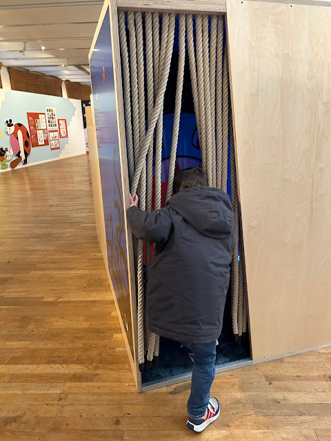
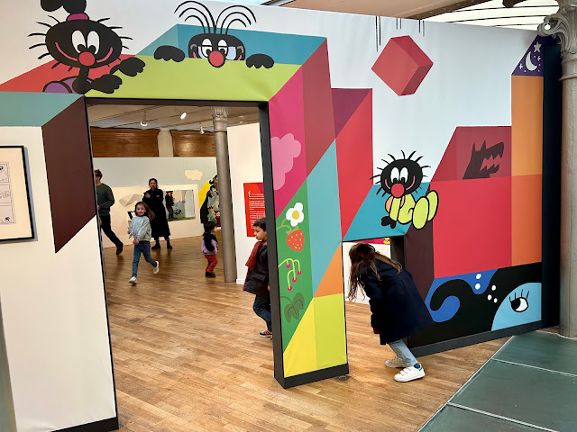
The colorful entrance signals that this is a special comics exhibit - a small door welcomes just children under 5, and a larger one for everyone else.


There are no words, dialogue or narration in Le Petit Poilu. Children as young as three years old enjoy reading these wildly complex visual stories on their own.  Since the albums can be read independently without their parents, Bailly and Fraipont speak directly to their youngest readers. “Wordless comics may have the strength to be able to speak to children as equals with a whole series of strategies to convey emotion, poetry, things like that” says Bailly in a video interview playing at the exhibit (translation from French is mine). 


Le Petit Poilu balances simple and fun adventure stories with serious themes such as migration, gender or playground aggression. Bailly and Fraipont put immense care into the sequencing of the story and ultimately a great deal of trust in children: “We offer them an opportunity to go very far in their capacities, in their intelligence to be able to decipher a story, even at 3 years old. I think it makes children, as soon as they bite, want to taste it again.”


Once in the exhibit hall, children immediately notice the free maps of the exhibit and without words or instructions, they also know exactly what to do with them.  The maps showed the layout and also gave them a mission at each stop: find the colored stamps to complete the map. The map is also self-referent to the series. It is a souvenir to take, like Petit Poilu, who always returns home with a special object from his adventures.


Photo credit: Daniel Fouss/Comics Art Museum


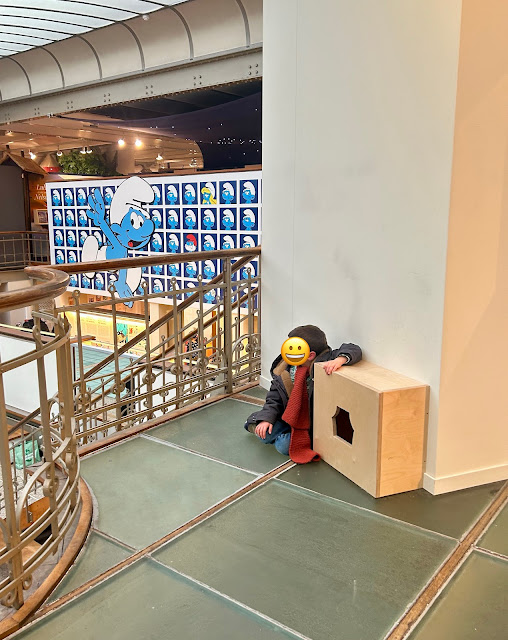
There are several large enclosed wooden cubes with small entrances that invite visitors to get low to the ground and discover what is inside.  There was a note to give priority to the youngest visitors, but families tended to explore the cubes together. So the young and the old climbed, jumped, hid and crawled through each of them and immersed themselves in these unique worlds that reference particular stories in the series. 


Each album of Le Petit Poilu follows a similar structure with endless variety, like the daily life of a preschool child.  Poilu wakes up, uses a toilet that is too big for him, eats breakfast, says goodbye to his parents and walks to school. But then something strange and magnificent happens. He discovers a new universe and an unexpected adventure awaits him. The cubes capture this magical turning point: bright, vivid images from the bande dessinée combined with the sensory experiences of music and textures to depict this triggering event that puts the story into motion.


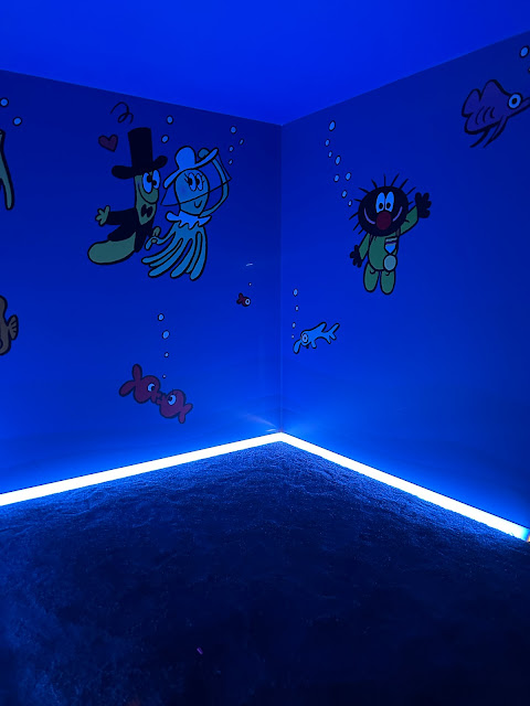
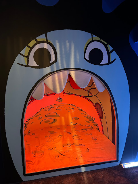
For example, the cube for La Sirène Gourmande (the first album in the series) is an underwater story where a large hungry mermaid swallows Le Petit Poilu, and he lands in a pile of rubbish that is her belly where the adventure to get out takes place.  The cube is awash in the beautiful underwater imagery and sounds, and the belly of trash is soft.


One very small cube discreetly sits in an unremarkable corner, and could be mistaken for a mouse hole. Once down on the ground, the visitor sees that it depicts the adventures in Madame Miniscule, where the size is turned upside down, and Le Petit Poilu as the child is large, and the adults and all of the objects around them are very small in comparison.


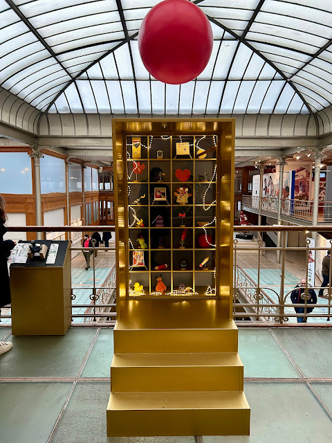
Because of its clever use of structure and repetition, Le Petit Poilu has a musical and rhythmic quality.  Each story hits similar moments with visual cues: Poilu shakes hands with a friendly character who will help him in the conflict; he looks longingly at a photo of his mother to give him courage to face the mounting adversity, and when the problem has resolved itself, he receives a special object to take home. All 27 objects from his 27 adventures are collected in a special cabinet adorned overhead with his clown nose:


 Like Alice in Wonderland and The Phantom Tollbooth, Le Petit Poilu is ultimately a voyage and return adventure story. Once he receives the special object, the story ends by unspooling itself: Poilu returns home, reunites with his parents, eats dinner, and goes to bed. All alone in his room, he checks his bag and finds the object that he received - proof that the magical adventure took place - and brings both his world and the magical one together.


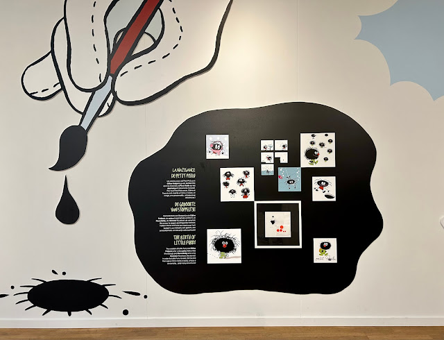
Lining the perimeter of the hall, large reproductions from the albums, sketches, original artwork and descriptive panels invite parents and children to learn together about the creation and backstory of the comic.  These panels are kept simple and placed at sight level to interest the younger visitors, but in reality, I did not see many children looking at them. They explained the process of creating a wordless comic, which starts with words and storyboarding first. Other panels highlighted the process of creating the look of Le Petit Poilu from a drop of ink.


 The exhibit ends with two adjacent rooms - one is furnished with a soft rug, floor cushions, and low bookshelves with multiple sets of the entire series available to read; the other features a television screen. Many visitors lingered there for nearly an hour.  It is a unique opportunity to read all 27 albums in one uninterrupted sweep, and visitors approached it in their own way. Some parents sat down on the floor and read the books to their children - that is, the parent created and narrated a story out loud from the pictures. Some children and parents were side by side reading silently to themselves.


Photo credit: Daniel Fouss/Comics Art Museum


Photo credit: Daniel Fouss/Comics Art Museum
 

 The other room features a looped video interview with Bailly and Fraipont.  The bench for watching is full-sized, and is surrounded by small sketches hung high.  In the video, the sound is off, and the subtitles are on - squarely aiming this space for the adults, perhaps to distract them long enough to leave the children alone to read the books. 


In the video interview, Bailly remarks how sometimes “words freeze and block things.” Drawing on a parallel with the silent films of Charlie Chaplin or Buster Keaton, he adds “there is not only burlesque, there are also a lot of emotions and humanity. This kind of intimacy with character is something that we can understand and feel without words.” In the albums, as well as the exhibit, there is space for fantasy within the reader and for their own words to tell the story.


 All photos taken by Laurie Anne Agnese unless otherwise noted.


Saturday, May 8, 2021

When Le Chat Was Put Among the Pigeons

 Musings by Wim Lockefeer

In a time of pandemic, it was no more than a fait divers on the global news cycle, but it was a fait nevertheless: the plan of the Brussels regional government to invest 9 million euros in a museum for Belgian cartoonist Philippe Geluck and his character Le Chat met with less than favorable, or at least mixed, reactions. Protest predominantly focused on the perceived lack of artistic merit in Geluck’s work and on whether the government should spend that amount on a new museum in times of Covid (while the Museum of Modern Art has been closed for more than a decade).

What is Le Chat? Why would the Brussels government want a museum for a cartoon cat? And why is everybody in the art world seemingly so set against it? Here are some thoughts from a local part-time comics journalist.

For the casual observer, Belgium’s government structure may seem like an impossible Gordian knot. We have three communities, each with their own language (Dutch, German, French) and their own governmental functions. In addition, there are two state-like regions that don’t really cover the same grounds, but also have their own governments. Then there’s the region of the capital or Brussels (with its own government) and there’s the federal government. Even I had to look it up, and I’ve lived here for more than fifty years.

Belgium likes to present itself as the cradle of European comics. Almost every sizable town has its speciality store, and comics fairs and festivals are all over. In Brussels especially you’ll bump into comics around every corner, be it in one of its several museums (including the comprehensive Comic Art Museum and the specialized Marc Sleen Museum), along the comics mural route, in galleries and art houses and in quite a lot of comics shops, both in French and Dutch (and a little English).

Even though Philippe Geluck is a cartoonist, his most important work, Le Chat, largely is not a comic strip. During its run in the Belgian newspaper Le Soir (from 1983 until 2013) his daily offering was quite often a single panel gag cartoon, with a penchant for bon mots, absurdism and self-referential jokes. Le Soir is one of the oldest newspapers in the country, and its readership is a perfect fit for Geluck’s kind of humor: respectable, highly educated, with a well-paying office job and quite progressive values, but not so much so as to ever be calling for a revolution.

Belgium may well be the birthplace of the Franco-Belgian comics tradition, but for the longest time comics were considered to be low-grade children’s fodder, whereas the single-panel cartoon was a quality cultural product for the discerning connoisseur, with international festivals in places like Knokke-Heist since the early 1960s. Think of the status of the New Yorker cartoon in the USA.

Single-panel jokes have the additional benefit that they can be easily reproduced on all kinds of merchandising products. Over the years Le chat has graced numerous post cards, napkins, badges, magnets, posters, and lately, of course, face masks. Le Chat chocolates (Les Langues du Chat) in their collectable tins are a favourite to take along when visiting friends. Les Chat and its licensing is omnipresent.

Or rather, that’s what you’d think if you visit Belgium and land in Brussels National Airport (or, conversely, if you leave the country and want a final farewell to all the riches it has to offer). If you don’t consider the ever-present Tintin for a moment (or at least try not to), you’d think that Belgium is basically Chat country.

Which it isn’t. I’d wager that if you ask any one hundred Dutch-speaking Belgians, roughly 80% would not know about Le Chat or Geluck (although they would now, after all the hullaballoo in the papers). In Brussels, the urban centers in the south of the country, and in France, they are a bona fide hit though, with more than 14 million books sold.

Because, indeed, Geluck also managed to get his cartoons collected in a long-running series of albums, published by Casterman (historically, the publisher of the more respectable clear line of bandes dessinėes, such as Tintin or Alix). From 1985 onwards, Le Chat was a recurring feature in color in the avant-garde comics monthly A Suivre (also published by Casterman) and, as with most of the more popular titles in that periodical, later collected in up-market hard cover books.

All in all, Philippe Geluck is without a doubt a very successful creator, with numerous books in various languages, radio shows and television series, awards and honorifics a-plenty, and even an asteroid named after him. He could be considered, for better or for worse, one of the most recognized Belgian authors of the past few decades.

But even while he kept quite busy with his cartoon series, stand-alone books, spin-off books and animation series, Geluck also started try his hand at a different, even more profitable business - that of fine art. Helped by specialized galleries such as Huberty-Breyne, he started doing large scale paintings with the same zany, absurdist humor and, indeed, with Le Chat.

At high-profile art events like the Brafa art fair, Geluck is present with his paintings, offered at quite hefty prices, and limited-run multiples. And he is selling – this is the kind of art that fits the office wall of an accountant who wants to be more than just a dreary functionary. It’s funny (it has an actual joke that may break the ice), it’s easy (Geluck’s art style has been called a lot of things, but never sketchy or chaotic) and it’s largely innocuous.

Halfway through the 2000s, Geluck started mentioning how Paris and other French cities had approached him with proposals for a museum of some kind for him and his creation, and culturos in the Brussels government got a tad anxious. After all, haven’t they just lost Tintin and the Hergé Museum, to Louvain-La-Neuve-Ottignies, a provincial town in French-speaking Walloon Brabant (one that, admittedly, also had a university)? Could they afford to lose Geluck as well, and to France at that?

            And so, a plan was made, a site was chosen (a building that for the longest time had been empty, but that is situated on the Rue Royale, in the middle of the cultural heart of the city) and initial designs were presented to the assembled press.

After which a (small) wave of protests washed in, especially from the Brussels art world, with a petition asking why a museum dedicated to one man, a cartoonist with a simplistic style at that, was in the works, while the whole collection of the National Museum of Modern Art had been in storage for more than a decade, and while other (more serious, I gather) art was being neglected.

While all this was covered in the press and on TV, the Brussels, and Belgian, comics scene, kept strangely quiet, even though the Belgian Comics Museum had announced only two weeks earlier that it was forced to let go a third of its employees because it had attracted 70% fewer visitors due to the COVID crisis. In addition to the rent from the book store and coffee shop, tickets are the only source of income of this unique Museum.

            Philippe Geluck seemed quite shocked by all the hubbub the plans for his museum had caused. During a television debate on commercial station RTL he announced that, if a better goal for the building could be found, he’d gladly step aside.

            So, what to do? Perhaps turn the Rue Royal building into a modern art museum and support the already existing Comics Museum? Give Le Chat its own wing there? For the government bodies involved in the affair, nothing seems to have changed in spite of any controversy. Maybe we should simply wait a couple more years. After all, Geluck is still alive and very much kicking, while other bigwigs of the Belgian art world only got their museums long after their demises. 

 A version of this will be published in print in IJOCA 23-1.