Articles from and news about the premier academic journal devoted to all aspects of cartooning and comics -- the International Journal of Comic Art (ISSN 1531-6793) published and edited by John Lent.

Thursday, October 17, 2024

Graphic Novel Review: Madame Choi and the Monsters: A True Story

 reviewed by Cord A. Scott, UMGC-Okinawa

Patrick Spät and Sherce Domingo; translated by Michael Waaler. Madame Choi and the Monsters: A True Story. London: Self-Made Hero Publications, 2024. ISBN 978-1-914224-22-5. $22.99. https://www.selfmadehero.com/books/madame-choi-and-the-monsters-a-true-story

Sometimes true historical stories seem so outrageous that they can feel like a fictional script. When visuals such as comic art are added, the stories become even more engaging. Madame Choi and the Monsters is one of those stories -- so engaging that it seems that it must be fake. Here is the book’s advertising blurb:

The incredible-yet-true story of celebrated South Korean actress Choi Eun-hee, abducted in 1978 by North Korean secret agents on the orders of their film-crazed future leader Kim Jong-il. Six months later, filmmaker Shin Sang-ok, Choi Eun-hee’s ex-husband, is abducted in turn. Choi and Shin remain unaware of each other’s fates until they meet again at a dinner hosted by Kim Jong-il in 1983. Kim forces Choi and Shin to make films, including the infamous kaiju cult classic Pulgasari (1985), all while convincing the world that they serve North Korea willingly. Choi and Shin’s love rekindles slowly in this reunited captivity. Only at the 1986 Vienna Film Festival do they escape, fleeing in a daring car chase to the American embassy.


The script of Madame Choi was written by Patrick Spät. He took the approach of weaving in the script of Pulgasari, as well as biographies of Choi and Shin, as an effective way to give readers exposure to each creator as well as their most famous movie. Some additional liberties were taken with the storyline, particularly the spirit within the Pulgasari arc that allows for a conscience and narrator device. Both Spät and Domingo are based in Berlin, and this book is translated from German.

Spät’s script also allows readers to understand the other quirks within the North Korea (DPRK) regime of the 1970s. Kim Jong-il was so obsessed with movies that he had amassed a reported 20,000 film library, and the first part of the graphic novel shows that obsession as Kim sent infiltrators into the South to steal movies and bring them back. Eventually, Kim decides to take the next logical step of making his own films, but with South Korean (ROK) creators.

While Choi Eun-hee was well known as an actress, she was also from a conservative country. Soouth Korea had traditional expectations for people, and when Choi divorced her abusive first husband, she felt repercussions. She met Shin, a director, and they fell in love and married. While unable to have their own children (another stigma in South Korea) they adopted two children and continued to produced films that were both popular as well as critically acclaimed. They produced 60 films throughout the 1960s and 1970s. (48) However, the South Korea of the 1970s was a military dictatorship, and not the free democracy of today. They fell afoul of government censors, and this led to strain on the two, both professionally and personally. (63) This constant tension of creativity and morals is one that now seems oxymoronic compared to North Korea and its repression, and while the censored events in the films may seem quaint by today’s standards, within South Korea at that time they were serious.

Purportedly, the strain in the marriage from censorship caused Shin to engage in an affair with another actress. This is critical to the story as it set in motion their divorce, their problems with each other’s careers, and the lure by which Kim brought the two at different times to Hong Kong, when they were then kidnapped and brought to the DPRK to make films for him. They re-met in North Korea in October 1983. (127-129) As Shin noted, he had the ability to do things like blow up an actual train on film (140-141), but at the same time, he suffered far more degradation than Choi did, although both were held in North Korea for years.

The story of Pulgasari is a folk legend in Korea, and the film is a monster movie made with both Japan and China. The film itself also had themes of the corruption of power, the need of a supreme (and ultimately ineffective) weapon to defeat monsters, and the idea that enemy forces would be defeated on the strength of traditional values. In the end, it was this movie, made with some of the crew who worked on the Toho Studio-era Godzilla films, that served as the basis for their escape. The film was sent to the Vienna film festival, and Choi and Shin carefully planned their escape from the hotel where they were staying. After a high-speed chase through the streets, the two ended up at the US Embassy.

While the graphic novel ends with the destruction of Pulgasari, and the real-world result of the guards being shot for allowing Shin and Choi to escape, there is a timeline which gives the further movements of the film-making family, from their reuniting with their adopted children in Virginia, their time in Hollywood, and their eventual return to South Korea, which was also a time of clarifying the stories about their time in the North. Both have since passed away, without gaining any residual rights or money from Pulgasari, which is now considered a cult classic.

In all, the book is a quick overview of geopolitics and monster movie making, that also gives insight into a closed society, one that is led by dictators obsessed with the very culture they deride. It gives one pause to think about what other stories might be out there to tell.

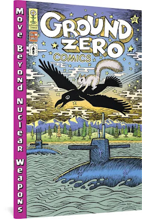
Comics Review: Ground Zero Comics: Move Beyond Nuclear Weapons

art by Pat Moriarty
reviewed by James Willetts

Leonard Rifas, et.al. Ground Zero Comics: Move Beyond Nuclear Weapons. Seattle: Fantagraphics, 2024. https://www.fantagraphics.com/products/ground-zero-comics-move-beyond-nuclear-weapons


Leonard Rifas is comics’ most enduring anti-nuclear activist, a tireless advocate for nuclear disarmament and non-proliferation. For over fifty years Rifas has been producing educational comics on the dangers of atomic weapons and nuclear power, as well as an array of other causes (such as food production, energy policy, motherhood, and corporate crime). Ground Zero Comics sees Rifas return to anti-nuclear comic books, with his new one serving as both a history of the anti-nuclear movement and a call to action. Arguing that we are in a new nuclear arms race, Rifas calls on ordinary people to challenge US policy through protest and activism. As Rifas puts it, “If we’re going to make it through the crises … a lot of things will have to change. If we have no voice, we’re not going to survive.” (32) Ground Zero Comics, a continuation of Rifas’ commitment to independently-produced educational comics, combines traditional cartoons and sequential comic strips with maps, graphs, charts, and scientific diagrams. Rifas combines his alternative comix sensibilities with the publishing power of Fantagraphics to create a slick and professional product.

While Rifas is the driving force behind Ground Zero Comics, he divides artistic duties with three other interior artists: David Lasky, Max Clotfelter, and Kelly Froh. Each is responsible for one of the comic’s four sections, with colors overall by Lasky. The first section introduces the central narrative, as a crow and a squirrel teach an unnamed protagonist about nuclear weapons. These pages feature Lasky’s illustrations over street maps and satellite imagery, covering the history of nuclear weapons in Washington state. Rifas, who resides in Seattle, concentrates much of his attention on the Pacific Northwest and its nuclear industry and anti-nuclear movement. Because of this, Ground Zero Comics can, at times, feel geographically isolated. The Space Needle, the Columbia Center, and the University of Washington function to illustrate scale, but provide a narrow point of reference for non-Washingtonians (or, indeed, non-Americans).

In the second part, Clotfelter covers the science behind, and destructive consequences of, nuclear weapons. His loose art style is the most reminiscent of the 1970s comix tradition that Rifas emerged from, and his illustrations of burned, irradiated, and mangled bomb-victims carries a commensurate sense of horror. One illustration on page 9, blending his style with that of Barefoot Gen’s Keiji Nakazawa, is particularly effective. Here Lasky leans into vibrant greens and pinks for a psychedelic style that accentuates the uneasiness of Clotfelter’s art.

Rifas provides art for the third section of Ground Zero Comics. This, along with the final section illustrated by Froh, feature the most traditional form of illustrated comic strip, with fewer infographics and maps. In Froh’s section the protagonist’s grandfather tells her about his personal history of anti-nuclear activism. This comes across as the most personal to Rifas. I was left wondering how much of the grandfather’s account was autobiographical, with a call to action motivated by the knowledge that “if dying old anti-bomb activists are not replaced by young activists, the anti-bomb movement dies with them.” (30) Ground Zero Comics argues that demonstration and protest have been successful in the past and can be again: “Much of the credit for stopping the drift towards nuclear war belongs to the millions of ordinary people around the world who joined or supported movements to demand peace and nuclear disarmament.” (29)

The choice to utilize multiple artists can lead to a jarring and incongruous mixture of text and art. It’s most successful in the sections illustrated by Clotfelter and Rifas, where the fusion of cartoons, satellite imagery and google maps, enhance the text. Unfortunately, the text of the final section fits uncomfortably alongside Frohs’ art, which is missing the same data-led imagery of earlier sections. The visualizations of scientific and geographic data in earlier sections enhance the illustrations, and this final section suffers for their absence. Lasky’s coloring lacks the same depth here, as talking heads opine against flat colored background panels.

It should also be noted that not all of the graphs and charts included are successful. A graph showing the potential impact of nuclear war shows population growth since the year zero (17). While it adequately shows that a nuclear war would see a massive drop in global population, there is no way for this graph to demonstrate that while hundreds of millions might die in the war, the majority of the population loss would come in the following years (seemingly recognizing this the comic adds in the fact that the “number of people who would starve to death after two years: over five billion”). A shorter time span, showing only the world population today and deaths over the years after an atomic war would help to demonstrate this.

Ground Zero Comics is clearly designed to be used in a classroom setting, and some of these issues could be mitigated by discussion. This is, ultimately, where Ground Zero Comics shines. Throughout, Rifas provides activities for readers, from drawing “a picture, image, cartoon, illustration, or graphic that represents “nuclear weapons”” (7) to opportunities for readers to think about their own stance on whether the US should dismantle her atomic arsenal, the scale of American military spending, and the utility of protest against nuclear policy (21). Each section could be isolated and given to high school or university students (although the text seemingly assumes an older audience, as one activity includes calculating how much of the readers taxes go to nuclear weapons).

Perhaps the most telling evaluation of Ground Zero Comics then is not about the comic itself, but how it can be used. If the audience is unclear, and the materials relevance outside Washington is more limited, it does provide an obvious and replicable model for educators to adapt. Rifas’ infographics and activities provide excellent starting points for discussion or teaching, even if student don’t end up reading the entire comic.

To supplement this, Rifas and the Ground Zero Center for Nonviolent Action also provide a substantial online resource pack, containing “a hundred pages of solid documentation, lesson plans, further thoughts, and fun facts,” available at https://www.gzcenter.org/comic_book_sources. This is ultimately best considered (in conjunction with the online resources) as an academic aid for anyone looking to teach on the history and morality of the bomb. In this respect, Ground Zero Comics is an invaluable introduction that comprehensively and thoughtfully discusses the arguments around nuclear weapons.


Book Review: Batman and the Shadows of Modernity

reviewed by Felipe Rodolfo Hendriksen, Profesor y Licenciando en Letras, Pontificia Universidad Católica Argentina

Rafael Carrión-Arias. Batman and the Shadows of Modernity: A Critical Genealogy on Contemporary Hero in the Age of Nihilism. Routledge, 2024. ISBN 1032423145. $180. https://www.routledge.com/Batman-and-the-Shadows-of-Modernity-A-Critical-Genealogy-on-Contemporary-Hero-in-the-Age-of-Nihilism/Carrion-Arias/p/book/9781032423142

Rafael Carrión-Arias’s Batman and the Shadows of Modernity is not just another analysis of a beloved superhero—it is a profound interrogation of the dark forces that shape our modern world, reflected through the lens of one of pop culture’s most enduring icons. By examining Batman as a product of our existential anxieties, Carrión-Arias crafts a narrative that pushes beyond conventional superhero studies and plunges into the philosophical depths of modernity itself.

At its heart, this book is a meditation on heroism and nihilism, themes that intersect in Batman’s tortured psyche. Carrión-Arias does not merely critique Batman as a character but positions him as a mirror for the postmodern age—a figure grappling with the collapse of meaning and the moral uncertainties of our time. He asks readers not just to observe Batman’s actions, but to understand the cultural and philosophical forces that drive them. It is a brave and ambitious endeavor that establishes Batman as not only a figure of justice, but a symbol of the fragmented self caught in the shadows of modern life.

From the outset, Carrión-Arias frames his study within the philosophical genealogy of Nietzsche and Foucault. Drawing on these thinkers, the author investigates how Batman emerges as a cultural product of late capitalism and existential despair. Carrión-Arias argues that he is not merely a hero, but also a reaction to the collapse of traditional systems of meaning. Rather than focusing solely on Batman’s psychological turmoil, Carrión-Arias positions the character as a reflection of the broader societal fears that define the modern age. And Gotham City, in his analysis, is no mere scene setting, but rather a manifestation of the existential dread that permeates contemporary urban life—a crumbling metropolis where the line between good and evil is blurred and where Batman must constantly navigate a world on the brink of moral collapse.

Where Batman and the Shadows of Modernity distinguishes itself from other analyses, such as those by Grant Morrison or Scott Snyder, is its willingness to tackle the philosophical implications of Batman’s role in a world stripped of meaning. While Morrison, for instance, explores Batman’s mythic dimensions and Snyder delves into his psychological resilience, Carrión-Arias focuses on the socio-political structures that both create and sustain Batman.

One of the book’s most compelling sections is its examination of Batman as a political figure. Drawing on Carl Schmitt’s concept of the “state of exception,” Carrión-Arias suggests that Batman operates as a sovereign figure who exists both within and outside the law. This paradoxical role reflects modern society’s unease with authority and justice, where figures like Batman become necessary yet deeply troubling symbols of order. Batman’s actions, while noble, reveal the fragility of the legal and moral systems upon which society depends. Carrión-Arias’s reading of Batman as an authoritarian figure has particular resonance in today’s political climate, where issues of surveillance, state violence, and personal freedoms are continually debated. By likening Batman to Schmitt’s sovereign figure, the author critiques the hero’s unchecked power, showing how Batman’s vigilante justice echoes the problematic dynamics of American exceptionalism.

The book’s philosophical backbone lies in its deep engagement with nihilism. Carrión-Arias draws extensively from Nietzsche’s The Birth of Tragedy and Dostoevsky’s The Brothers Karamazov, situating Batman as a tragic figure whose pursuit of justice is driven not by hope, but by a profound rejection of meaning. In doing so, Carrión-Arias presents Batman as a hero defined by his refusal to succumb to the chaos surrounding him. Batman’s moral code, particularly his refusal to kill, is framed as a Sisyphean effort to impose order on an inherently disordered world.

Carrión-Arias’s treatment of Batman’s villains, particularly the Joker, is another highlight of the book. Drawing on Mikhail Bakhtin’s theories of the carnivalesque, the author argues that the Joker represents the ultimate embodiment of chaos and disorder, a figure whose very existence challenges Batman’s moral universe. The Joker is not simply Batman’s opposite; he is the embodiment of a world without rules, a world where meaning has been completely eroded. Carrión-Arias’s analysis of Arkham Asylum: A Serious House on Serious Earth as a polyphonic narrative adds depth to his argument, showing how the interplay of voices within the text mirrors the broader cultural debates about sanity, power, and morality.

While Batman and the Shadows of Modernity is a profoundly thought-provoking text, its density may be a barrier for readers who are less familiar with the philosophical frameworks the author engages with. At times, Carrión-Arias assumes a high level of philosophical literacy, particularly when discussing theories of Nietzsche and Foucault. While this adds intellectual heft, it may alienate readers looking for a more accessible exploration of Batman. That being said, the book’s strength lies in its willingness to tackle complex, often uncomfortable questions about heroism, morality, and the modern world. For those willing to engage with its complexities, Batman and the Shadows of Modernity offers a rich and rewarding exploration of one of pop culture’s most iconic figures. It is a book that not only deepens our understanding of Batman but also forces us to confront the shadows that shape our own world.

In conclusion, Batman and the Shadows of Modernity offers a significant contribution to both superhero studies and broader philosophical discourse. By positioning Batman as a figure intertwined with the moral uncertainties and existential struggles of the modern world, Carrión-Arias transcends typical superhero analysis and opens up new avenues for understanding the character’s cultural relevance. This book not only deepens our appreciation for Batman as a reflection of modern nihilism but also lays the groundwork for future scholarship on how superheroes function as ideological symbols in an era marked by fragmentation and crisis. As both a cultural critique and a philosophical treatise, Batman and the Shadows of Modernity stands as an essential text for scholars, philosophers, and comic book enthusiasts alike, one that will likely shape future discussions on the intersection of power, identity, and morality in the superhero genre.

Exhibition Review: Hell, Ink & Water: The Art of Mike Mignola

  reviewed by Carli Spina


Hell, Ink & Water: The Art of Mike Mignola. New York: Philippe Labaune Gallery. September 19 - October 26, 2024. https://philippelabaune.com/show/philippe-labaune-gallery-hell-ink-water-the-art-of-mike-mignola

As a gallery specifically devoted to “high-end narrative art and illustration,” the Philippe Labaune Gallery in New York City was a perfect setting for Mike Mignola’s first gallery exhibition. This exhibit featured a range of his work, while his iconic work on Hellboy was well-represented through an array of cover illustrations and watercolors of the characters. The exhibit also included many pieces from his other notable works, such as a collection of illustrations and a watercolor from Pinocchio: An Illuminated Edition. Seeing this curated collection of Mignola’s works together underscored recurring themes of his work, including death, the supernatural, playing cards, plants, and the macabre, to name just a few. It offered a clear understanding of the way that his personal style translates across media, from pencil sketch to watercolor. Given how many of the illustrations are in black, white, and, occasionally, shades of gray, the color work in the watercolors particularly stood out.

 For many Mignola scholars and fans, the Hellboy art was a major draw of this exhibit and there were several pieces of interest including his original artwork for many covers which demonstrate his skill at character expressions, dynamic motion, and composition. In addition to covers, his Hellboy characters are front and center in the original artwork he created for a poster for the Art Bubble Festival held in Copenhagen, Denmark in 2017. The gallery had arranged many of the Hellboy pieces near one another, which offered a nice way to compare them and see recurring elements and approaches. Beyond Hellboy, his work with other well-known comics characters also popped up here and there in the exhibit, including Batman, Robin, and the Rocketeer, which offered a chance to see how his art translates to characters that are not his original creations.

 The exhibition featured several pencil drawings of characters with plant elements in their anatomy. They were quite a bit different than the other works in the collection while, at the same time, very clearly in line with his style. These sketches exhibited Mignola’s skill in bringing a character to life through a single drawing and his deft depiction of apparent motion.

 Mignola’s watercolors were a true highlight of the exhibit. His use of color in these pieces skillfully drew the viewer’s eye to specific elements in some works and, in others, created lighting within the work that felt by turns natural and eerie. While these watercolors displayed the same recurring elements seen in his other works, their color and style made them stand out even among all the other impressive pieces in the exhibit.

 The gallery, in conjunction with IDW Publishing, created a catalog for the exhibition. It features images of art from the exhibition with the title and size of each piece presented alongside it. Signed copies of the catalog were available at the gallery and unsigned copies are available for sale elsewhere. It is a great option for Mignola fans who were not able to visit the exhibit in person, particularly those interested in seeing the watercolors from the exhibit. The gallery’s website also hosted high-quality images of the pieces in the exhibit that users can zoom in on, which is another helpful resource for those who want to examine the pieces. Fans of Mignola’s work will be impressed by the range of works included in this exhibit and those who were not able to visit the gallery should definitely check out the website or the print catalog.


Exhibition Review: Beautiful Monsters: The Art of Emil Ferris

 reviewed by Carli Spina

Kim Munson. Beautiful Monsters: The Art of Emil Ferris. New York: Society of Illustrators’ Museum of Illustration. August 3-October 19, 2024. https://societyillustrators.org/event/beautifulmonsters/

To coincide with this year’s publication of Emil Ferris’ My Favorite Thing is Monsters: Book Two, the Society of Illustrators’ Museum of Illustration devoted its main floor and lower level gallery spaces to an exhibition of her work curated by Kim Munson. Munson has ample experience in this arena, having edited the Eisner Award-nominated anthology Comic Art in Museums, curated the museum exhibit Women in Comics, and served as a 2022 Eisner Award judge. Clearly, Munson curated this exhibit with care to ensure that it adds to visitors’ understanding of Ferris and her work. The pieces selected illustrated many aspects of Ferris’ work in My Favorite Thing is Monsters including her character design work, her influences, and the monster magazine covers which feature in both volumes. Pieces from her short work “The Bite That Changed My Life” from Our Favorite Thing Is My Favorite Thing Is Monsters, which was created for Free Comic Book Day in 2019 were also prominently featured in the exhibit.

Where the exhibit exceled most was in placing Ferris’ work in context. This began as visitors entered the first room of the exhibit where the first case and interpretative text focus on Ferris’ father’s work as a toy designer. His work as a designer of iconic toys, including the Rock ‘Em, Sock ‘Em Robots, the light-up game Simon, and the Mickey Mouse push button landline phone, where Mickey holds the receiver, were highlighted as an important source of inspiration for Ferris’ work and particularly her repetition of shapes. The influence of toys carried into the second room of the exhibit where an illustration of Granny Smith: Super Crime Fighter was paired with an actual doll with an apple in place of the head, and a label explaining how Ferris grew up creating her own toys from 10-cent items found in the Salvation Army bin. Understanding how these childhood experiences carried into Ferris’ work adds a deeper layer to her artwork and her text.

The exhibit also contextualized Ferris’ references to several classic paintings of Judith beheading Holofernes by bringing these pieces, and some initial drafts, together while listing the works Ferris references. Though this section of the exhibit would have benefited from including reproductions of the works referenced for comparison, it was nevertheless helpful in making explicit the connection between these classic works and Ferris’ art. In keeping with this connection to classic art, Ferris created a large-scale piece titled Scary Starry Night specifically for this exhibit. It is described on the accompanying label as a “tribute to Van Gogh’s 1889 painting The Starry Night” and the piece consists of a large, rectangular illustration that is very similar to the original painting, drawn in the style of Ferris’ artwork for this book with cross-hatching in ball-point pen. Eyes are featured in place of the stars found in the original work and a red set of eyes has been added to each of the black towers that rise in the left side of the piece in this adaptation. To the left of this work, a cutout figure of Van Gogh holding a palette and brushes was positioned as if he is in the midst of painting the larger work. This illustration continues Ferris’ practice of reworking classic art works and more modern popular illustrations in her own style and inhabited by her own characters. At the same time, it also served as an interactive element of the exhibit, given that the label specifically suggested that visitors take their picture with this piece and post it on social media. Such photo opportunities are becoming more common in museums, but this one contributed to the exhibit by serving both as a focal point for the eye upon entering the larger of the two rooms of the exhibit and as an original work specifically created for the exhibit.

While the majority of the works in the exhibit were illustrations from My Favorite Thing is Monsters, the exhibit would still have benefited from more detailed labels in places, particularly for those works that are not illustrations from one of the books. A good example of this was one of the few three-dimensional objects in the exhibit, a mask that appears to be a recreation of one found in an illustration. A recent interview with the author seems to confirm that this mask was created by Ferris’ mother when she was a child,[1] which an adjacent comic in the exhibit described. However, a label with more details about this would have been appreciated, especially given that greater context is given for her father’s creative career and his influence on Ferris. Given that her mother was also a professional artist,[2] this felt like a missed opportunity to offer a comparative look at her mother’s influence in her work.

This exhibit offered a chance to experience Ferris’ work, often in a new context that added to visitors’ understanding of her novels but could be appreciated by both fans of her work and those who have not yet read it.


[1] Vitali, Marc. 2024. “Eagerly Awaited Graphic Novel Embraces Chicago, Art and Monsters — Both Real and Imaginary.” WTTW. June 4. https://news.wttw.com/2024/06/04/eagerly-awaited-graphic-novel-embraces-chicago-art-and-monsters-both-real-and-imaginary

[2] Yood, James. 1991. “Eleanor Spiess-Ferris: Zaks Gallery.” Artforum International. Sept. 1: Reviews 139.

Sunday, October 13, 2024

Research Prompt: What is the most panels ever used on a comics page?

 by Mike Rhode (updated 10/14/2024 with additional suggestions as an addendum)

I was at a talk by Jonathan Roth this weekend, who was asking children how many panels a comics page should have. He usually defaulted to 3 or 4 in his Rover and Speck graphic novels. He asked me what the largest number ever used was... so I reached out to some comics scholar friends.

Here's some pages they came up with...

Going back to Jim Starlin's 1970's Warlock with 33 panels...

 
This Milo Manara page from Giuseppe Bergman has about 38 panels...


Longshot Comics by Shane Simmons has 40 panels...

 
 A page from Spinoza #3 with 53 panels...

 
 Lewis Trondheim's Mr. O has 60 panels... and Darko Macan notes, "Mister O and Shane Simmons differ from the others because their *every* page has the same busy grid."


Possibly 81 panels in Gaiman’s Miracle Man depending on how you define a panel... (I personally would consider this to be 13, based just on dialogue balloons).
 

Joe Matt's "Hell to Pay" from Peepshow has 96 panels...


There’s a page from Paul Chadwick's Concrete where he’s swimming across the Atlantic Ocean with 150 panels...


The What Were Comics? project has this example of 236 panels in Marvel Graphic Novel #6, aka Star Slammers by Walt Simonson... (Andrei Molotiu noted, and I agree: Some of those are a bit iffy, like the Simonson --it may have a grid superimposed on it, but absolutely no one would read the majority of those squares as individual panels.)
 
 
Flood, by Eric Drooker has a 16x16 grid for 256 panels, but half are blank...

 
Andreas's Rork had 300, according to Will Quinn on Twitter in 2018...


... and that appears to be the winner at the moment, although something by Chris Ware could dethrone it, I suppose. Leave a note in comments if you have other suggestions.

So why use this many panels on a single page? What effect are these cartoonists attempting to show? Does it work? 

Addendum

Paul Gravett linked to this on Facebook, and I posted it to two comics studies lists, and here's some more suggestions.

from Andrei Molotiu: The second page of Bill Griffith's "The Plot Thickens" from Raw no. 2? (60 or 61 depending on how you count "End"- MR)


from Box Brown: There's a Chris Ware page that has 177 panels...


 from Alex Fitch: Apparently Absolute Batman 1 has quite a few; a couple of Liam Sharp’s Hulk issues were pretty packed with panels, and Woodrow Phoenix’s She Lives has 64 panel pages…

from JL Mast: A page I did for one of my webcomics 20 years ago! 400 small panels.

from Harry Demetrious (and Nicolas Verstappen agreed and provided an image from the book): Frank Quitely draws panels descending into infinity in Multiversity, thousands if not millions. The "what shall I watch tonight?" page, endless thumbnail choices wiping out narrative immersion....


from John Bateman: Beyruth, Danilo (2012). Astronauta: Magnetar. São Paulo: Editora Panini. p. 41. I count 424 panels. Paul Gravett followed up on this and provided the image: An interesting example here from Brazil: 'The Astronaut' is a graphic novel from 2015, an adult version of a Maurício de Souza character, but real sci-fi, with lots of physics explaining astronomy. Here a full-page multiplies, first by 4 and then by more... (since it's just copying the same 9 panels multiple times, I think this has to have a qualifier - MR)


Lucio Luiz provides considerably more information for the above page's design: 

I’d like to show you a page with 1,224 panels. It’s from Astronauta: Magnetar of Danilo Beyruth (it was published in some countries, but I’m not sure if it was published in English).

To give you context about the narrative, [here's] five pages (38 to 42), but the page with a lot of panels is page 41. This character is stuck in space, alone. In page 38 he starts his “day 1” with his routine. In page 39, he starts “day 2” with the same routine. And this routine goes on with page 40 repeating the same 9 panels, each time smaller. In page 41, there is 136 repetitions (the routine has 9 panels, so 136 x 9 = 1,224  panels in this page). In page 42 the sequence finishes with a single panel with “Day 146”. And that was really the 146th day because the routine appeared exact 145 times in the 4 prior pages. This scan is not very good, but in the comic, all panels, even the smallest, are well defined. I believe it’s a great amount of panels and also a great way to show the loneliness of the character in all these days stuck in space (that was exactly Beyruth's intention, by the way).


Final update (10/25/24): 

Aaron Kashtan: How about this strip by Mark Newgarden from Raw #6?


This is the one where the one guy has a nosebleed, and he doesn't have a tissue to stop it. And the other guy says to use a rag instead, and the first guy says "The New York Post is considered a rag" and he stuffs the New York Post into his nose.
 

Mark Newgarden: Aaron Kashtan I was trying to outdo Subitzky, so I must have counted.


Thursday, September 26, 2024

Book Review: Hurricane Nancy by Nancy Burton, edited by Alex Dueben

Reviewed by Cassia Hayward-Fitch

Nancy Burton. Hurricane Nancy. Seattle: Fantagraphics, 2024. 112 pp. US$30 (Paperback). ISBN: 9781683969839. https://www.fantagraphics.com/products/hurricane-nancy

 This retrospective of Nancy Burton’s work, Hurricane Nancy – one of the artist’s pen names – is the first-ever collection of Burton’s work, and the latest in a line of Fantagraphics’ collections of underground comix by female artists, preceded by anthologies such as The Complete Wimmen's Comix (2016) and Tits & Clits 1972-1987 (2023). Like these two earlier publications, Hurricane Nancy attempts to make the work of a pioneering female comix creator available to a broader audience, helping to alter public perceptions of the “boys only” nature of the underground comix movement. The book is split into four sections and begins with an introduction that situates Burton as the first female artist to emerge from the broader underground comix movement. This is followed by a selection of Burton’s comix and artwork, divided into work created between 1965 and 1971, and her new artwork from 2010 to the present. Finally, the edition is rounded off with an all-new interview by editor Alex Dueben. Here, Burton discusses her involvement in protest movements, the impact of her global travels and music on her art, her artistic background, and the factors that led her to cease creating art in 1971 and then to resume in 2010.

The presentation of Burton’s early work has an archival tone; the comix are mounted on a black background, with many of the pages featuring scans of the original artwork; sepia-toned and complete with stains, rips, marginalia notes, correction fluid marks, and faint blue tracing lines. This creates an intimate reading experience, giving the reader the impression that they are being made privy to Burton’s private collection. The selection of work from 1965 to 1971 begins with “Gentle’s Tripout,” a serial comic strip about a group of friends who go on a journey to find the “Wicked Wandering Hag” in the hope of lifting the curse that has rendered one of their number, Vera, silent. After the comic abruptly ends with an incomplete, half-finished strip, it is followed by a selection of artwork that resembles the psychedelic poster art of the time. Similarly, Burton’s artwork from 2010 to the present, which features gigantic figures who peer through house windows, larger-than-life cat heads, lizards, and birds, bears similarities to the Alice in Wonderland-esque poster art of the 1960s. Her style also resembles artists such as Aubrey Beardsley in that, where most psychedelic posters utilized brilliant color, Burton’s artwork, like Beardsley’s before her, is drawn in black ink on white backgrounds. Across both sections, the artwork is unaccompanied by captions, dates (except when this is indicated in the artwork itself), or contextual information. This alleviates the feeling that a critic is breathing down the reader’s neck, dictating the “correct” way in which the art should be interpreted. It is only in the interview that concludes this collection that Burton herself situates her work within the broader context of her life and artistic influences, which, alongside the underground press movement and poster art, she lists as art nouveau, abstract expressionism, and formline art.

Overall, this collection presents a decade-spanning overview of an artist whose career has one foot in underground comix and the other in poster art but who has yet to gain significant recognition within either sphere. Burton's entire career is contextualized through the inclusion of the introduction and interview, and the collection demonstrates the fluid divide between underground comix and other contemporary artistic movements, making it a valuable addition for scholars wishing to broaden discussions of female underground artists and the nature of the underground comix movement itself.